Preview image. Unlock full-res
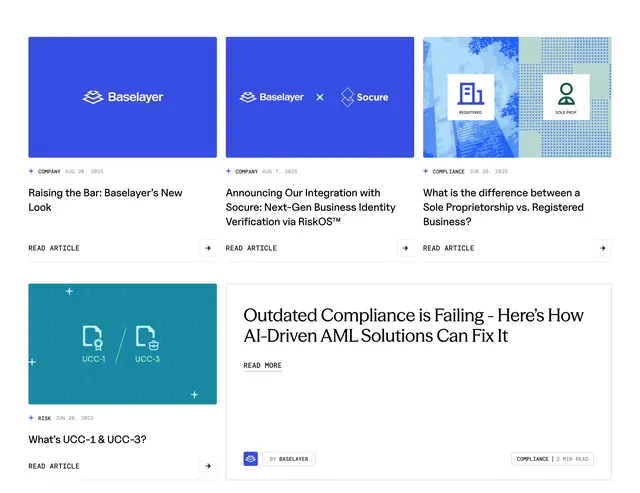
Mixed-size blog grid with branded thumbnails, category tags, and a wide serif featured article card.
Summary
A bento-style news grid mixes three equal article cards on top with a small card and a wide featured story below, all using consistent metadata and arrow CTAs.
Visual description
White page with no section header visible. Top row holds three vertical cards with blue or split graphic thumbnails, blue "+ COMPANY" or "+ COMPLIANCE" tags, dates, bold titles, and "READ ARTICLE" labels beside square arrow buttons. Bottom row pairs a compact teal UCC explainer card with a double-width featured card using large serif headline "Outdated Compliance is Failing," underlined READ MORE, and a footer bar with Baselayer attribution and "COMPLIANCE | 2 MIN READ" tag in bordered boxes.
Key takeaway
Bento sizing breaks editorial monotony while shared card anatomy keeps scanning easy. Serif featured card creates hierarchy without a hero image. Bordered tag pills give a modular, technical brand feel.
Reuse notes
Works for B2B content hubs needing both digest cards and spotlight stories. Thumbnails should stay on-brand flat graphics. Mixed card widths need responsive reflow planning.