Preview image. Unlock full-res
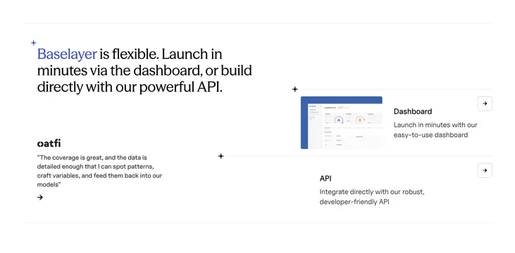
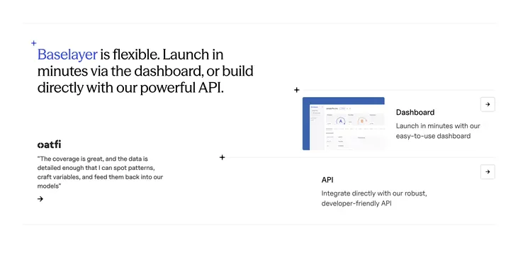
Asymmetric platform section with flexible headline, oatfi quote, and two linked rows for Dashboard and API access paths.
Summary
A blueprint-style two-column block pitches Baselayer flexibility with a bold headline, oatfi testimonial, and stacked Dashboard and API option rows.
Visual description
White background with thin gray grid lines and small plus marks at intersections. Left column shows a blue-accented headline where "Baselayer" is colored and the rest is black sans-serif, plus an oatfi logo quote and arrow link below. Right column splits horizontally into Dashboard row with a small dashboard screenshot thumbnail, title, one-line description, and square arrow button, and an API row with text-only description and matching arrow control.
Key takeaway
Grid-line framing sells technical credibility without heavy illustration. Pairing no-code and API paths in equal rows makes platform choice explicit. Client quote under the headline bridges marketing and proof.
Reuse notes
Strong for developer platforms offering both UI and API onboarding. Dashboard thumbnail must read at small size. API row benefits from a code snippet variant for dev audiences.