Preview image. Unlock full-res
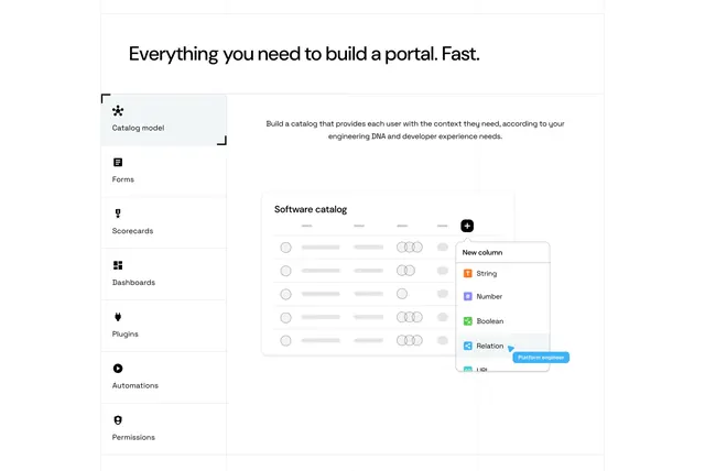
Light feature section with a vertical icon-tab menu on the left switching a product catalog mockup on the right.
Summary
A light feature section that uses a vertical icon-labeled tab menu on the left to switch a product catalog mockup on the right, set against a faint blueprint grid.
Visual description
A left-aligned oversized black headline ("Everything you need to build a portal. Fast.") spans the top. Below, a vertical menu of icon-plus-label tabs runs down the left (Catalog model, Forms, Scorecards, Dashboards, Plugins, Automations, Permissions), with "Catalog model" active and marked by corner brackets and a light fill. To its right, a short paragraph of body copy sits above a white "Software catalog" product mockup: a table of placeholder rows with avatar circles, a black "+" add-column button, and an open "New column" dropdown listing typed options (String, Number, Boolean, Relation, URL) with a small blue "Platform engineer" pointer tag. Faint dotted blueprint gridlines run behind the whole section.
Key takeaway
The vertical icon-tab list turns a long feature set into a compact, browsable switcher where one mockup does the explaining. Corner-bracket framing on the active tab is a subtle, technical selected-state cue. The faint blueprint grid behind everything reinforces a build-it-yourself, developer-platform identity.
Reuse notes
Best for a platform with many distinct capabilities that share one product surface, so each tab swaps the mockup rather than the layout. Needs real, legible UI mockups per tab to pay off. The blueprint grid sets a technical tone; pair with a clean sans and keep the left menu short enough to avoid scrolling.