Preview image. Unlock full-res
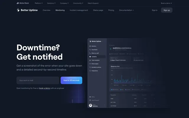
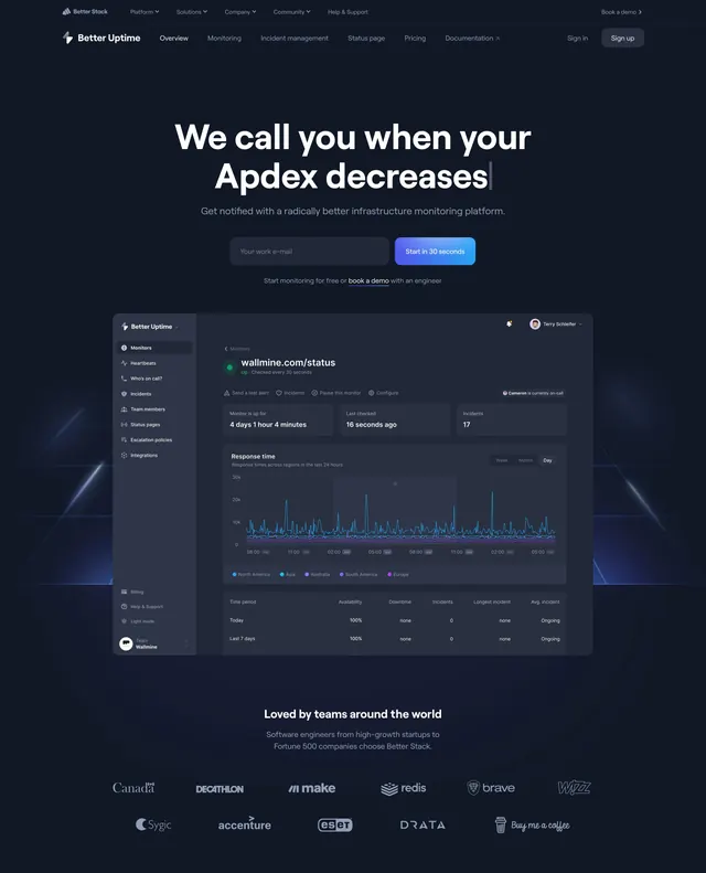
Dark centered hero with typing-style Apdex headline, email signup, full dashboard mockup, and grayscale client logo grid below.
Summary
Better Uptime hero with dual nav, We call you when your Apdex decreases headline with cursor, signup row, large centered dashboard, and Loved by teams logo strip.
Visual description
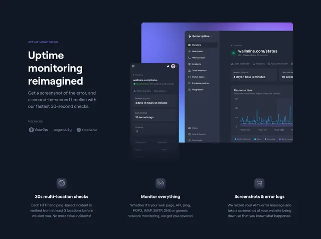
Dark navy with blue light streaks behind UI. Global and Better Uptime nav bars. Centered white headline with trailing cursor on Apdex decreases, gray subhead on infrastructure monitoring, email input and blue-purple gradient Start in 30 seconds button, caption with book demo link. Large centered Better Uptime dashboard: sidebar, green Up status, metric cards, multi-region response graph, stats table. Below, Loved by teams header and two rows of grayscale logos (Canada, Decathlon, Make, Redis, Brave, Wizz, Sygic, Accenture, Eset, Drata, Buy Me a Coffee).
Key takeaway
Typing cursor on the headline implies dynamic monitoring without animation in a still. Full-width dashboard under signup proves product immediately. Logo grid under the hero extends social proof without a separate section break.
Reuse notes
Strong uptime or APM landing hero. Centered stack needs vertical space; shorten copy if dashboard dominates mobile. Typing effect should be optional in implementation.