Preview image. Unlock full-res
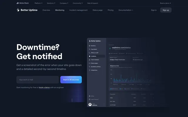
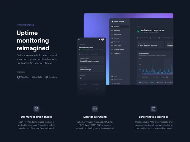
Split uptime section with Replaces competitor logos, desktop and mobile dashboard mockups, and three-column feature icons below.
Summary
Uptime monitoring reimagined split hero with VictorOps, PagerDuty, OpsGenie Replaces row, overlapping desktop and phone dashboards, and three icon features on 30s checks, protocols, and screenshots.
Visual description
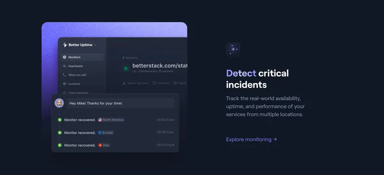
Dark charcoal background with purple glow behind mockups. Top split: left lavender UPTIME MONITORING label, white headline Uptime monitoring reimagined, gray subhead on 30-second checks and error screenshots, Replaces row with muted VictorOps, PagerDuty, OpsGenie logos. Right: overlapping desktop Better Uptime dashboard (Monitors sidebar, green Up, response graph) and mobile status view. Bottom three columns with rounded icon squares: 30s multi-location checks (globe), Monitor everything (signal icon listing HTTP/API/ping protocols), Screenshots & error logs (image icon).
Key takeaway
Replaces competitor logos position the product in a known category instantly. Desktop + phone overlap shows monitoring anywhere in one art-directed frame. Icon trio below extends the hero without a separate section jump.
Reuse notes
Strong for uptime SaaS displacing legacy incumbents. Competitor logos need legal clearance. Split + bottom grid requires consistent icon style across three columns.