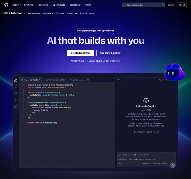
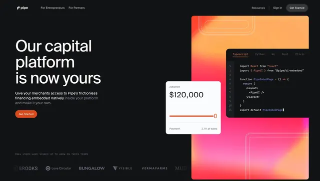
Grainy blue-purple gradient hero with white developer copy and CTAs on the left, overlapping light docs UI showing Python client setup on the right.
Summary
A textured dark gradient developer hero that layers a real docs window�tabs, sidebar, Python snippet�over the right half while left-aligned white type drives to "Let's go" and an API key link.
Visual description
Left two-thirds: noisy navy-to-violet gradient with large white headline "Developer resources," supporting paragraph about API access and Playground, white filled pill "Let's go," and text link "Get an API key" with arrow. Right: a bright docs interface card titled cohere docs with version selector, top tabs (Guides active), left nav highlighting "Creating a client," and main pane showing Python import plus ClientV2 initialization in a code block with language tabs and a parameters table header below. The docs card overlaps the gradient edge, creating depth.
Key takeaway
Showing actual documentation UI instead of abstract dev art instantly signals credibility. Contrast between grainy marketing gradient and crisp white docs panel is the whole visual hook.
Reuse notes
Best for API-first products with polished doc sites. Update the highlighted nav item and snippet to match your onboarding flow. Heavy gradient may compress poorly on mobile unless the docs stack below.