Preview image. Unlock full-res
Dark, premium SaaS-style insurance homepage with a split hero, supporting logo wall, feature callouts, and a contact/footer sequence.
Summary
Dark, premium SaaS-style insurance homepage with a split hero, supporting logo wall, feature callouts, and a contact/footer sequence.
Visual description
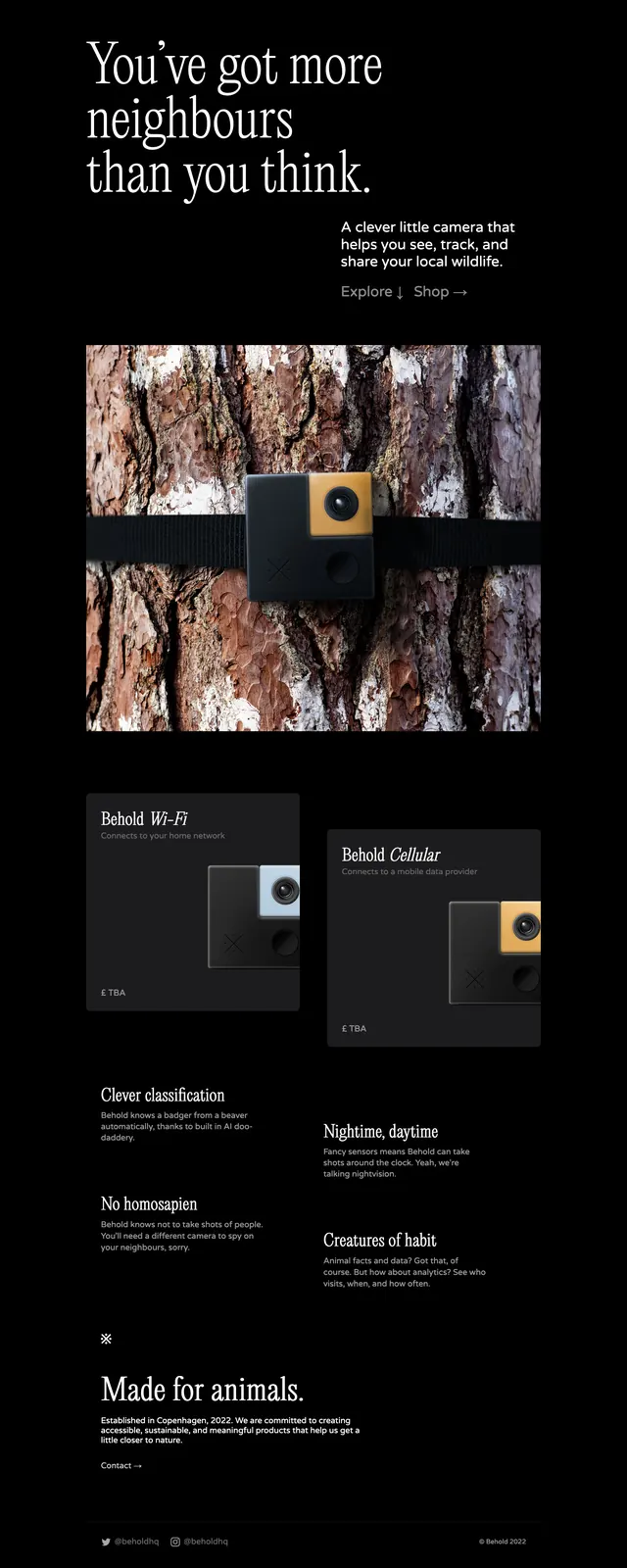
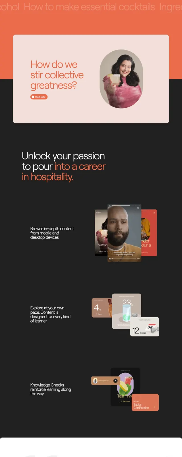
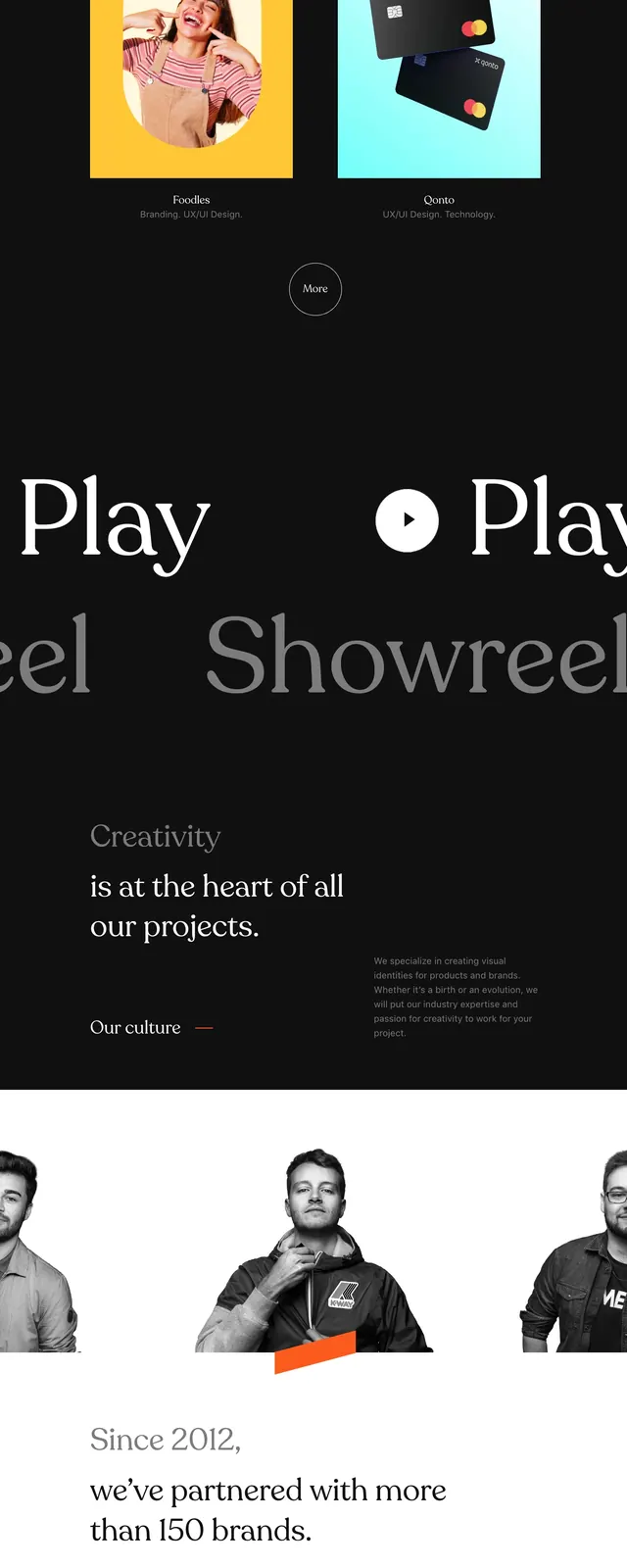
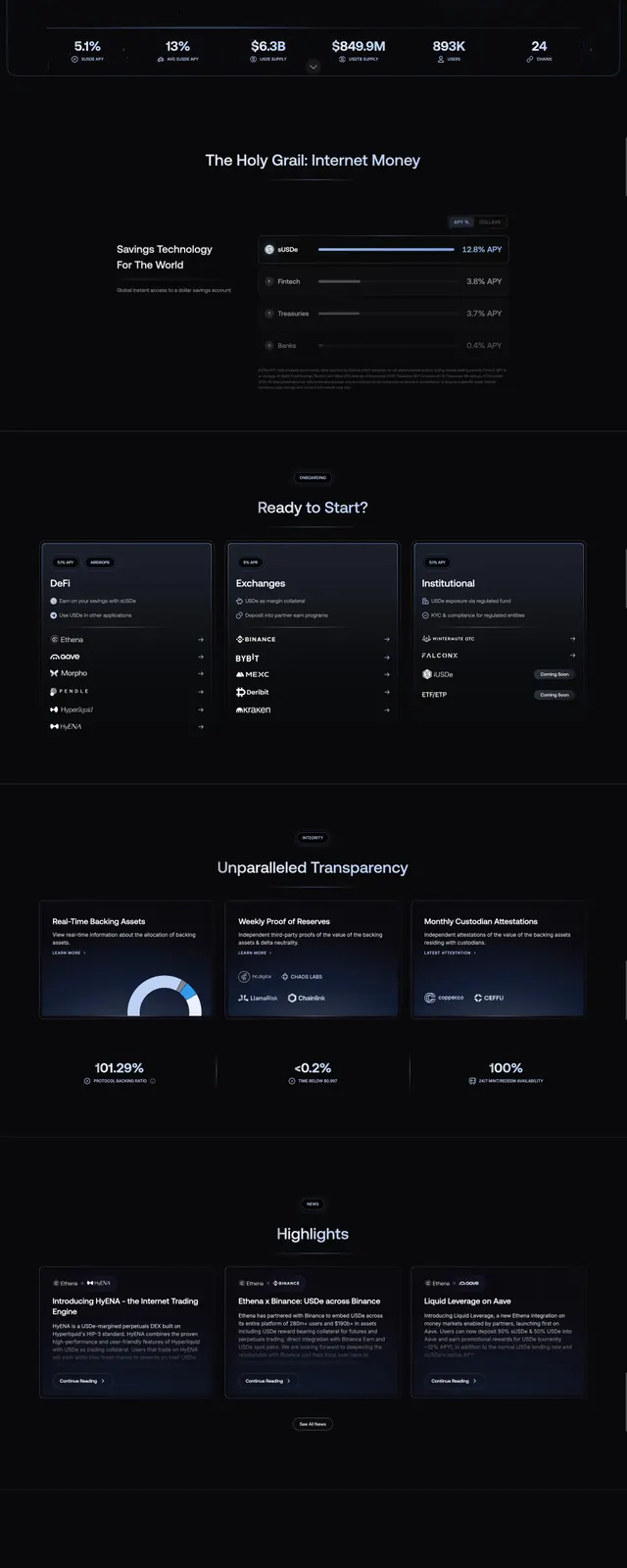
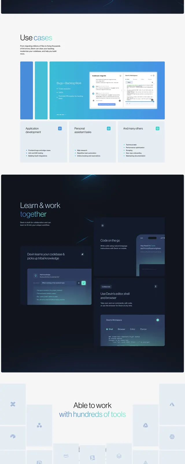
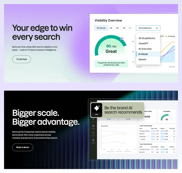
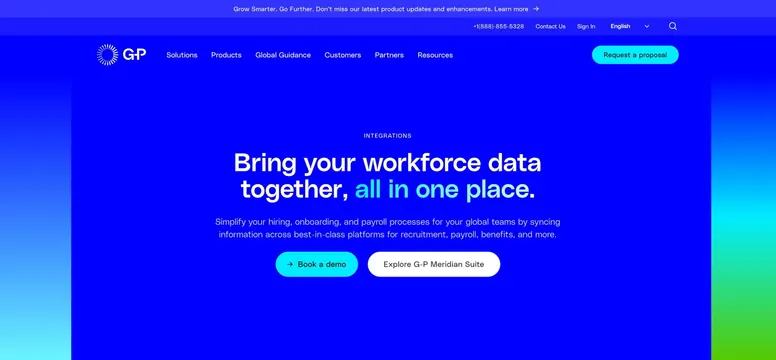
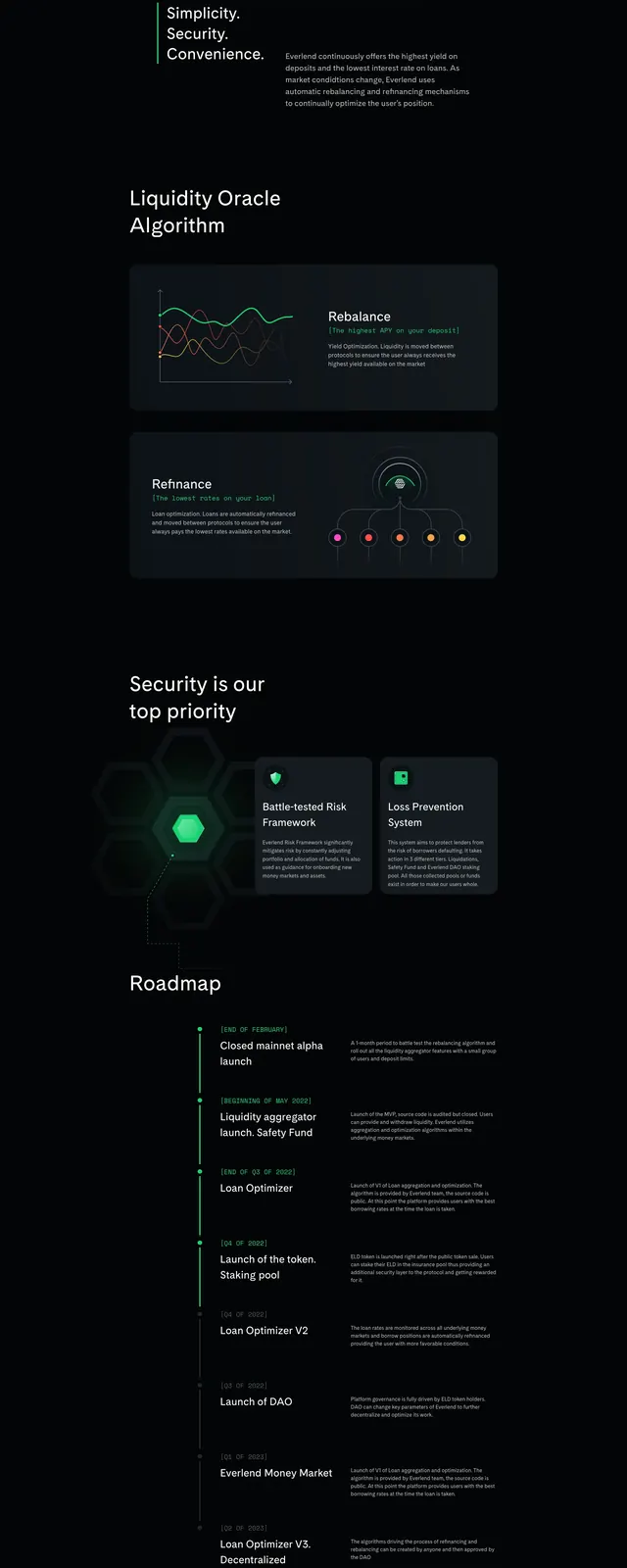
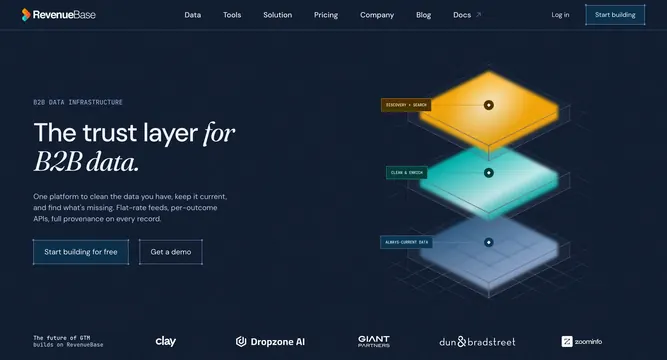
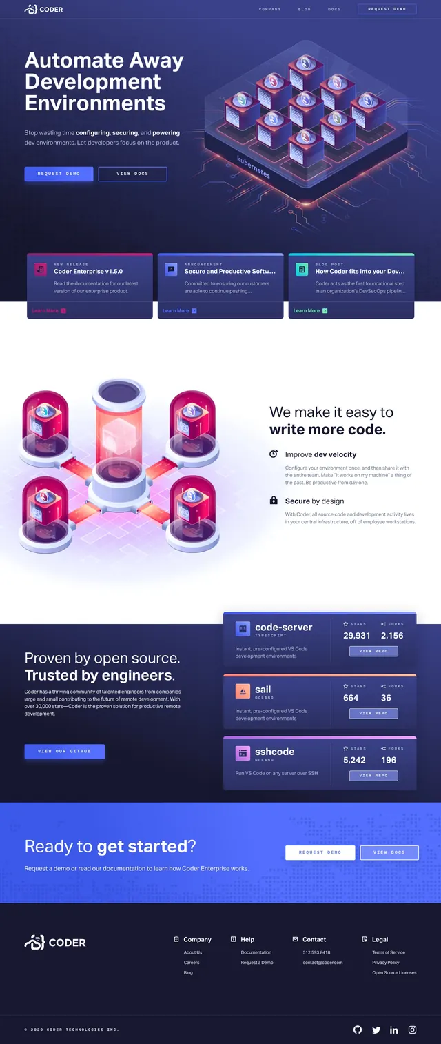
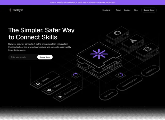
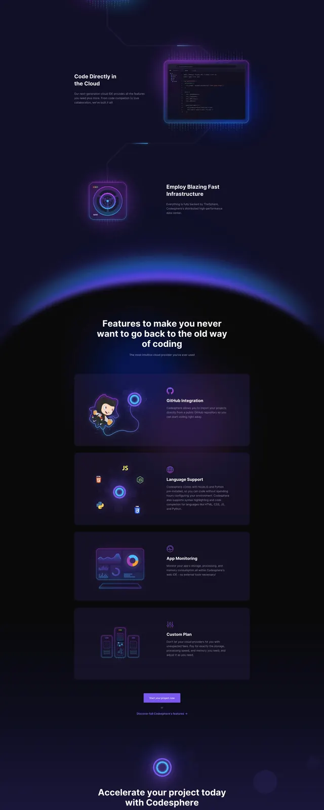
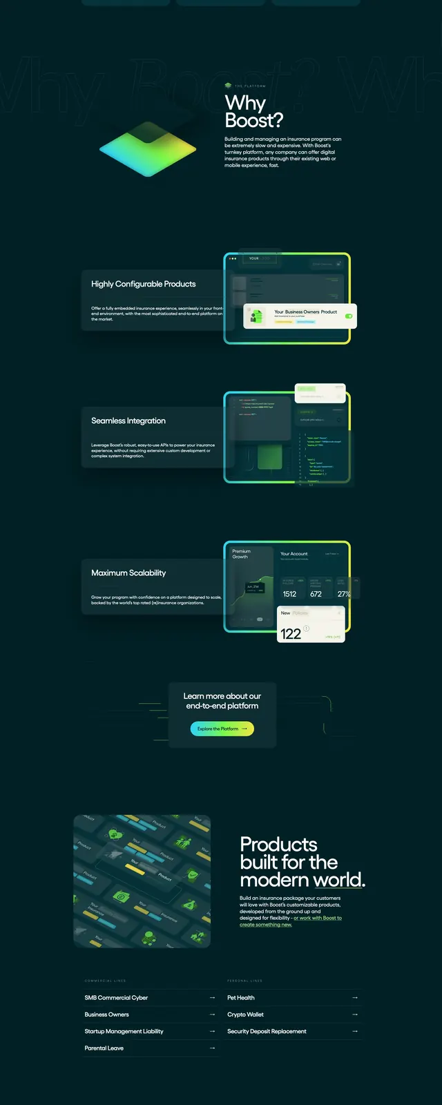
The page opens on a dark teal background with a top navigation bar, a large left-aligned headline, short supporting copy, and a bright rounded primary CTA. On the right, a translucent product-style card shows layered interface panels and neon accents. Lower sections include a centered logo wall with partner/customer marks, two feature blocks with code and dashboard imagery, a small CTA panel, a light-background contact section, and a multi-column footer.
Key takeaway
Use a dark, high-trust hero with a bright gradient CTA and a floating product mockup to make a technical platform feel premium. Supporting proof points like customer logos and feature snapshots reinforce credibility without breaking the visual rhythm.
Reuse notes
Works well for B2B insurance, fintech, or developer-platform landing pages that need a polished, enterprise feel. The layout depends on strong contrast and staged interface imagery, so it is less suited to content-heavy or purely editorial sites.