Preview image. Unlock full-res
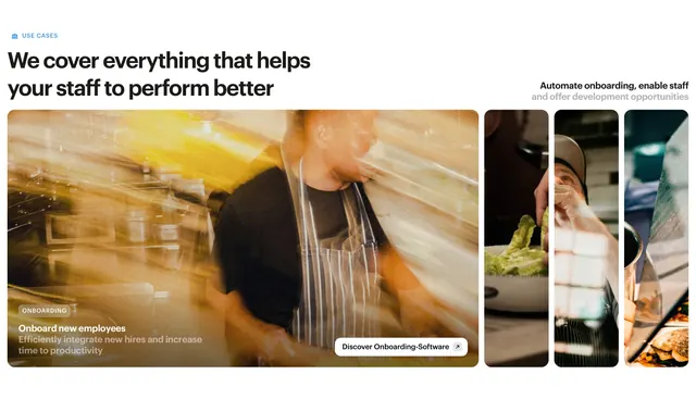
Use-case features section with a left headline and a horizontal carousel of tall photographic cards, the active one expanded with a category badge and CTA.
Summary
A use-case features section where a left-aligned headline introduces a horizontal row of tall photographic cards. The active card is widened and overlaid with a category badge, title, description, and a pill CTA.
Visual description
Top left, a small blue caps eyebrow ("USE CASES") sits above a two-line dark headline ("We cover everything that helps your staff to perform better"); a second muted line at top right reads "Automate onboarding, enable staff and offer development opportunities". Below runs a row of tall rounded image cards of people working in kitchen and hospitality settings. The leftmost card is expanded and motion-blurred, carrying a dark "ONBOARDING" pill badge, a white title ("Onboard new employees") with a line of supporting copy, and a white "Discover Onboarding-Software" pill button. Three narrower cards peek in to the right, implying a scrollable set.
Key takeaway
Treating use cases as an image carousel where only the active card expands to reveal its badge, copy, and CTA keeps the row tidy while spotlighting one story. The warm, motion-blurred workplace photography makes a training tool feel human and in-motion.
Reuse notes
Good when each use case maps to a distinct audience or workflow you can photograph in context. Needs strong, consistent photography across cards. The expand-on-active pattern reads as interactive; pair with arrows or drag if you want the motion to be obvious.