Preview image. Unlock full-res
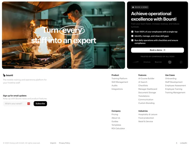
Footer fronted by a dark book-a-demo card beside a fiery kitchen photo, over a multi-column light link grid with a newsletter signup.
Summary
A footer that opens with a final conversion zone, a fiery kitchen photo beside a dark book-a-demo card, then drops into a clean multi-column link grid with a newsletter input below.
Visual description
The top band splits into two rounded panels: on the left a warm photo of a chef cooking over open flame, captioned with an outlined-and-solid white headline ("Turn every staff into an expert"); on the right a near-black card with a "BOOK A DEMO" eyebrow, a two-line heading ("Achieve operational excellence with Bounti"), three check-marked benefit lines, a white "Book a demo" button, and a muted "TRUSTED BY COMPANIES OF ALL SIZES" logo strip. Below on white sits the footer proper: the Bounti wordmark with a one-line descriptor and an email newsletter field with a black "Subscribe" button on the left, and four link columns (Product, Company, Features, Use Cases, Industries) to the right. A thin bottom bar shows copyright, Imprint, Privacy Policy, and a LinkedIn link.
Key takeaway
Combining the last CTA and the footer into one block, using a photo panel plus a dark demo card to convert before the link grid takes over. The outlined-plus-solid headline treatment over the photo adds typographic interest cheaply.
Reuse notes
Efficient when you want a strong closing demo prompt without a separate full CTA section above the footer. The dark card recolors easily and the two-zone structure scales down by stacking the panels. Keep the link grid restrained so the demo card stays the focal point.