Preview image. Unlock full-res
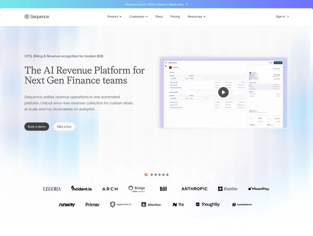
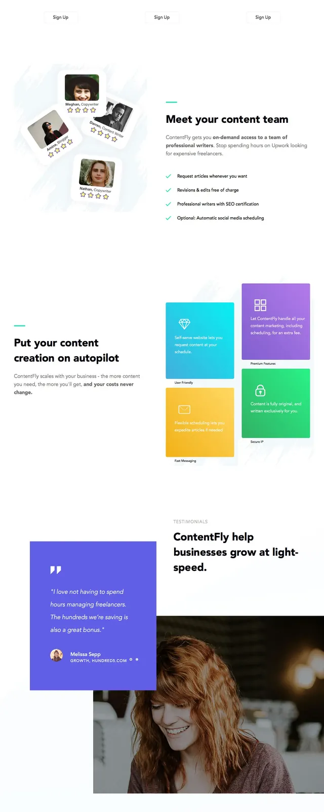
A pastel gradient SaaS landing page for Bowtie with a split hero, feature blocks, testimonials, product screenshots, pricing cards, and a dark footer.
Summary
A pastel gradient SaaS landing page for Bowtie with a split hero, feature blocks, testimonials, product screenshots, pricing cards, and a dark footer.
Visual description
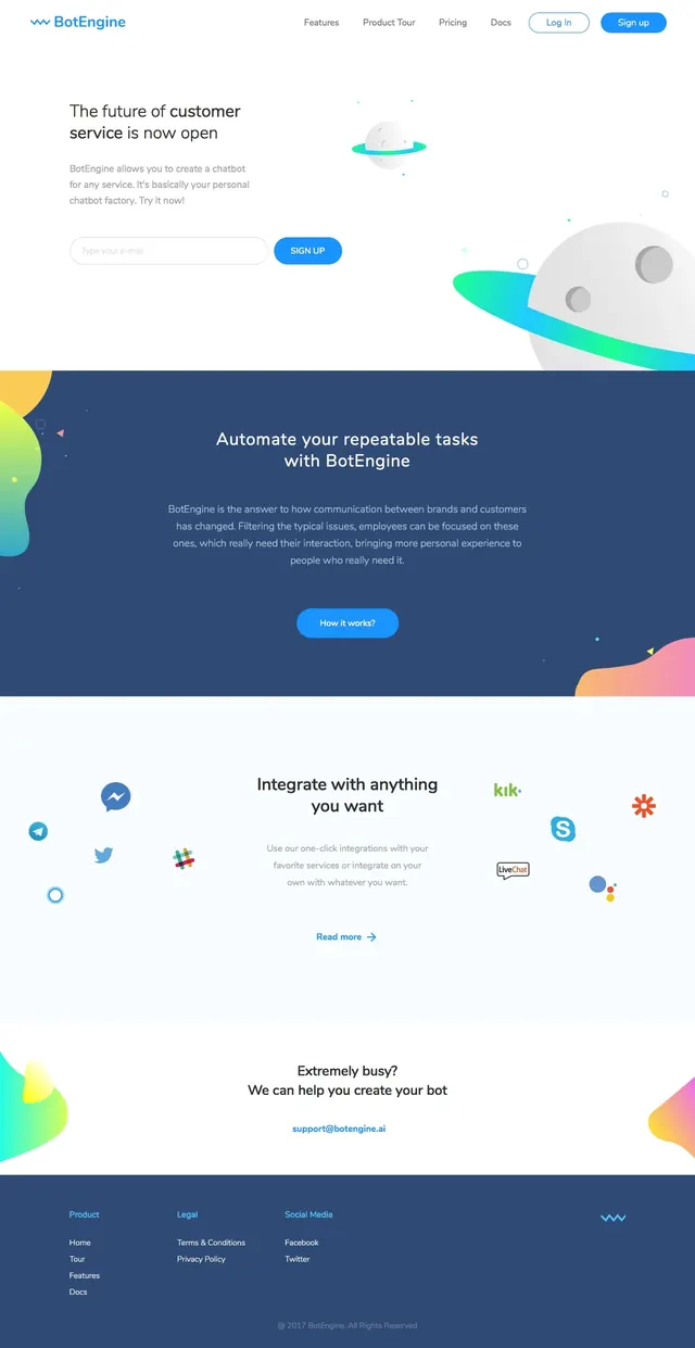
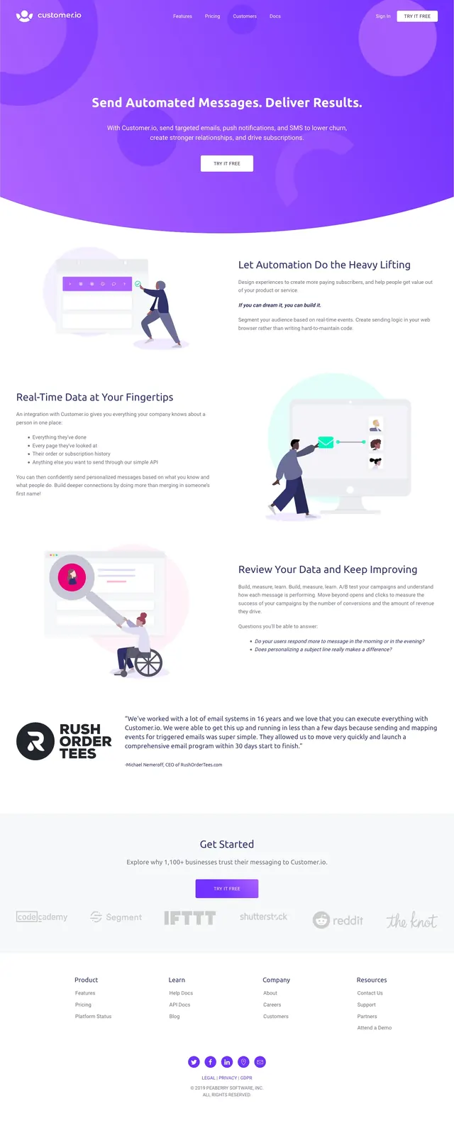
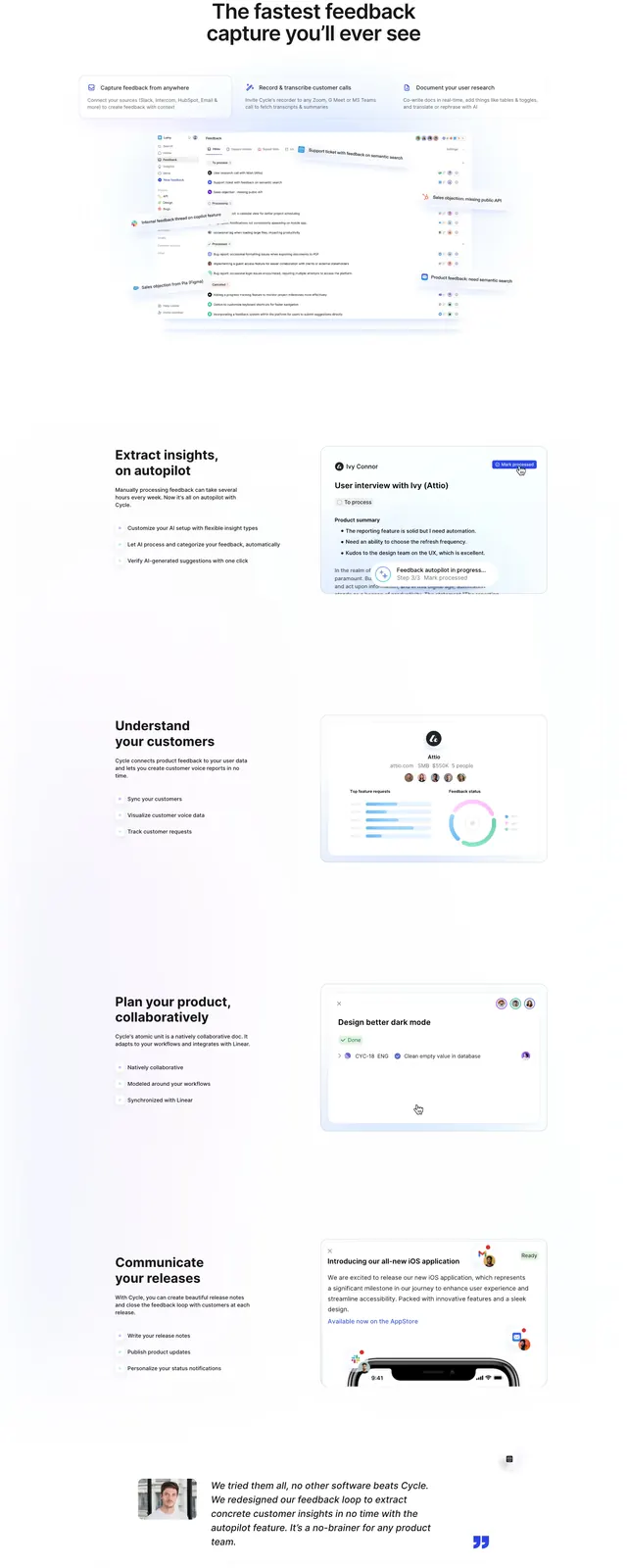
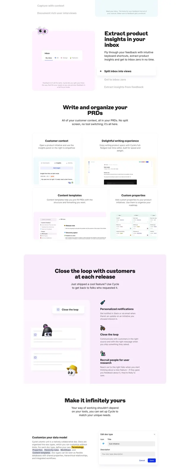
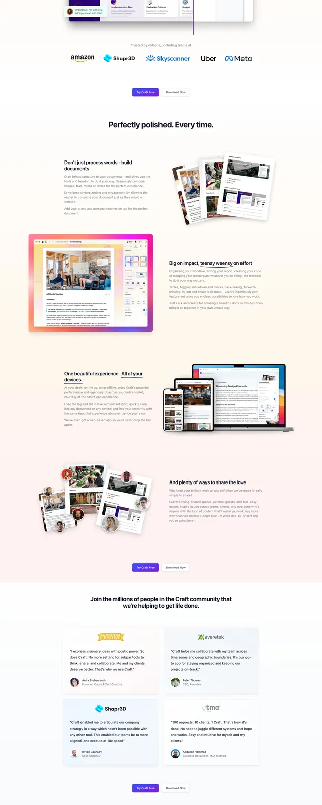
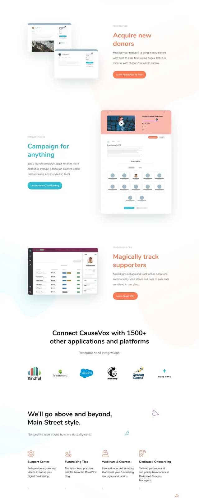
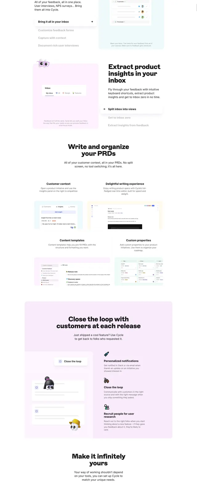
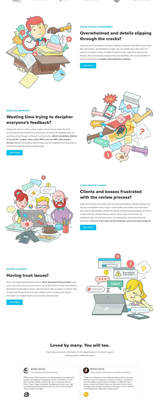
The page opens with a large hero on a purple-to-pink gradient background, with a thin top navigation, a big headline on the left, and a tilted phone illustration on the right. Below it are three centered feature blurbs with icons, followed by a two-column testimonial section with circular avatars and quoted text. Farther down, the page shows overlapping product screenshots, a dark dashboard-preview band, two pricing cards, a gradient call-to-action strip, and a dark footer with link columns.
Key takeaway
The design combines soft gradient branding with a conventional SaaS landing-page structure, making the interface feel approachable while still clearly product-focused. The repeated use of white cards against colored sections gives the page strong visual rhythm.
Reuse notes
Useful for customer-support or AI SaaS sites that need a polished, friendly marketing page with multiple conversion points. The gradient hero and light card system are easy to adapt, but the layout depends on strong product imagery and tidy spacing.