Preview image. Unlock full-res
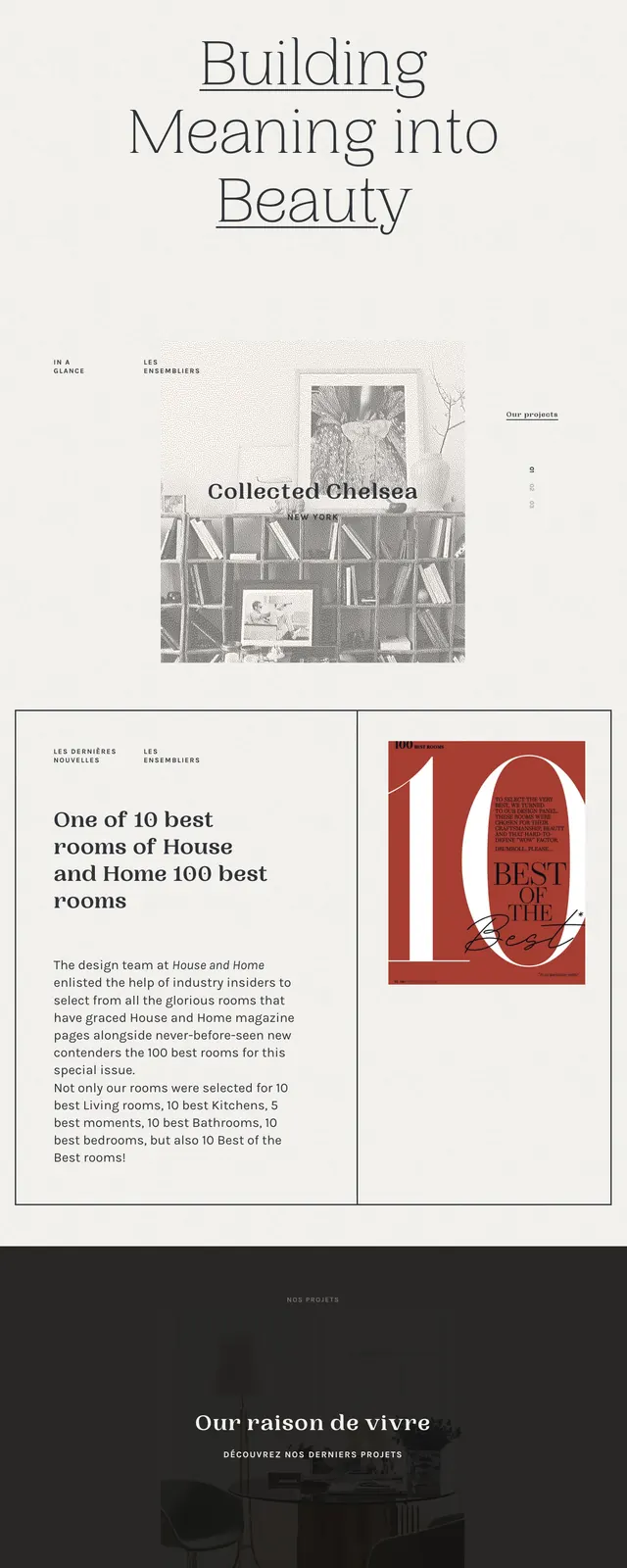
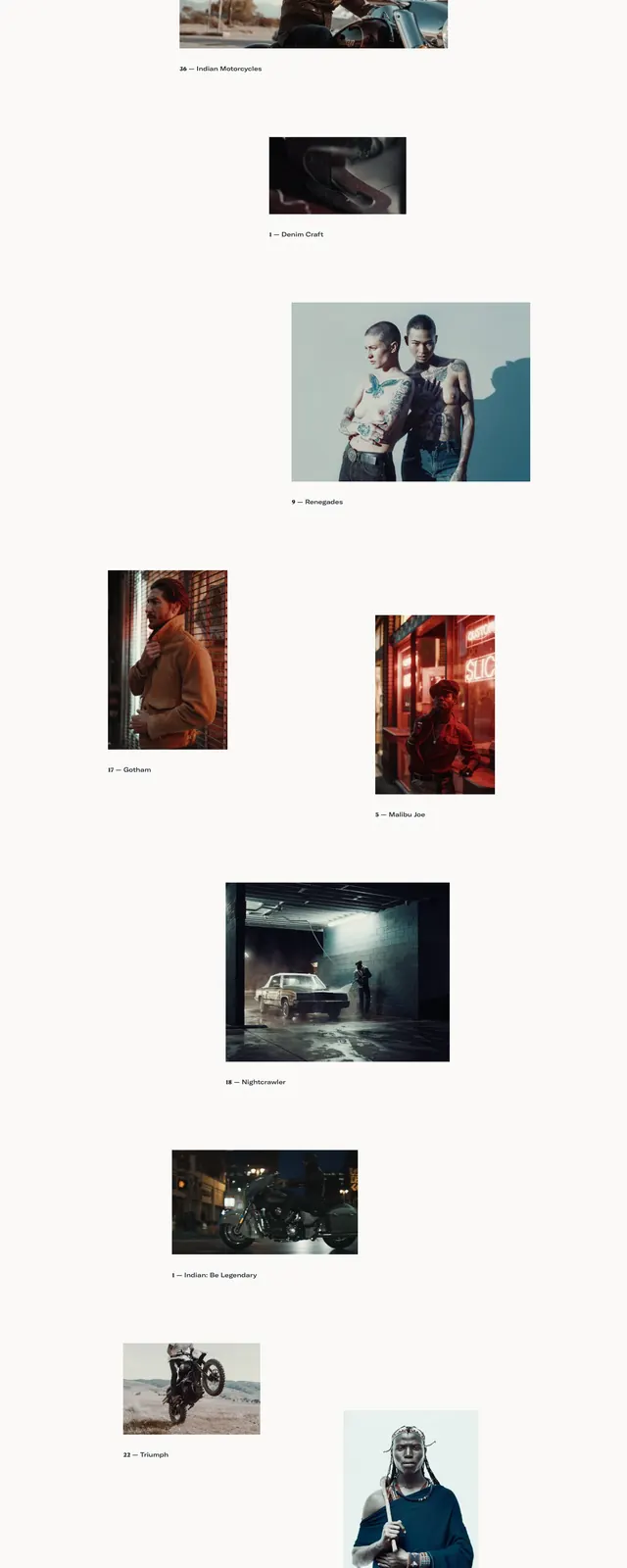
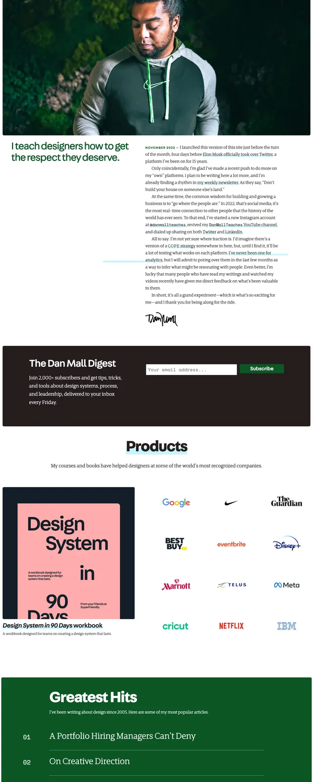
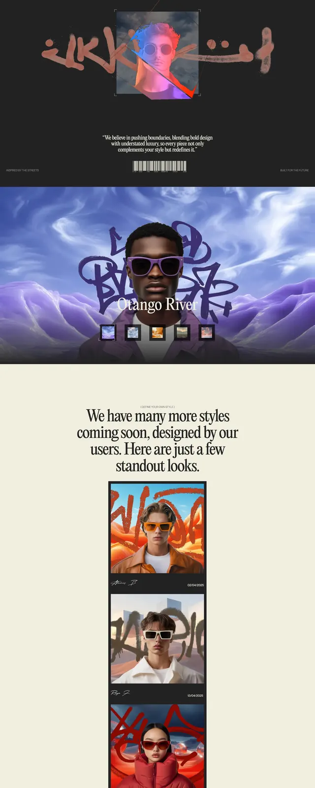
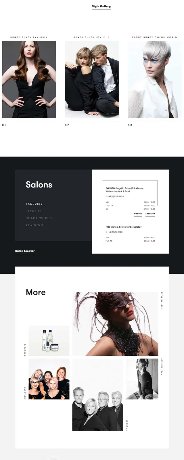
A minimalist luxury hair salon homepage with a fashion-forward hero, stark black-and-white sections, and editorial spacing.
Summary
A minimalist luxury hair salon homepage with a fashion-forward hero, stark black-and-white sections, and editorial spacing.
Visual description
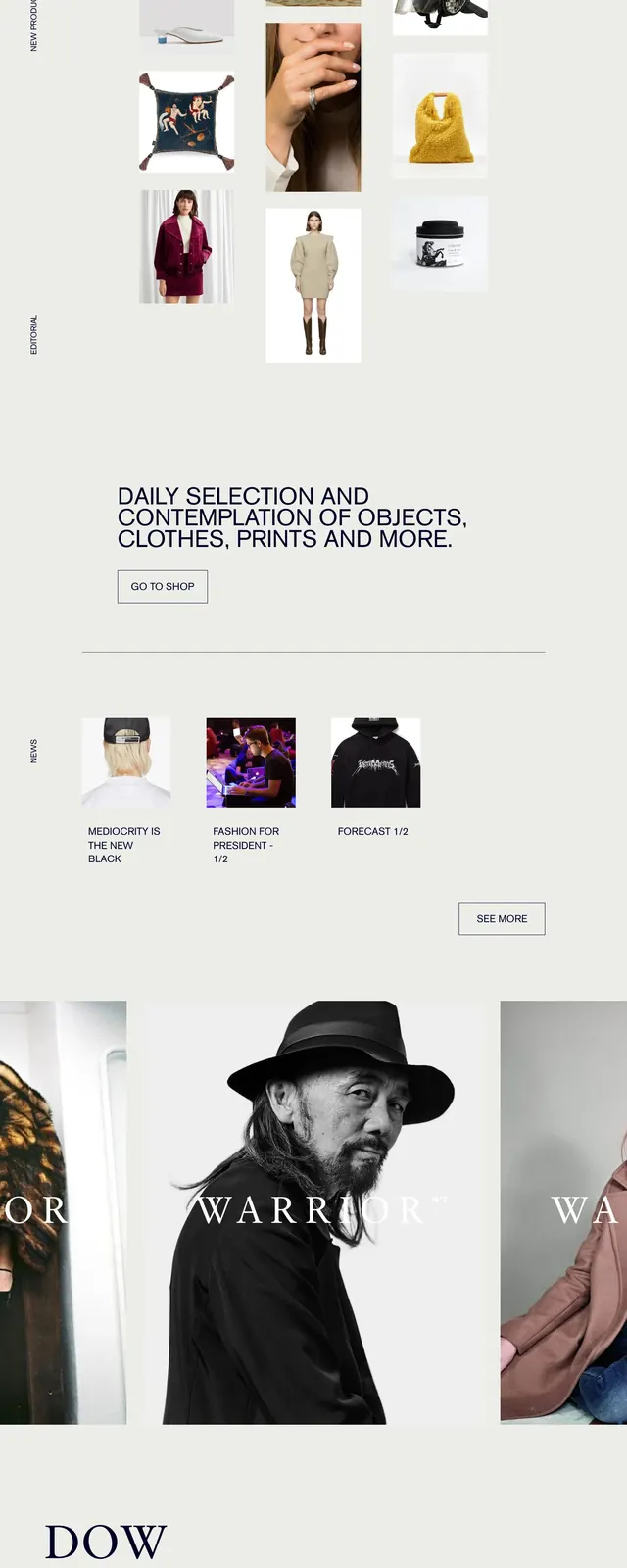
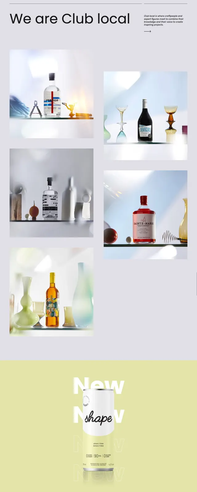
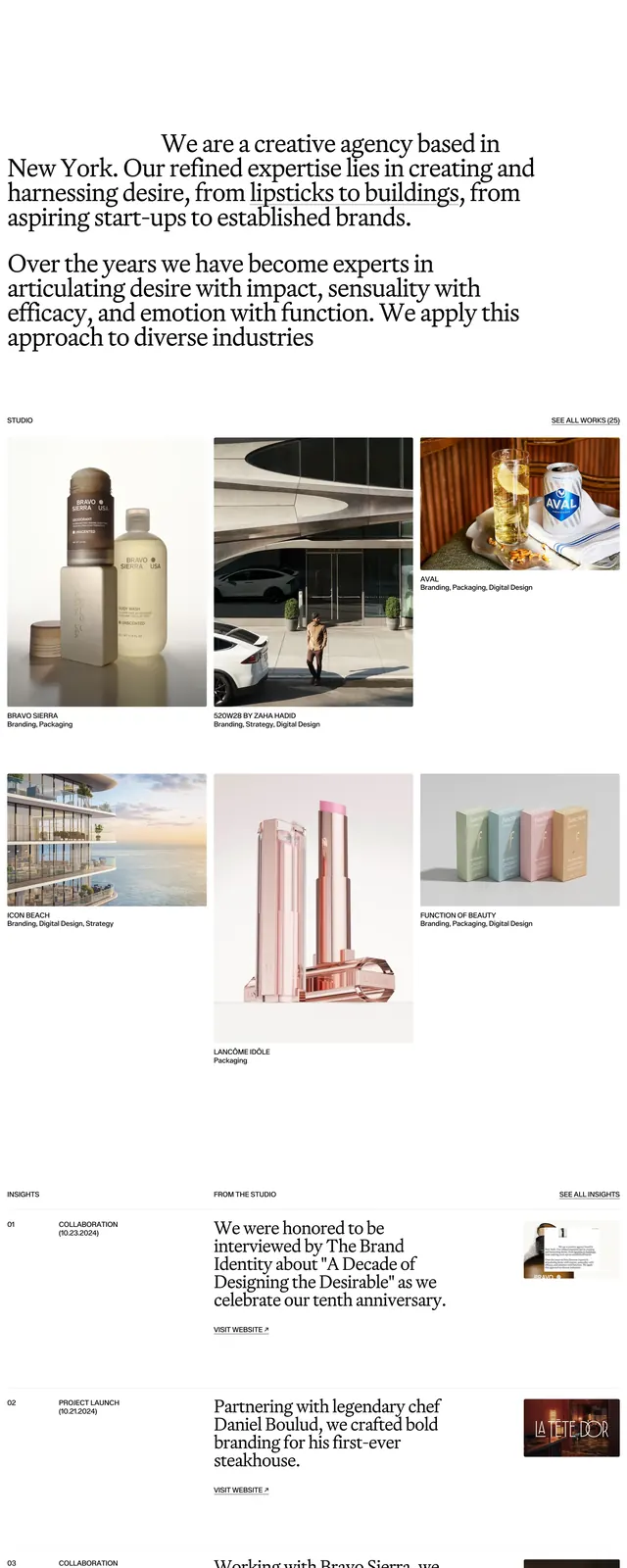
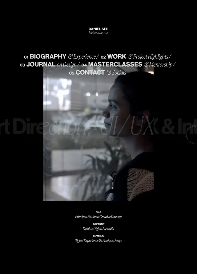
The top of the page uses a full-bleed fashion photograph with a centered serif headline and a small supporting line beneath it. A thin horizontal navigation sits across the top with understated menu links and a compact logo. Lower sections switch to a black-and-white editorial grid, including a salon list panel, a white information card, and a large split content block with photography and body copy. The page ends with a sparse footer containing contact details and social links.
Key takeaway
The design relies on strong typography, generous whitespace, and high-contrast photography to feel premium and culturally aware. It is especially effective for brands that want a salon or beauty experience to read more like fashion editorial than traditional service marketing.
Reuse notes
Reuse the hero structure for premium lifestyle brands: large image, centered headline, thin navigation, and minimal CTA placement. The lower sections translate well to location directories, service overviews, or about pages when you want a refined, gallery-like presentation.