Preview image. Unlock full-res
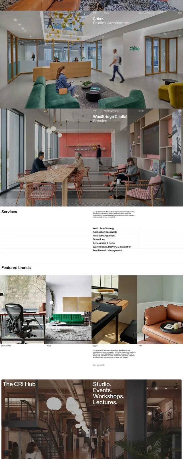
A clean portfolio-style homepage with a bright orange hero, oversized headline, project imagery, service list, brand gallery, and minimal footer.
Summary
A clean portfolio-style homepage with a bright orange hero, oversized headline, project imagery, service list, brand gallery, and minimal footer.
Visual description
The page opens with a full-width orange hero featuring a faint abstract chair-like illustration, small top navigation text, and a large bold headline reading 'Defining Spaces.' Below it, a white section introduces the company in a short paragraph with a small text link. Further down, the page stacks a featured projects strip, a wide project photo, a services section with a text intro and list, a featured brands grid, and a product-style gallery of furniture images. The bottom area is sparse and footer-like, with small link columns, contact details, a centered black logo mark, and compact legal text.
Key takeaway
The strongest reusable move is the contrast between the loud color-block hero and the restrained, editorial content sections below it. The layout uses generous whitespace and simple typography to make a portfolio site feel premium without adding visual clutter.
Reuse notes
Works well for design studios, furniture brands, and consultancies that need a confident first impression and image-led storytelling. Reuse the orange hero and stacked content rhythm, but keep the footer and brand grid minimal so the page does not become visually crowded.