Preview image. Unlock full-res
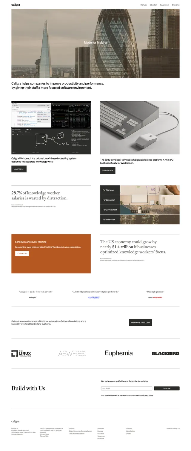
A clean, image-led corporate landing page with a minimalist editorial layout and strong focus on product credibility.
Summary
A clean, image-led corporate landing page with a minimalist editorial layout and strong focus on product credibility.
Visual description
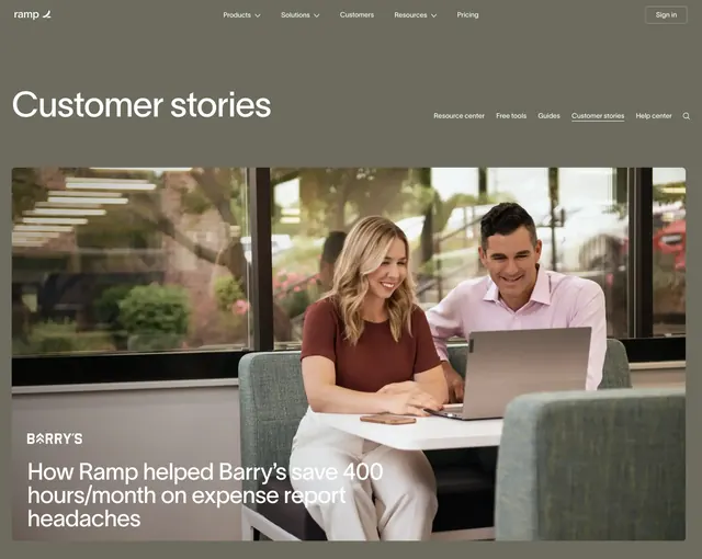
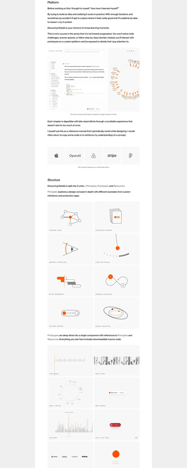
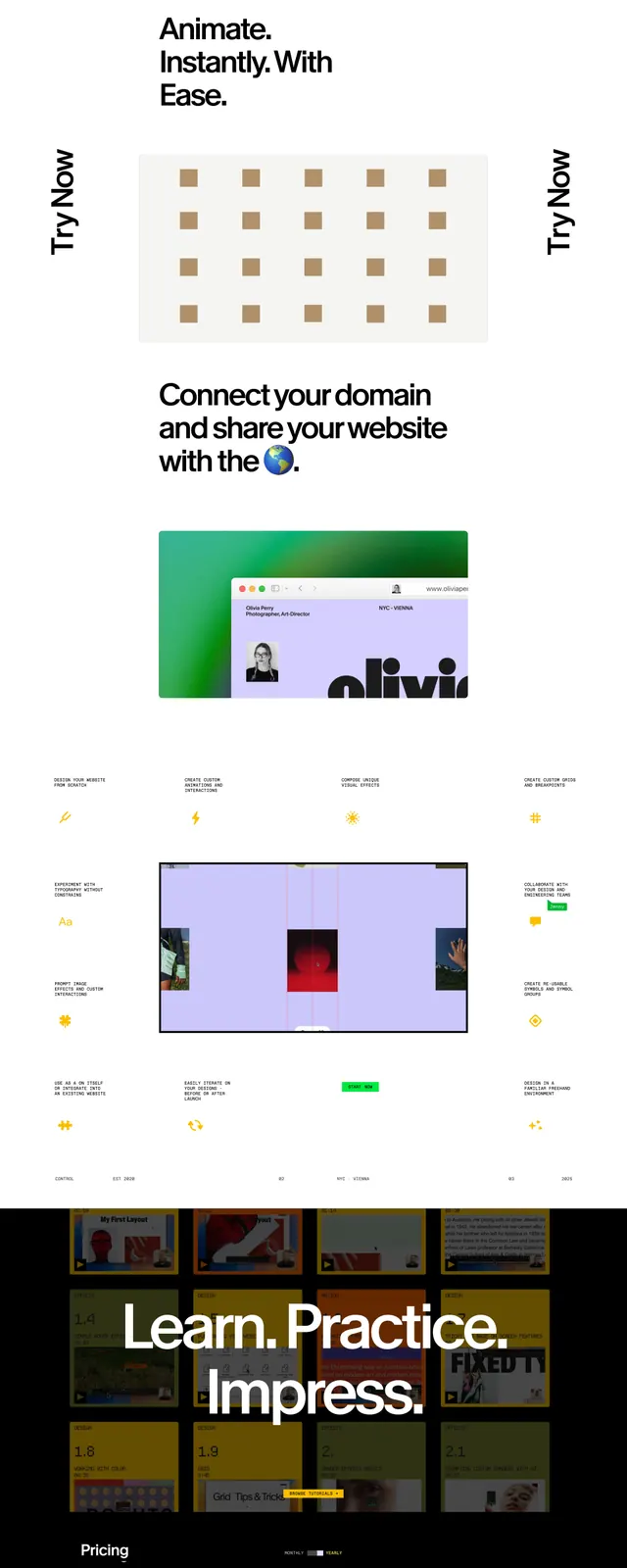
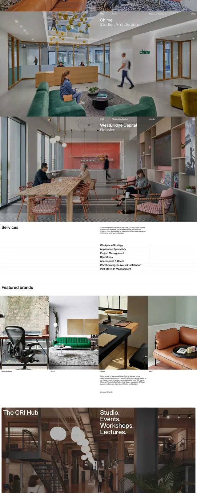
The page uses a white background with thin dividers, lots of whitespace, and a restrained editorial structure. A wide hero image sits under a simple top navigation, followed by a short value proposition and a sequence of product feature blocks arranged in a two-column grid. Lower sections include a stats callout, a CTA panel, testimonial quotes, partner logos, and a newsletter signup above a sparse footer. Imagery mixes cityscape photography, product shots, and dark interface screenshots to present the brand as polished and technical.
Key takeaway
This design combines corporate restraint with magazine-like pacing, using large photography and simple typography to build authority. The reusable pattern is a clean hero plus modular credibility sections: features, stats, testimonials, logos, and CTA.
Reuse notes
Works well for B2B or productivity brands that need to feel credible without looking generic. Reuse the two-column content rhythm, thin separators, and mixed photo/product imagery to keep the page feeling structured and premium.