Preview image. Unlock full-res
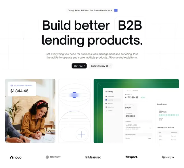
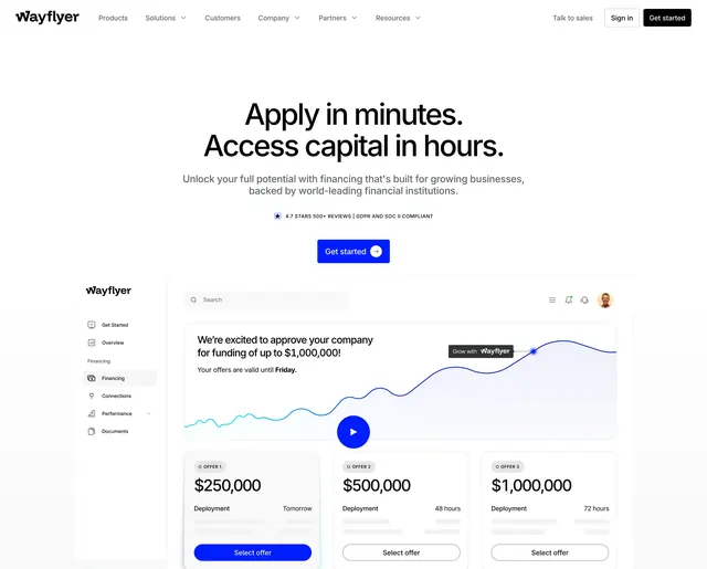
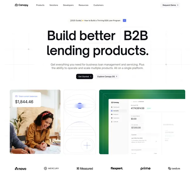
Centered light hero with oversized serif-toned headline over a faint grid, anchored by a three-tile dashboard-and-photo collage and a logo row.
Summary
A clean, light B2B fintech hero that leads with a very large two-line headline and pairs it with a balanced three-tile row mixing a product dashboard, an abstract graphic, and a lifestyle photo.
Visual description
A slim navbar with wordmark, five centered nav links, and a pill "Request Demo" button sits on white. A small pill eyebrow announces a 2025 guide above an oversized near-black headline ("Build better B2B lending products.") set over a faint engineering-grid background with crosshair marks. One line of muted gray sub-copy follows, then a dark filled "Get Started" button beside a light "Explore Canopy OS" secondary. Below, three equal tiles span the width: a balance-card-over-photo of a smiling person, a thin-line abstract sphere graphic with a plus icon, and a green-headed product UI screenshot. A row of six grayscale customer logos closes the section.
Key takeaway
The three-tile collage that shows product, concept, and human in one balanced row, so the hero proves the software, the idea, and the audience at once. The faint engineering grid plus crosshairs adds technical texture without competing with the headline.
Reuse notes
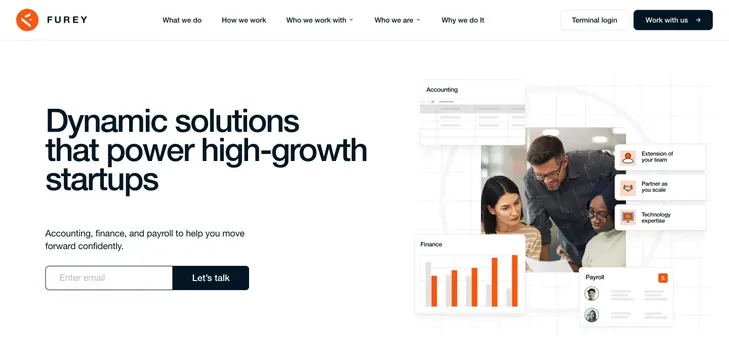
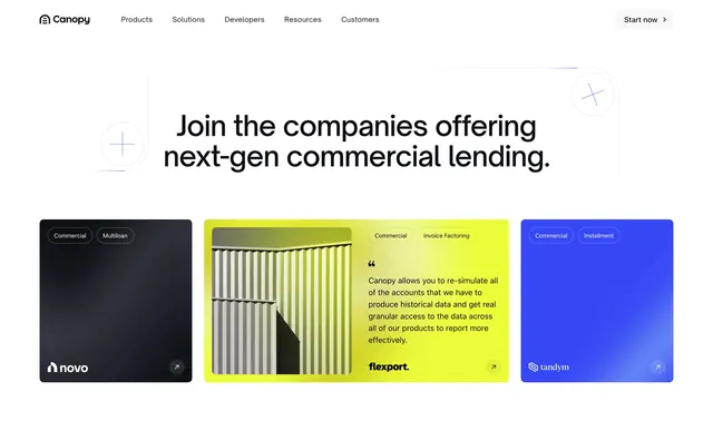
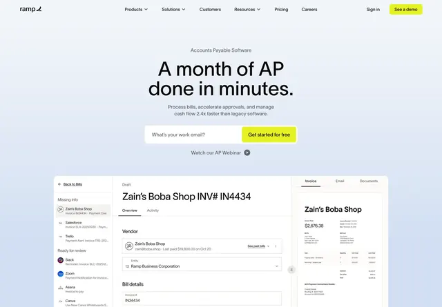
Strong default for a B2B or fintech platform that needs to look credible and human at the same time. The triptych needs three genuinely distinct visuals to avoid looking repetitive. Works on light backgrounds; the green dashboard tile carries the brand color.