
Preview image. Unlock full-res
Light testimonials slider of customer-story cards in alternating brand colors, with peeking next card and arrow controls.
Summary
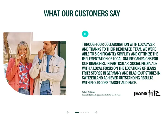
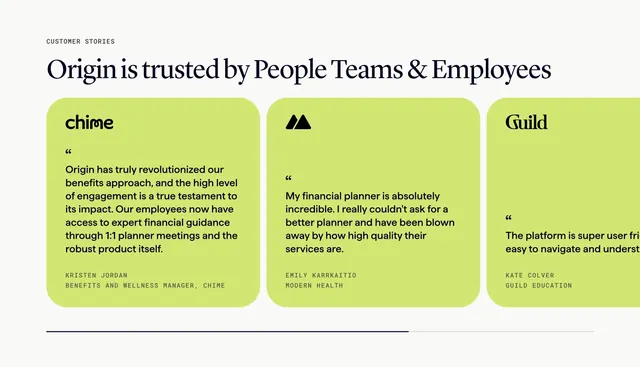
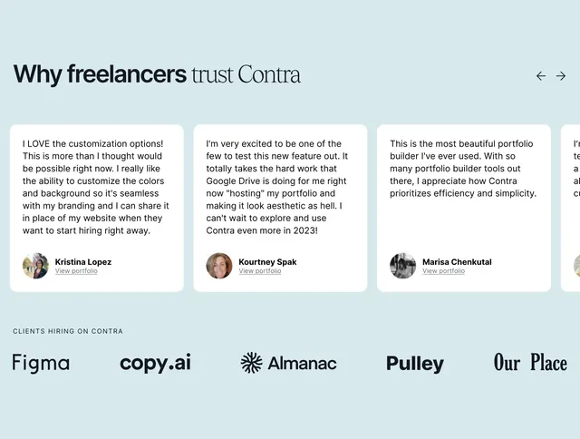
A testimonials section built as a horizontal slider of customer-story cards, each headlined with a result and colored differently, with the third card peeking off the right edge.
Visual description
A left-aligned two-line headline "Meet the companies leveling up with Harmonic" in heavy black sans-serif, balanced by a gray pill "Read more stories" button on the right. Below run wide rounded story cards: a blue card, a white card, and a dark navy card cut off at the right edge to signal more. Each card carries a multi-line story title, a small row of "[Company] x Harmonic" with a "Read the story" link, and a date; the navy card shows a large white "FLYBRIDGE" wordmark. Two circular gray arrow buttons sit at the bottom-left for manual paging. The background is a soft gray.
Key takeaway
Framing testimonials as outcome-led story cards rather than floating quotes makes them feel like a case-study library. Alternating card colors plus a deliberately peeking next card communicates a swipeable carousel at a glance. The headline-left, button-right header keeps the controls reachable.
Reuse notes
Reach for this when you have written customer stories worth linking out to, not just one-line quotes. The peeking card and arrows imply motion, so only use these signals when the slider truly scrolls. Works on light backgrounds where the colored cards can carry the contrast.
More testimonials sections
See all



More like this


Keep what you find
A free account saves references to boards and can send you a weekly email of picks based on what you save.
To see every result, go Pro.