Preview image. Unlock full-res
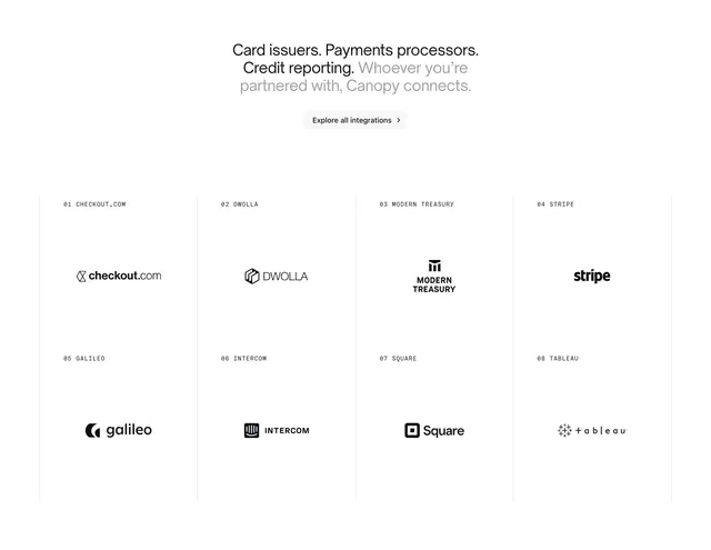
Centered integrations headline with explore CTA above an 4x2 logo grid labeled with monospace index numbers.
Summary
A minimalist integrations section with a two-tone centered headline and an indexed 4x2 partner logo grid separated by vertical rules.
Visual description
White background. Centered headline mixes bold black phrases ("Card issuers. Payments processors. Credit reporting.") with a lighter gray closing line about connecting partners. Gray-bordered pill button reads "Explore all integrations >". Below, an eight-cell grid in two rows of four with thin vertical dividers only. Each cell has a monospace label in the top-left (01 CHECKOUT.COM through 08 TABLEAU) and a centered solid-black logo.
Key takeaway
Numbering integration partners like a catalog (01, 02...) adds structure and a technical feel to a simple logo wall. Rendering all logos monochrome keeps disparate brand colors from clashing.
Reuse notes
Use when partner count is moderate and names are recognizable in black. Monochrome treatment fails for logos that rely on color identity. Pair with a product page that explains connection depth.