
Preview image. Unlock full-res
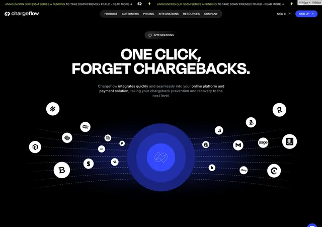
A dark integrations section pairing a left-aligned pitch with a wide grid of colorful app-icon tiles that fade out at the edges to imply a large ecosystem.
Summary
A dark integrations section that leads with a left-aligned pitch and a link, then fills the lower half with a wide grid of rounded, colorful app-icon tiles that fade to black at the edges.
Visual description
Near-black background. Top-left: a small "Integrations" eyebrow, a headline ("Keep all your tools in sync with one source of truth"), two muted lines about connecting billing to CRMs, ERPs, payment providers, and data warehouses, and a "Discover integrations" text link with an arrow. Below, a broad multi-column grid of rounded square tiles. Many tiles are empty dark placeholders; scattered among them are recognizable colored app icons (Exact, QuickBooks, Xero, NetSuite, Salesforce, HubSpot, Snowflake, Postgres, MySQL, MongoDB, and more). The grid bleeds off all sides and dims toward the edges, implying a much larger set.
Key takeaway
The partly-filled, edge-fading icon grid: a few real logos among dimmed empty tiles suggest a big ecosystem without needing every integration present or legible. Left-aligning the copy against a full-bleed grid creates an editorial, spacious feel rather than a centered logo dump.
Reuse notes
Best for products whose value is breadth of connections (billing, data, CRM). The fade-to-edges trick only works on dark; on light you lose the vignette. Keep enough recognizable logos visible that the grid reads as real, not decorative, and ensure the "Discover integrations" link leads somewhere comprehensive.
More integrations sections
See all











More like this





Keep what you find
A free account saves references to boards and can send you a weekly email of picks based on what you save.
To see every result, go Pro.