
Preview image. Unlock full-res
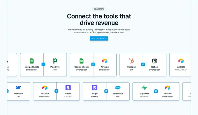
Centered integrations headline surrounded by a scattered grid of colorful app logos with depth-blur.
Summary
An integrations section that floats a centered headline and CTA inside a loosely scattered field of recognizable app logos. The defining move is the soft depth-of-field blur applied to logos farther from the center.
Visual description
On a warm cream background, a faint grid of empty rounded-square tiles fills the canvas. Real partner logos in their brand colors (Google, Microsoft Teams, Jira, Salesforce, ADP, Workday, Greenhouse and others) sit in app-icon rounded squares scattered across the grid at varying positions. Logos near the edges and corners are slightly blurred while central ones stay crisp, creating a shallow depth effect. Dead center, a two-line headline in dark teal sans-serif reads about seamless integrations, with a single filled dark-green pill button below it.
Key takeaway
The depth-of-field blur on outer logos, which keeps a busy logo cloud from competing with the centered headline and implies a much larger ecosystem extending past the frame. The empty ghost-tile grid behind the icons gives the scatter structure without forcing strict alignment.
Reuse notes
Good for an integrations or partners section when you want to show breadth without a rigid logo wall. Works best when the logos are genuinely recognizable, since the colorful icons carry the visual interest. The selective blur needs care so key partners stay legible.
More integrations sections
See all










More like this







Keep what you find
A free account saves references to boards and can send you a weekly email of picks based on what you save.
To see every result, go Pro.