Preview image. Unlock full-res
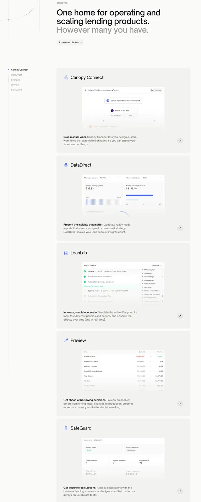
Long scroll section with left product nav and stacked feature cards each showing a product screenshot and description.
Summary
A platform overview section pairing a sticky left nav of five products with tall right-hand cards for Connect, DataDirect, LoanLab, Preview, and SafeGuard.
Visual description
White and light-gray page. Top has gray "Canopy OS" label, large headline about operating lending products, lighter gray subhead, and "Explore our platform >" text link. Left sidebar lists five product names with a dot on the active item. Right column stacks five large rounded cards: each has a small product icon, name, paragraph, UI screenshot (workflow branch, charts dashboard, action timeline, preview comparison table, account metrics), and a circular arrow link in the corner.
Key takeaway
Sticky sidebar navigation that mirrors the scrollable feature cards, so users always know which product they are viewing. One screenshot per card at generous size beats icon-only feature grids for complex suites.
Reuse notes
Best for multi-product platforms with five or fewer modules to list. Screenshots must be legible at card width. Sidebar pattern needs enough vertical scroll to justify stickiness.