Preview image. Unlock full-res
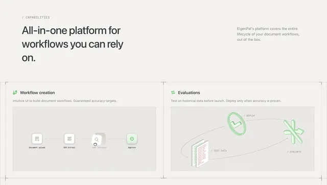
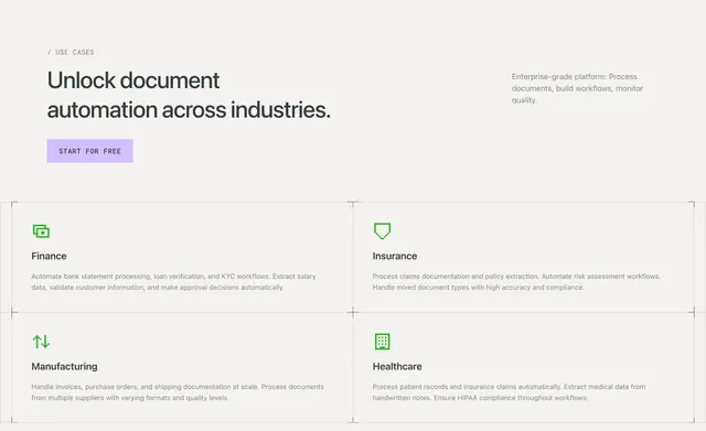
Use-cases section with a bordered 2x2 industry grid, pixel icons, corner brackets, and a purple start-for-free CTA.
Summary
Use-cases section with a bordered 2x2 industry grid, pixel icons, corner brackets, and a purple start-for-free CTA.
Visual description
Off-white page with a split header: left shows a slash-prefixed USE CASES label, large sans headline about document automation across industries, and a light purple filled START FOR FREE button; right holds a short platform descriptor in gray. Below, a 2x2 grid uses thin dark borders with L-shaped corner brackets at the outer corners. Each cell pairs a small green pixel icon with a bold industry title and gray body copy covering finance, insurance, manufacturing, and healthcare workflows.
Key takeaway
Corner brackets and crosshair grid lines give a blueprint feel that elevates a simple four-card layout. Pixel icons add personality without breaking the minimal palette.
Reuse notes
Good for vertical-specific SaaS feature or use-case blocks where you need four clear industry stories. The bracket frame needs full width; on mobile the grid should stack while keeping the border language. Purple CTA is the only strong accent, so keep surrounding UI muted.