Preview image. Unlock full-res
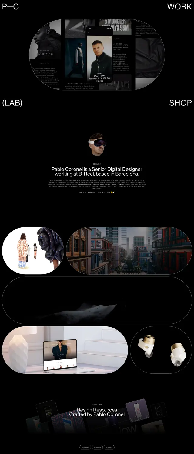
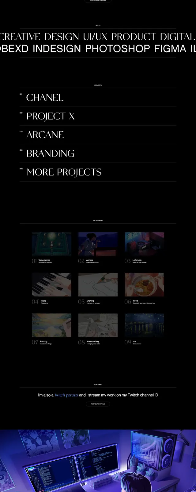
A dark, cinematic personal portfolio page with oversized serif typography, sparse navigation, and muted blue accents.
Summary
A dark, cinematic personal portfolio page with oversized serif typography, sparse navigation, and muted blue accents.
Visual description
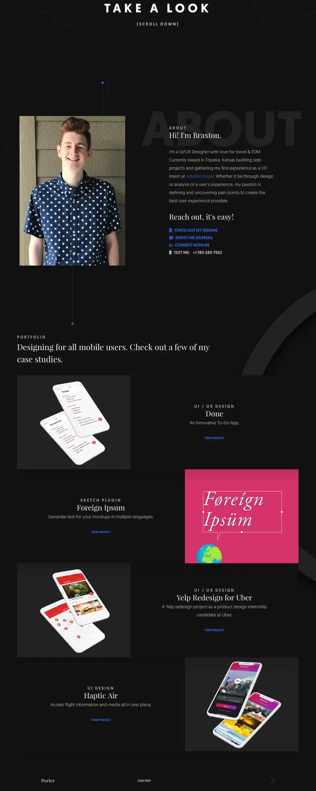
The page opens on a nearly black full-bleed hero with a large centered serif headline reading "WELCOME TO THE WORKSPACE OF CATHY," accented by a small blue highlight. Minimal corner icons and a tiny preview card sit around the headline, creating a sparse, editorial composition. Lower sections show an intro blurb with a resume button, a "MORE PROJECTS" heading, a grid of project cards, a wide illustrative banner, and a closing contact CTA. The overall design relies on strong spacing, subtle dividers, and low-key imagery against a dark background.
Key takeaway
The design uses restraint and contrast to make the typography feel premium and memorable. It is especially effective for a personal portfolio or creative designer site that wants a cinematic, high-end feel.
Reuse notes
Reuse the hero structure for any portfolio landing page that needs a strong first impression with minimal chrome. The project grid and final contact CTA are also reusable patterns for showcasing work and driving inquiry.