Preview image. Unlock full-res
A high-contrast monochrome landing page for Chdartmaker built around oversized all-caps typography and large photographic project imagery.
Summary
A high-contrast monochrome landing page for Chdartmaker built around oversized all-caps typography and large photographic project imagery.
Visual description
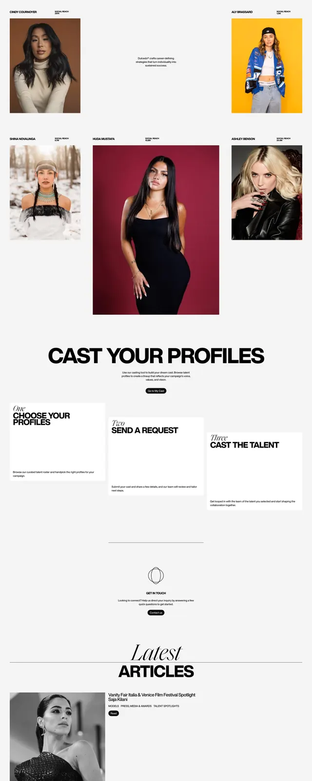
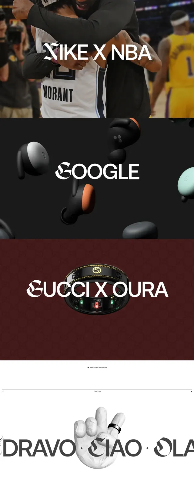
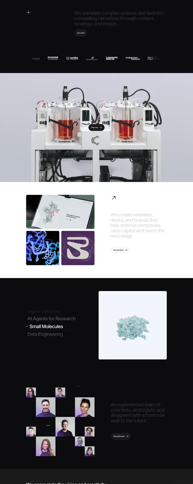
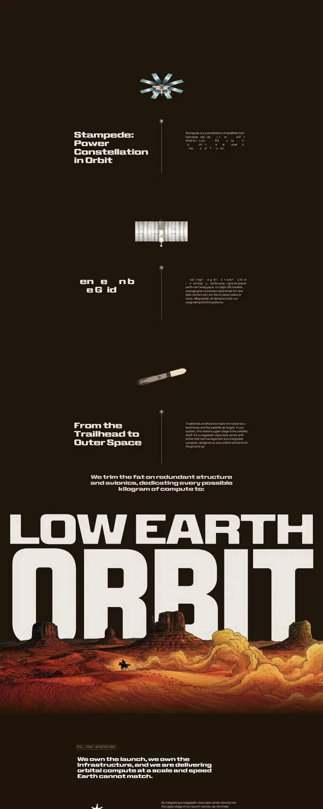
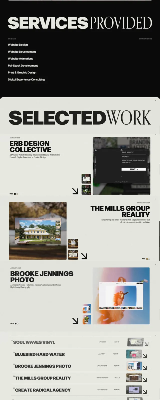
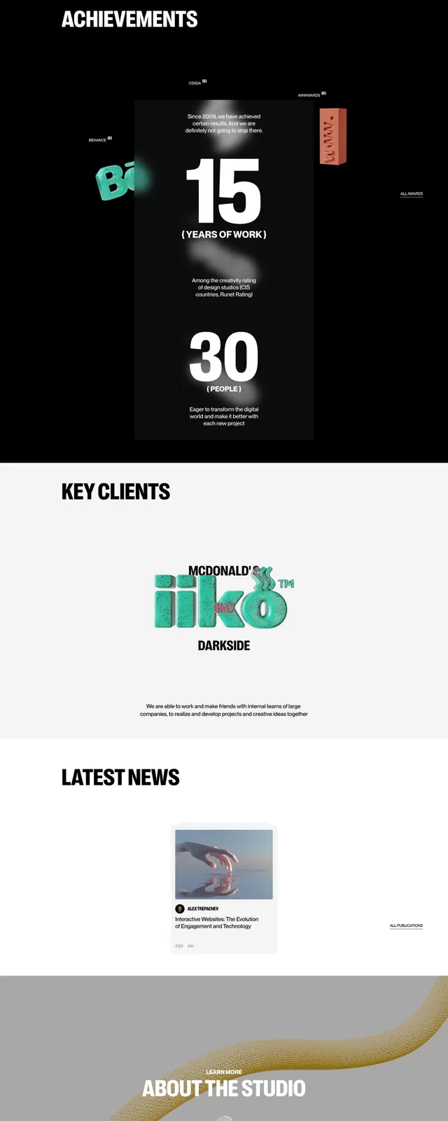
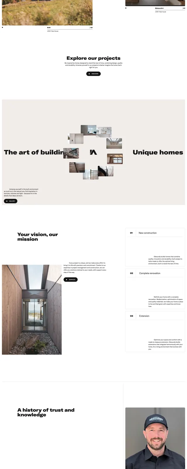
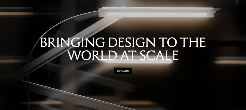
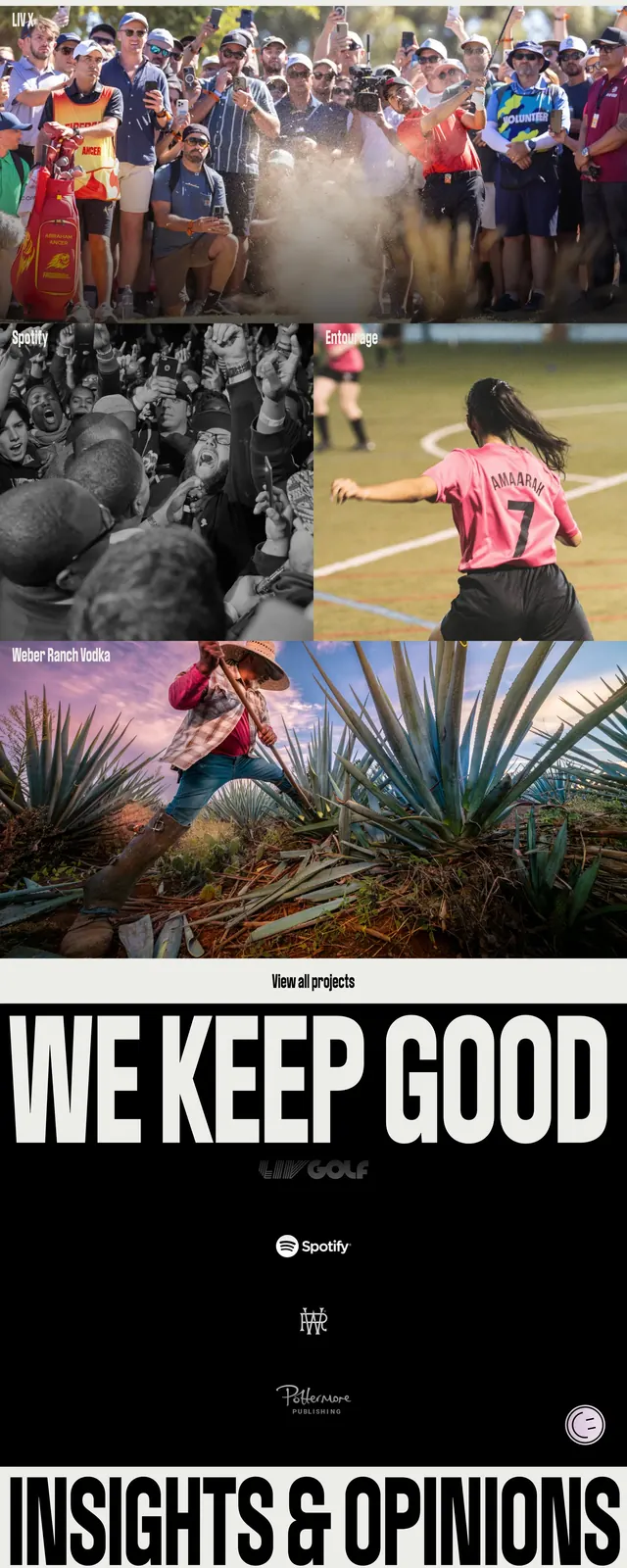
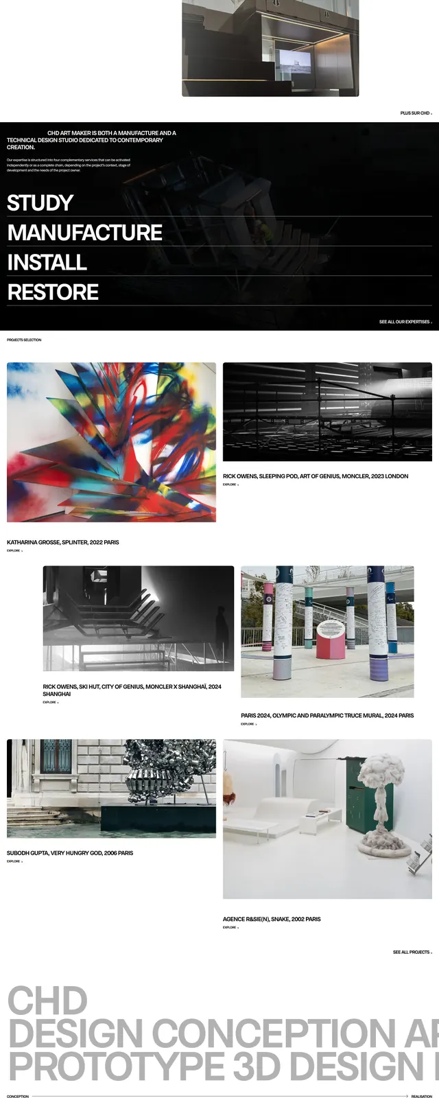
The page opens with a full-bleed black hero featuring a huge all-caps wordmark across the top and a dark photographic background. Small navigation links sit on the left, while tiny supporting labels and project credits are placed near the lower edges of the hero. Below, a white content block introduces the studio with centered uppercase copy, followed by a grid of large project images and captions, a row of client logos, a dark news strip with three image cards, and a final footer-like band with contact details and another oversized brand wordmark.
Key takeaway
The main reusable idea is the contrast between massive editorial branding and tightly controlled supporting text. The long scroll uses alternating dark and light bands to keep the page feeling curated and art-directed.
Reuse notes
Use this pattern for portfolios, studios, or cultural brands that need a strong identity-led homepage. It works best when the visual system can sustain large imagery, restrained navigation, and very little UI chrome.