Preview image. Unlock full-res
A dark, space-themed landing page for Cowboy Space that uses oversized industrial type and stark contrast to frame a mission-driven brand narrative.
Summary
A dark, space-themed landing page for Cowboy Space that uses oversized industrial type and stark contrast to frame a mission-driven brand narrative.
Visual description
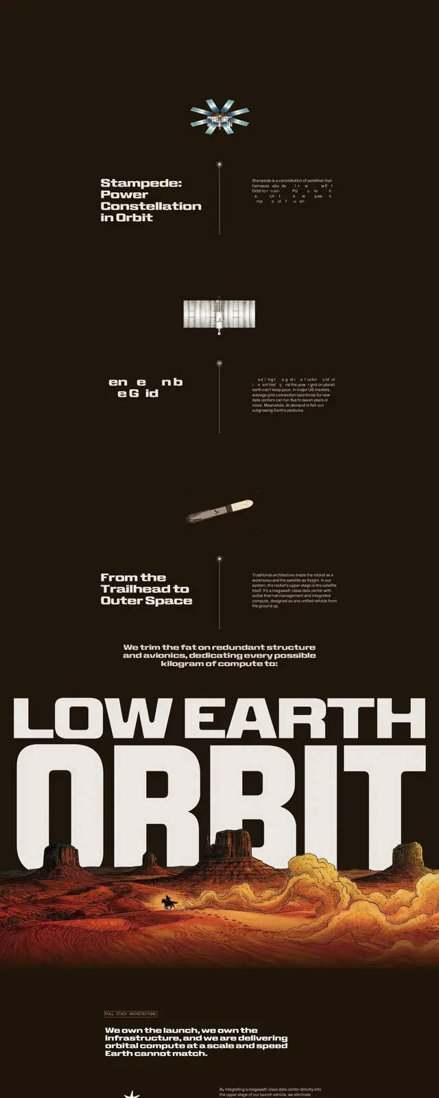
The page opens with a full-bleed dark hero showing Earth in space behind a centered red headline, with a small logo at top left and a small icon at top right. Below, the layout shifts into stacked editorial sections on deep brown backgrounds with enormous white all-caps typography, narrow supporting text blocks, and a small rocket-like image centered between sections. Farther down, a compact CTA area appears with a short button and tiny supporting copy, ending on a light background with a very large Cowboy Space wordmark and emblem.
Key takeaway
The strongest move is the extreme scale contrast: huge slab-like headlines paired with tiny explanatory copy. The dark, spacey palette and sparse layout make the brand feel cinematic and engineered.
Reuse notes
Works well for mission-led hardware, aerospace, or technical brands that want an editorial campaign feel. Reuse the oversized type and minimal navigation when the goal is to make a single statement rather than present a dense product page.