Preview image. Unlock full-res
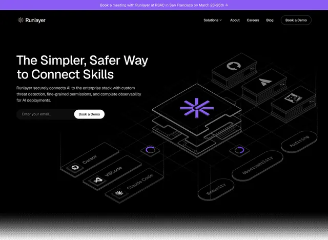
A dark, code-focused SaaS homepage with a centered hero, integration logos, testimonial proof, and a strong conversion CTA.
Summary
A dark, code-focused SaaS homepage with a centered hero, integration logos, testimonial proof, and a strong conversion CTA.
Visual description
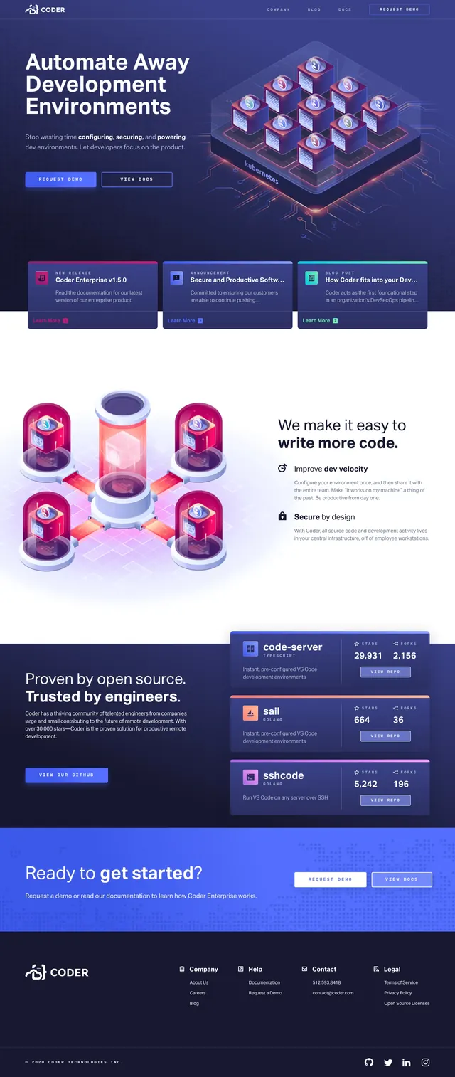
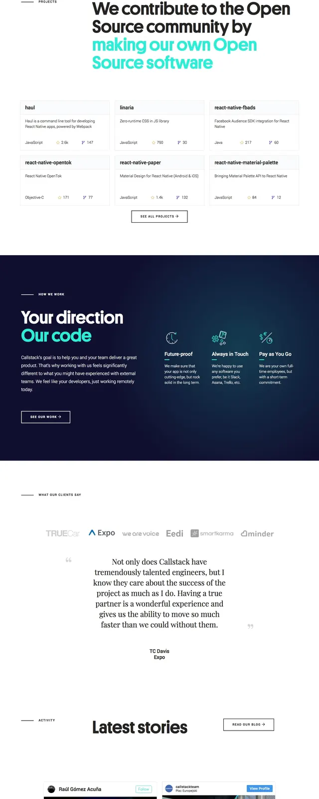
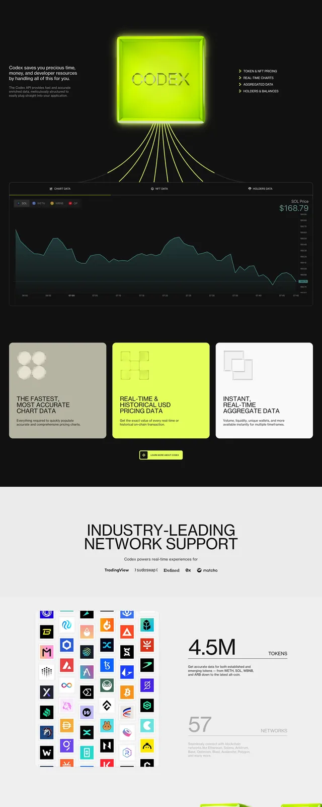
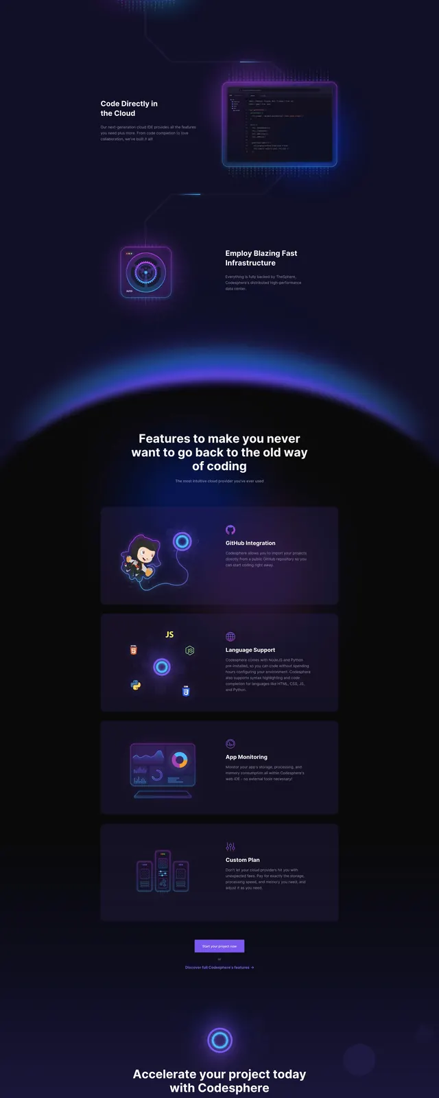
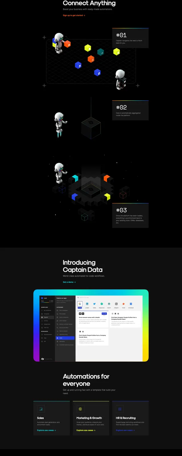
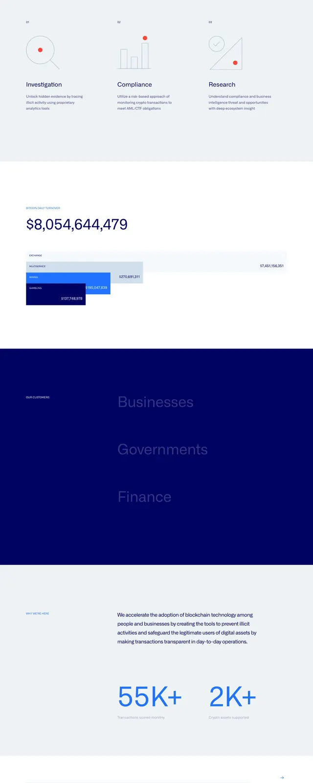
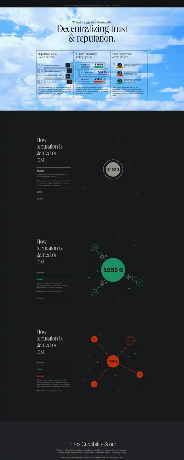
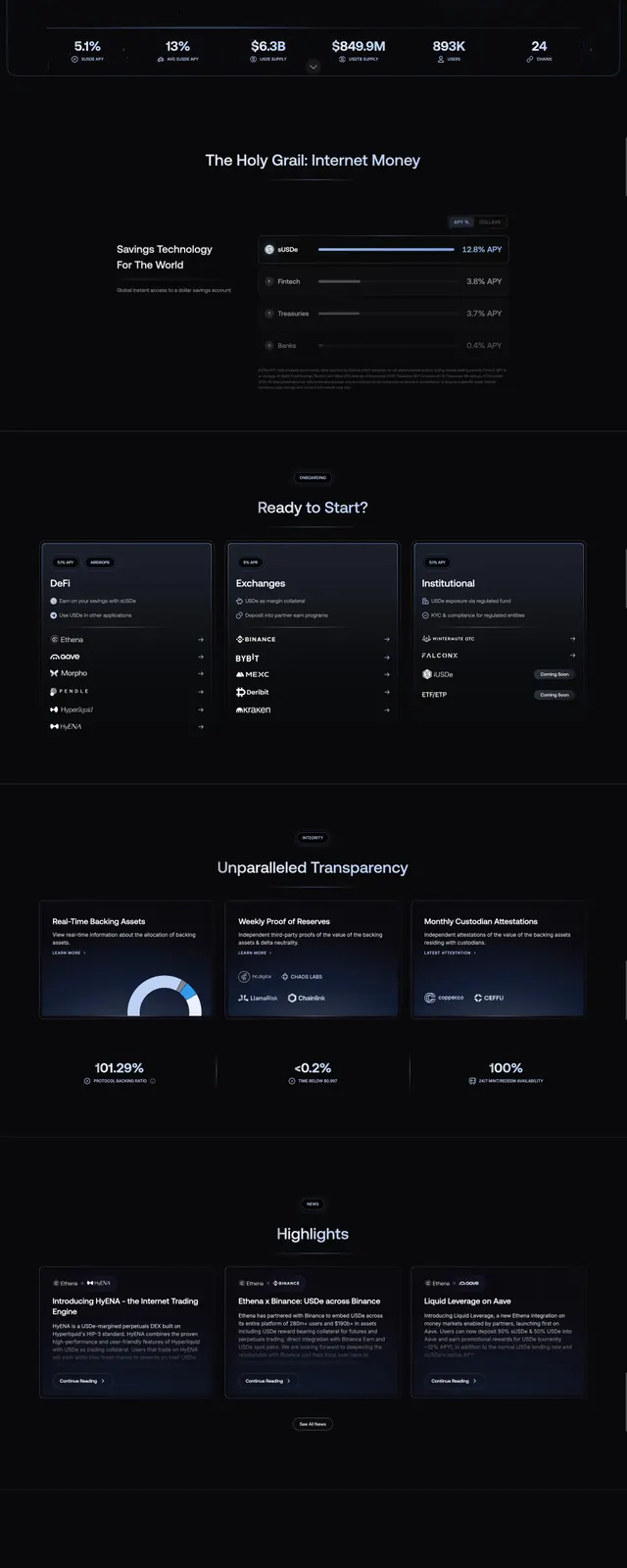
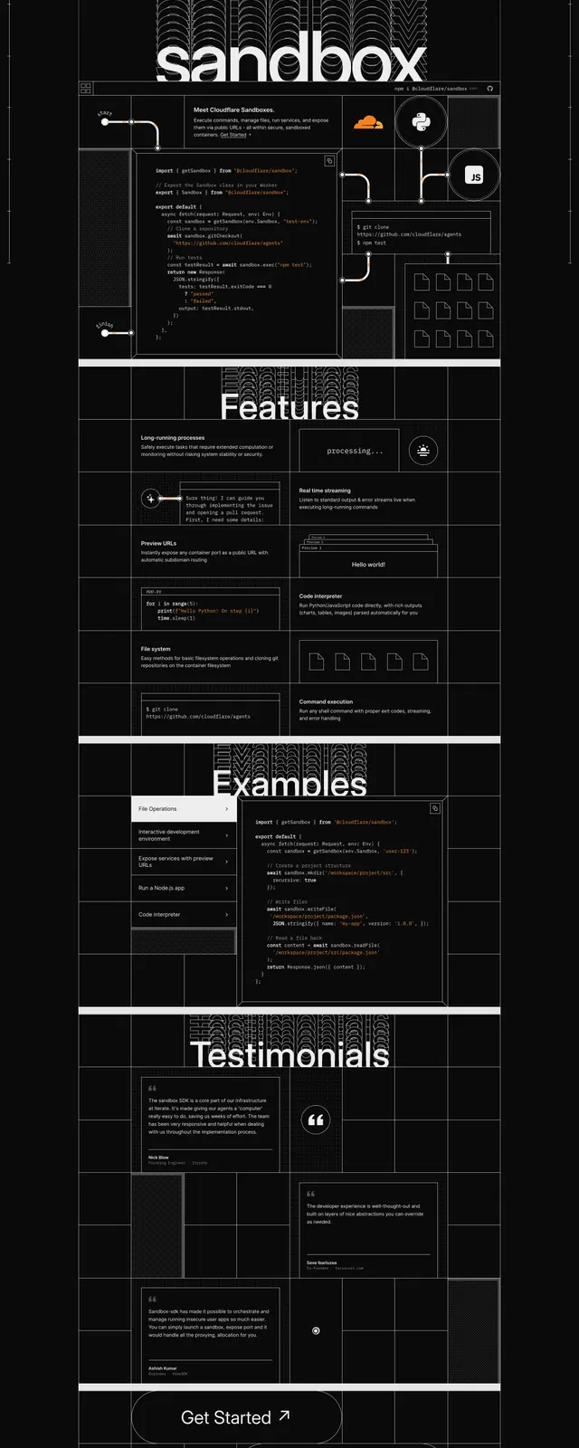
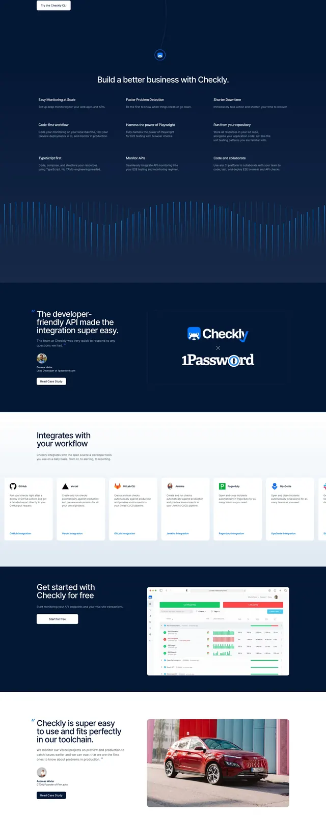
The page uses a deep navy background with a centered hero headline, supporting copy, and two call-to-action buttons. Below the fold, the layout stacks social-proof logos, a testimonial split section, a grid of integration cards, and a final signup CTA. White and light-gray text contrasts sharply against the dark canvas, with small product icons and subtle motion-like line graphics adding a technical feel. The footer continues the dark treatment with multiple link columns and restrained branding.
Key takeaway
This design leans on clarity, contrast, and developer credibility to drive signups. It works well for products that need to feel technical, modern, and trustworthy at first glance.
Reuse notes
Reuse the centered hero with strong headline hierarchy and a compact CTA cluster for other developer-focused landing pages. The integration-card grid and testimonial block are especially adaptable for SaaS proof and ecosystem messaging.