Preview image. Unlock full-res
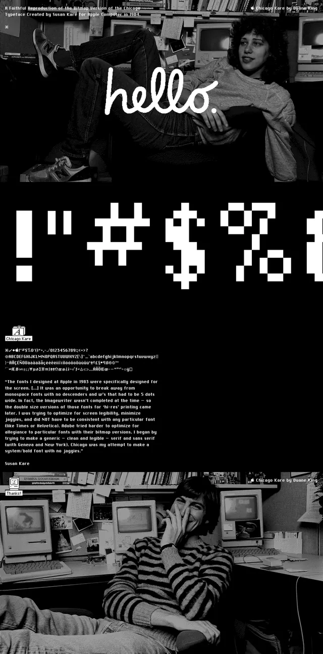
A high-contrast black-and-white editorial landing page built around vintage computing imagery, oversized bitmap lettering, and a handwritten greeting overlay.
Summary
A high-contrast black-and-white editorial landing page built around vintage computing imagery, oversized bitmap lettering, and a handwritten greeting overlay.
Visual description
The page is a tall, stacked composition on a black background with large photographic slices of Susan Kare and old Macintosh computers. Near the top, a handwritten white "hello." sits over the photo, followed by two oversized blocks of pixel-style characters separated by white horizontal bands. Lower on the page, small dense text appears in white, along with a tiny logo mark and another black-and-white photo at the bottom.
Key takeaway
The strongest move is the contrast between soft personal imagery and harsh bitmap typography. The page uses repetition, scale, and monochrome treatment to make type feel like the subject.
Reuse notes
Use this structure for portfolio or editorial pages that need a strong typographic identity and archival feel. It works best when the image content and type system are both intentionally nostalgic and high contrast.