Preview image. Unlock full-res
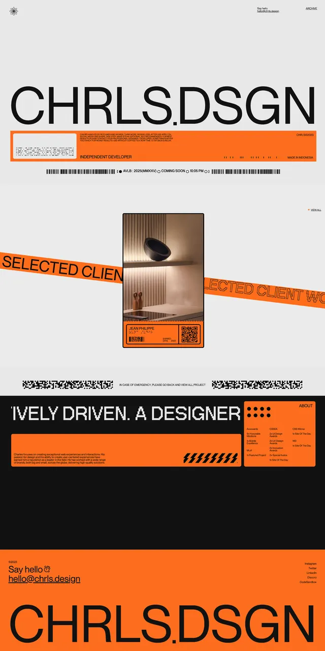
A bold portfolio landing page with oversized branding, orange accent bars, and stacked showcase sections.
Summary
A bold portfolio landing page with oversized branding, orange accent bars, and stacked showcase sections.
Visual description
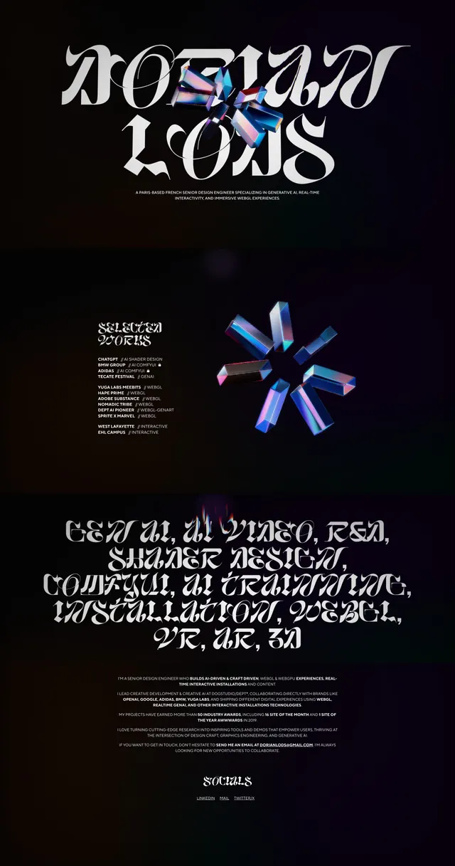
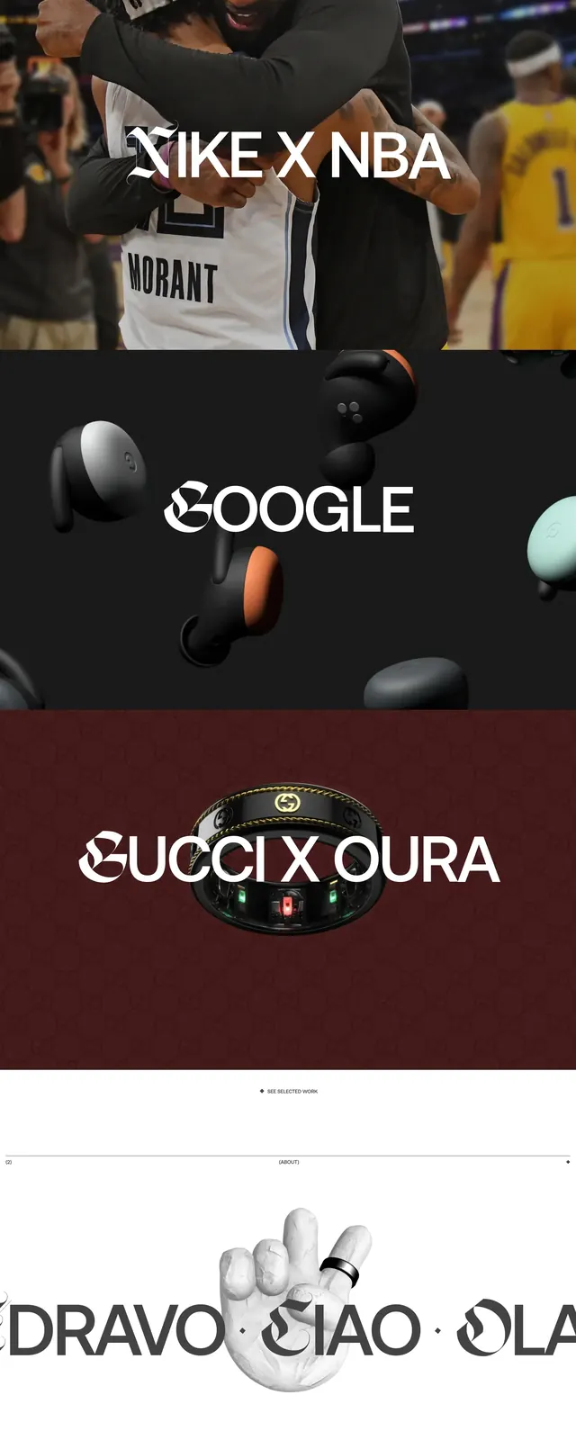
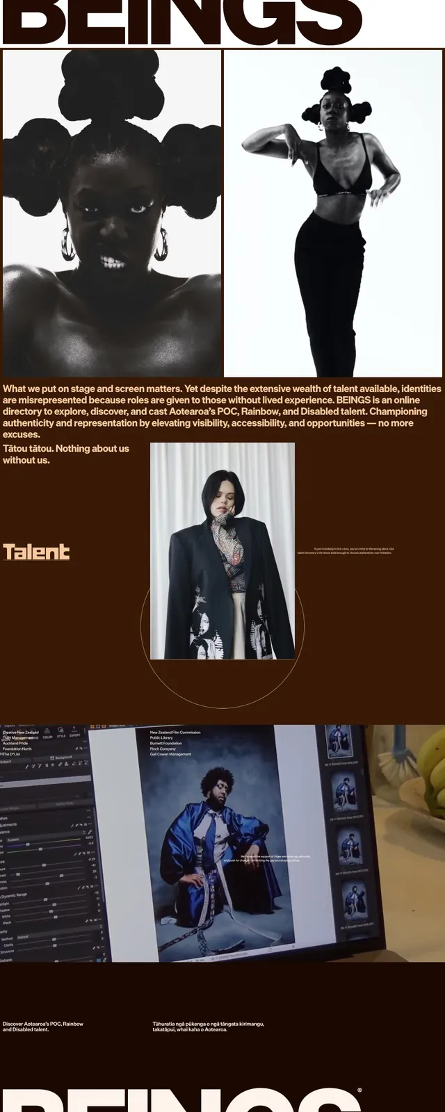
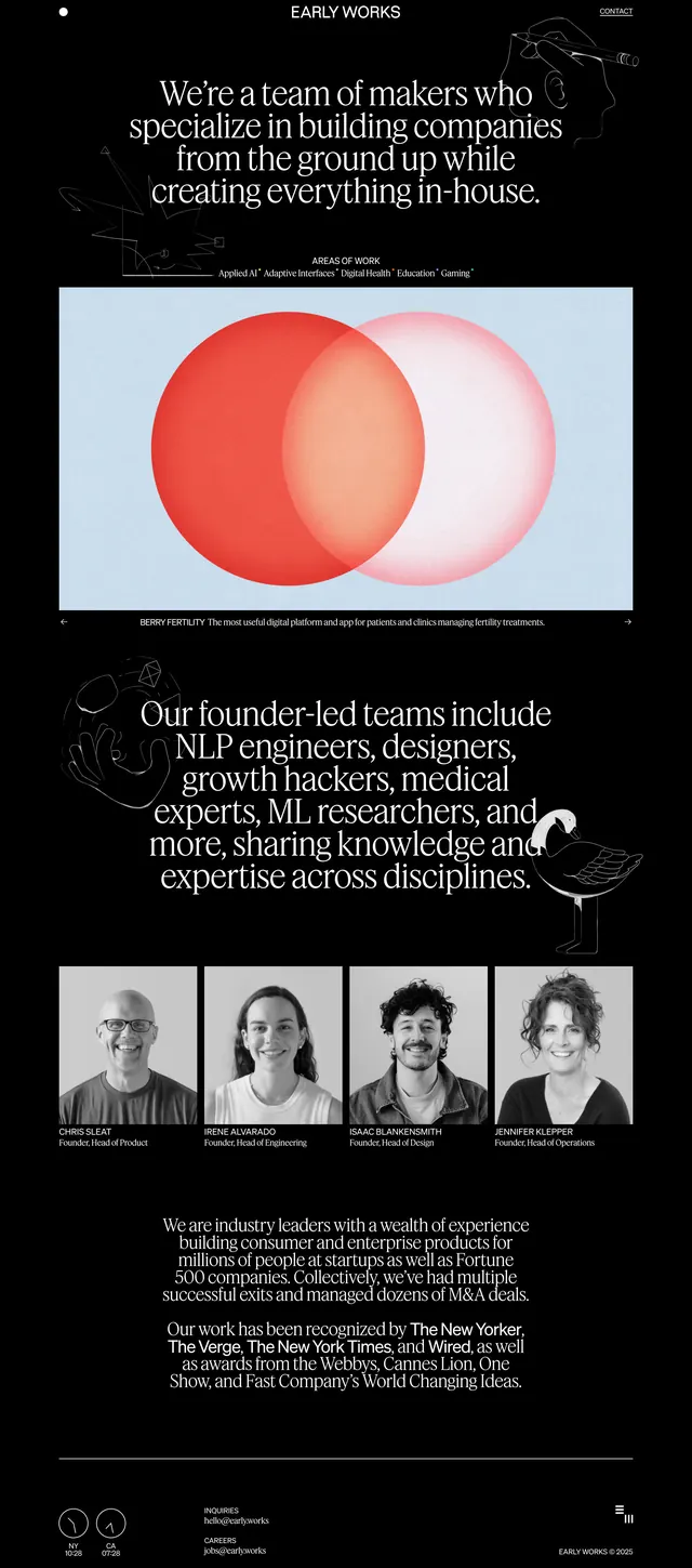
The page opens on a stark white background with a huge black wordmark centered near the top and small utility text in the corners. Bright orange horizontal bands carry dense microcopy and act as separators between sections, while centered image cards and repeated project preview blocks break up the page. Lower slices switch to a dark section with oversized all-caps copy, orange content panels, and a simple contact/footer area before returning to the large wordmark at the bottom.
Key takeaway
The strongest move is the contrast between massive identity text and narrow information bands. Repeating the orange strip as a structural motif gives the page a recognizable rhythm.
Reuse notes
Works well for a portfolio or agency site that wants a raw, graphic, self-promotional feel. Best paired with strong typography, sparse chrome, and a limited accent color so the layout stays readable despite the dense composition.