Preview image. Unlock full-res
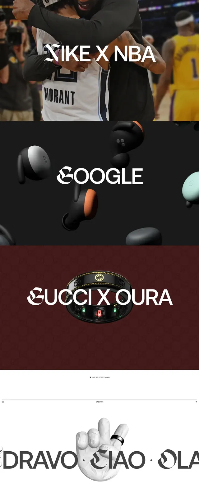
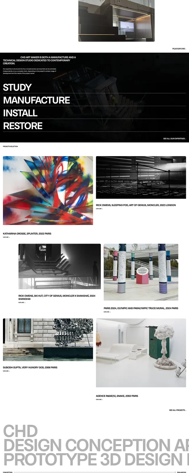
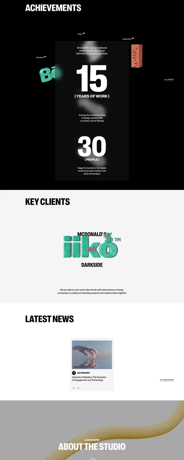
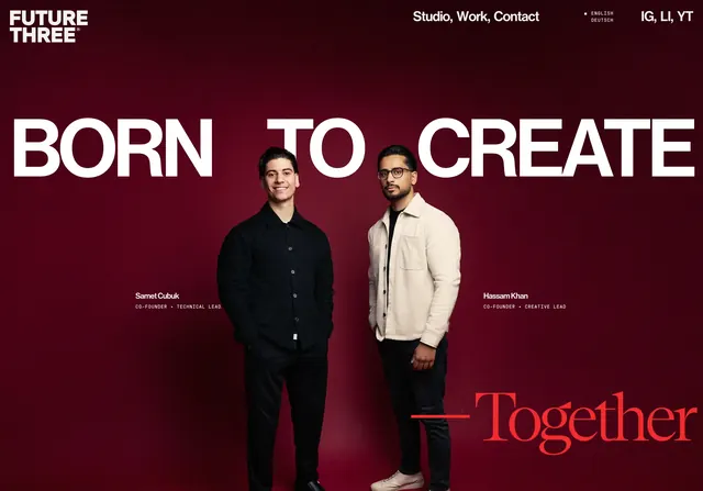
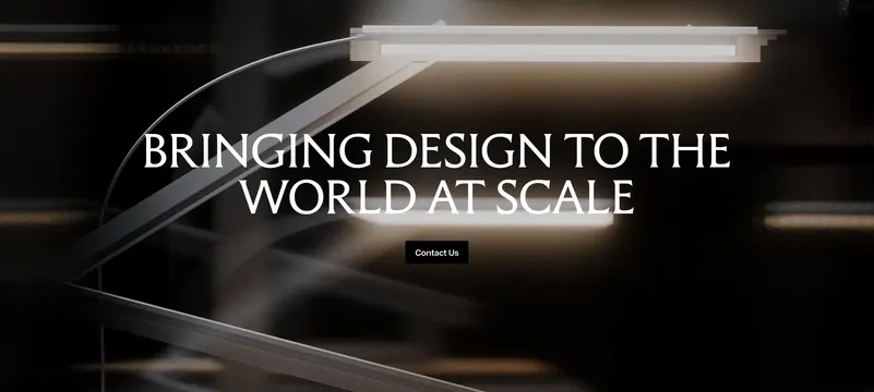
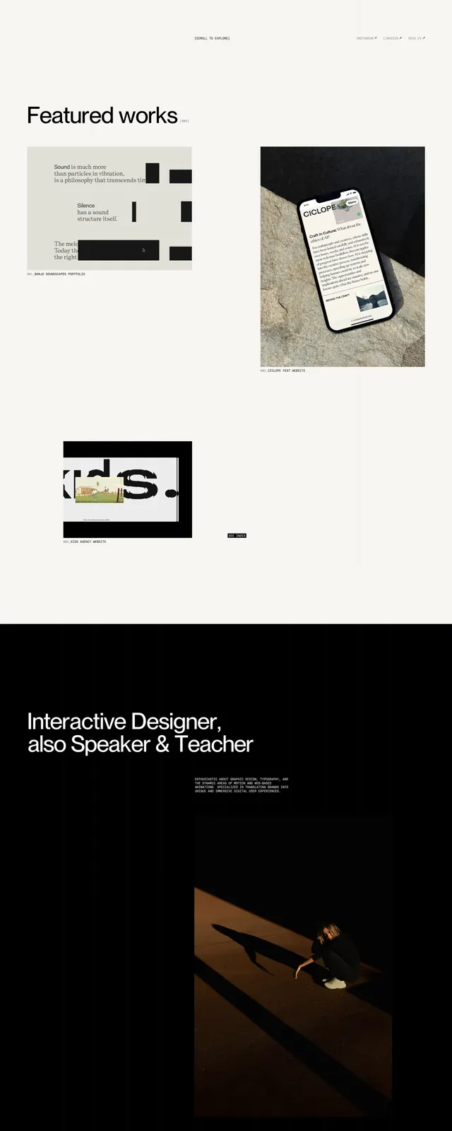
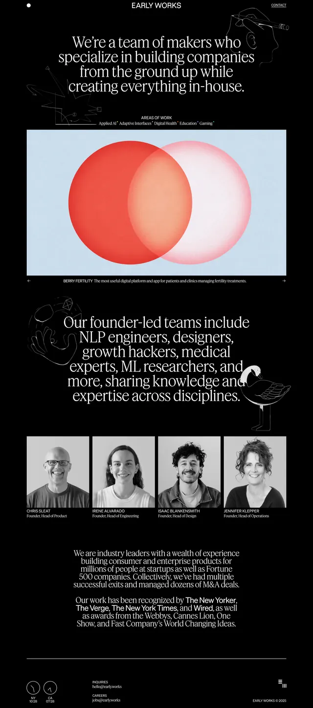
A dark, editorial agency site with a centered hero, featured work panels, and a team/about section built around oversized serif type.
Summary
A dark, editorial agency site with a centered hero, featured work panels, and a team/about section built around oversized serif type.
Visual description
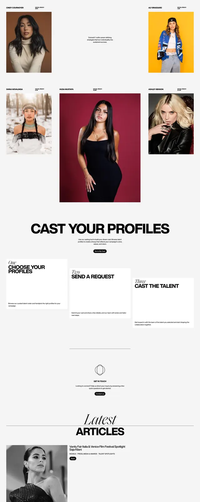
The page uses a black background with small white navigation text at the top and a large centered serif headline in the hero. Decorative line-art illustrations sit near the corners, and the first major content block is a large image card with two overlapping red circles on a pale blue field. Lower sections show another oversized text block, a four-column team portrait grid, and a compact footer with contact details and small utility icons.
Key takeaway
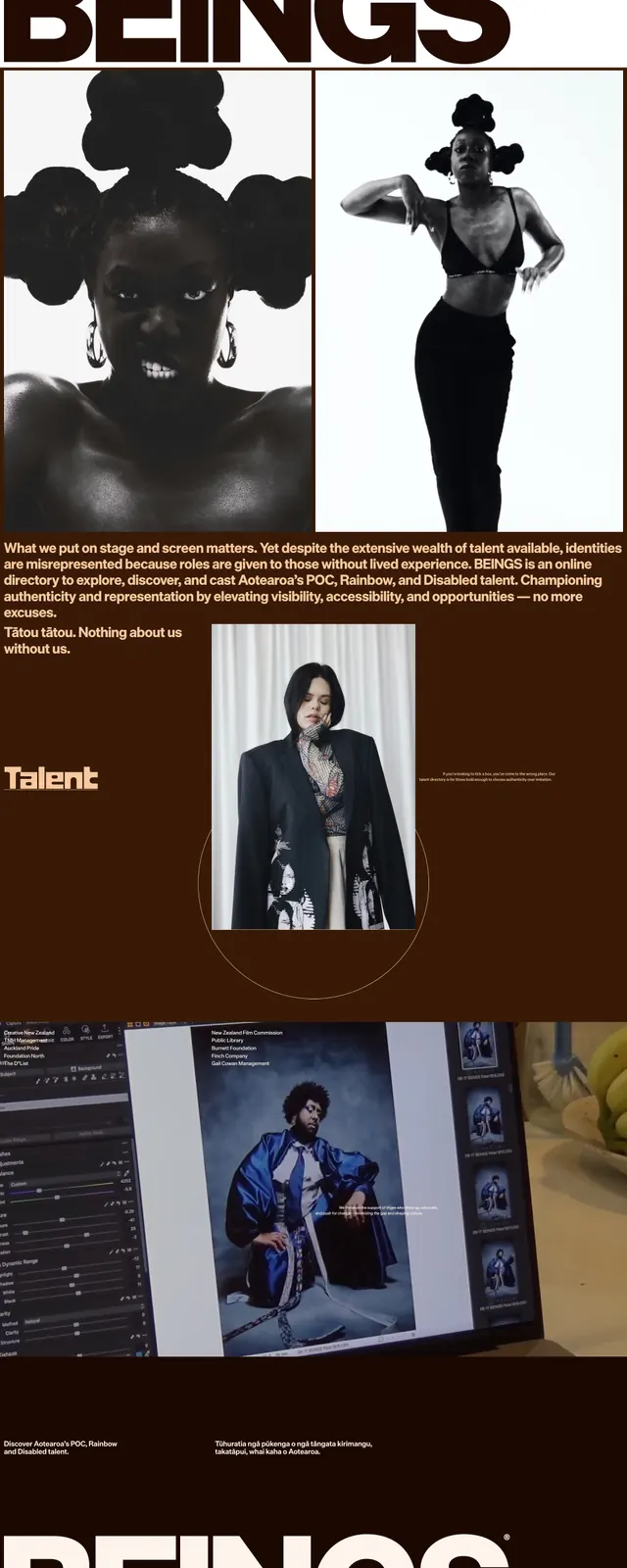
The strongest move is the contrast between austere black editorial framing and soft, graphic imagery inside large image panels. Oversized serif typography gives the page a premium, founder-led studio feel without relying on heavy color.
Reuse notes
Use this pattern for agency, studio, or consultancy homepages that need to feel sharp and credible with minimal UI chrome. It works best when you have strong imagery, a small team section, and concise positioning copy; it is less suitable for dense product marketing pages.