Preview image. Unlock full-res
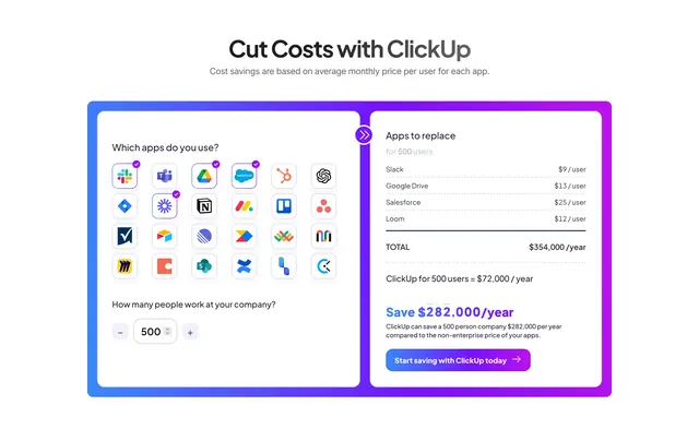
Gradient-bordered calculator card letting users pick apps and company size to compare stacked SaaS spend against ClickUp pricing.
Summary
A "Cut Costs with ClickUp" calculator inside a blue-purple gradient border where selected app icons and headcount drive a side-by-side annual savings total.
Visual description
White page with centered title and gray disclaimer about average monthly prices. Large rounded container with blue-to-purple gradient outline splits into input and output halves. Left side asks "Which apps do you use?" above a grid of app logo tiles; several show purple checkmarks for Slack, Google Drive, Salesforce, and Loom. Below, a stepper sets company size to 500 people. A circular purple chevron divider sits on the vertical split. Right side lists per-user costs for selected apps, bold "TOTAL: $354,000 / year," ClickUp comparison at $72,000, and large gradient "Save $282,000/year" callout plus explanatory copy and gradient CTA button "Start saving with ClickUp today."
Key takeaway
The left-input, right-output calculator frame makes ROI feel tangible. Selected app tiles with checkmarks communicate interactivity even in a static capture.
Reuse notes
Strong for all-in-one platform positioning against tool sprawl. Needs credible pricing assumptions and enough recognizable logos; gradient border carries the whole visual identity.