Preview image. Unlock full-res
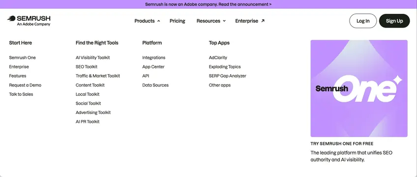
Expanded Products dropdown with four link columns, Adobe acquisition banner, and a purple Semrush One promo card beside the main navbar.
Summary
Semrush navbar with Products mega menu open: four categorized link columns plus a gradient Semrush One promotional tile on the right.
Visual description
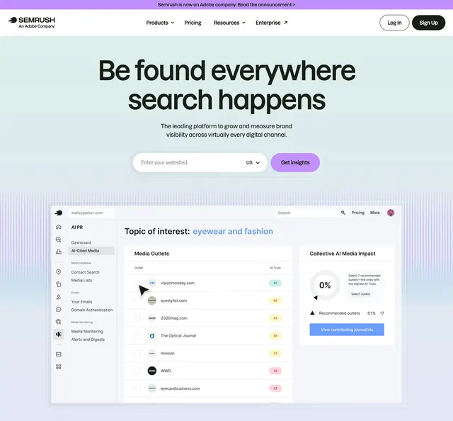
Thin lavender top banner reads Semrush is now an Adobe company with announcement link. White navbar shows Semrush logo and An Adobe Company tagline, centered links for Products with chevron, Pricing, Resources, and Enterprise with external icon, plus outline Log in and black Sign Up pills. Open dropdown spans full width on white with four columns: Start Here listing Semrush One, Enterprise, Features, Request a Demo, Talk to Sales; Find the Right Tools with AI Visibility, SEO, Traffic and Market, Content, Local, Social, Advertising, and AI PR toolkits; Platform with Integrations, App Center, API, Data Sources; Top Apps with AdClarity, Exploding Topics, SERP Gap Analyzer, Other apps. Right edge holds a large square promo card with purple gradient abstract shapes, Semrush One logotype with star icon, bold TRY SEMRUSH ONE FOR FREE headline, and one-line platform summary.
Key takeaway
Anchor the mega menu with one visual promo card instead of five equal text columns. Group links by user intent (start, tools, platform, apps) so scanning beats alphabetical lists. Keep auth actions persistent in the navbar while the menu is open.
Reuse notes
Reference for complex SaaS navigation with many SKUs. Requires disciplined IA; overloaded columns defeat the layout. Promo card should highlight a single flagship offer, not rotate multiple campaigns in one capture.