Preview image. Unlock full-res
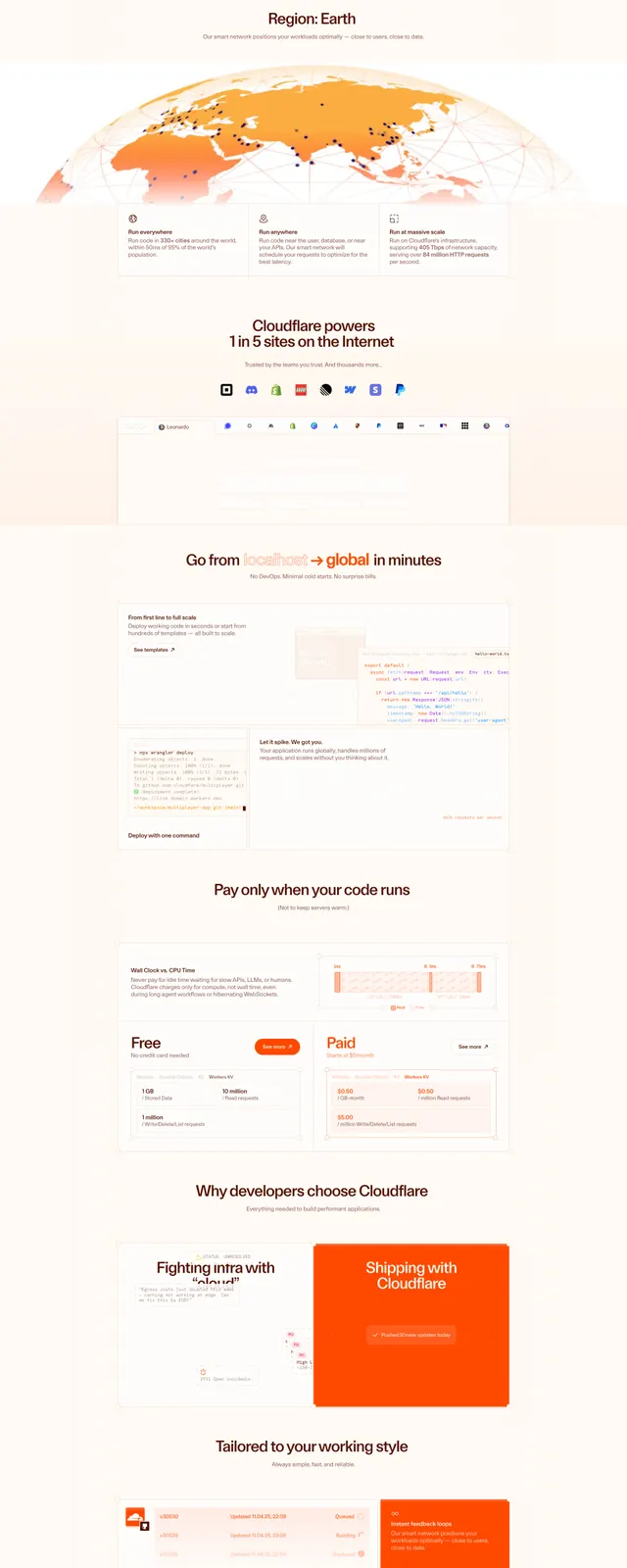
A bright orange, developer-focused landing page with a large hero, feature tabs, code and diagram panels, pricing blocks, and a strong final CTA.
Summary
A bright orange, developer-focused landing page with a large hero, feature tabs, code and diagram panels, pricing blocks, and a strong final CTA.
Visual description
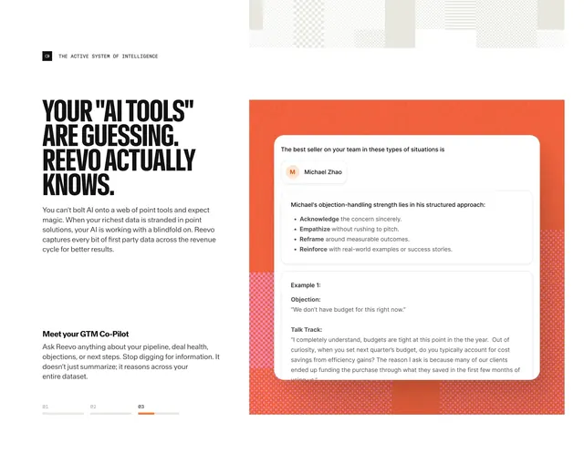
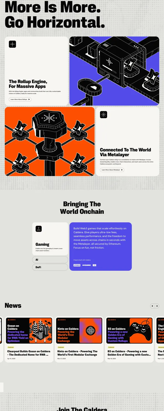
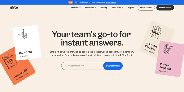
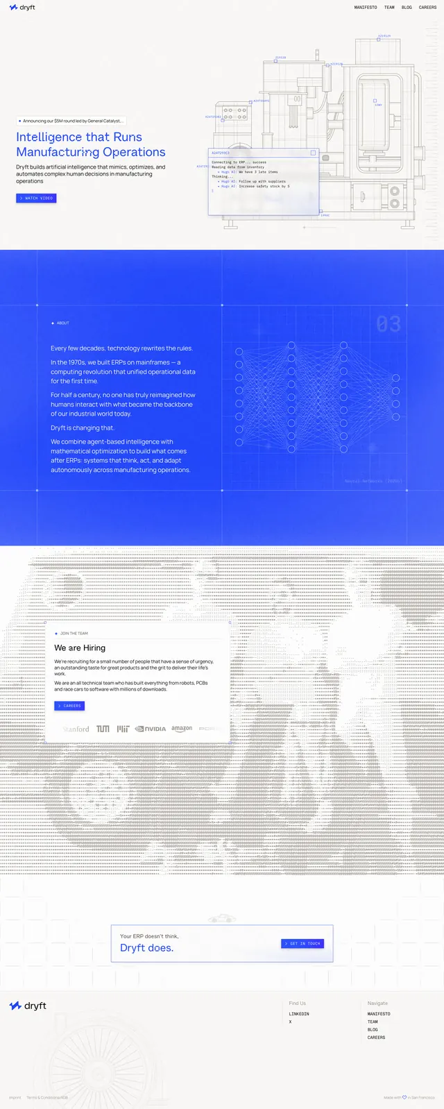
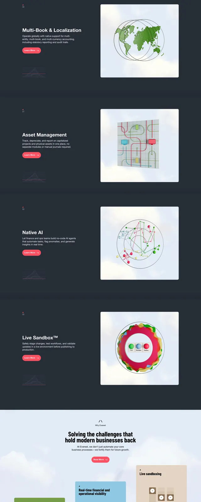
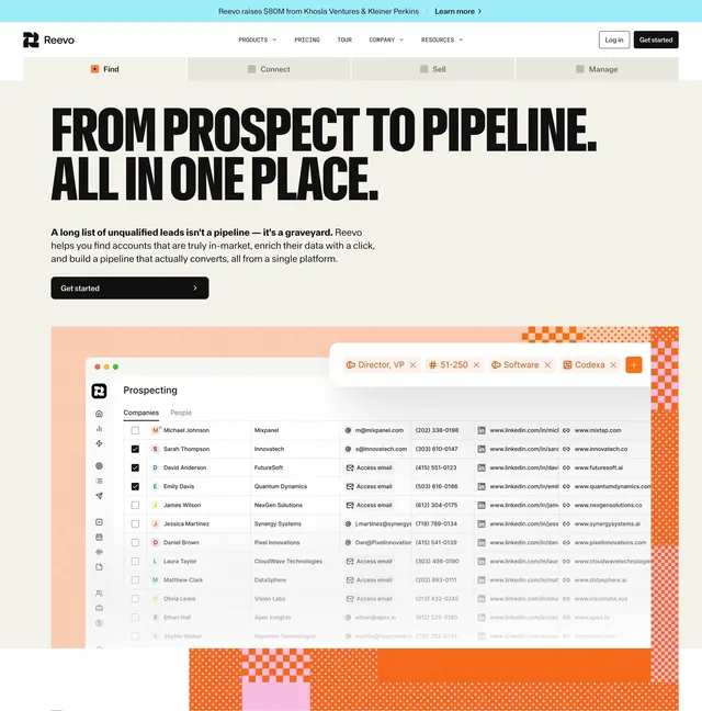
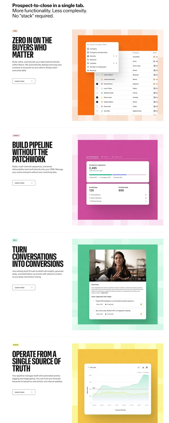
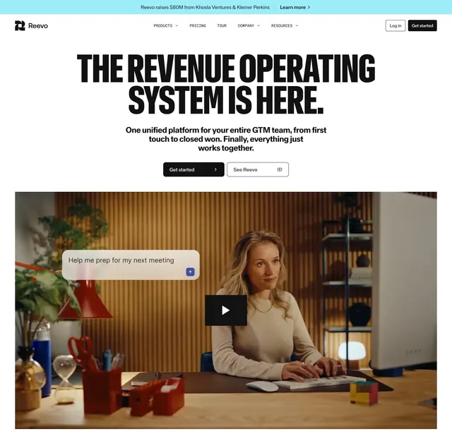
The page opens with a large, full-width orange hero card containing a top navigation, centered headline, supporting copy, and a primary call-to-action button. Below it are stacked content sections with centered headings, tabbed product categories, simplified architecture diagrams, code blocks, and bordered cards arranged in a clean grid. Further down, pricing-style comparisons and feature callouts appear alongside another large orange CTA banner and a compact multi-column footer. The overall layout uses lots of white space, thin borders, rounded cards, and subtle drop shadows to frame the content.
Key takeaway
This is a strong example of a developer-platform homepage that combines bold brand color with structured product storytelling. The reusable pattern is a centered hero followed by modular feature, pricing, and CTA sections.
Reuse notes
Reuse the orange hero treatment, tabbed feature switcher, and diagram-plus-code storytelling for other developer tools. The card system and final CTA banner translate well to SaaS landing pages that need to feel both polished and technical.