Preview image. Unlock full-res
A clean, conversion-focused SaaS landing page for fleet and fuel payments with oversized type, card-based feature blocks, and bright blue CTA sections.
Summary
A clean, conversion-focused SaaS landing page for fleet and fuel payments with oversized type, card-based feature blocks, and bright blue CTA sections.
Visual description
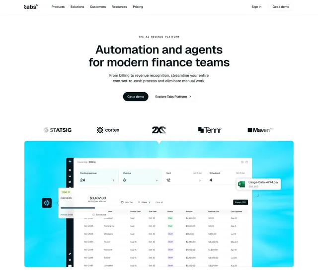
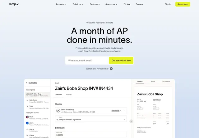
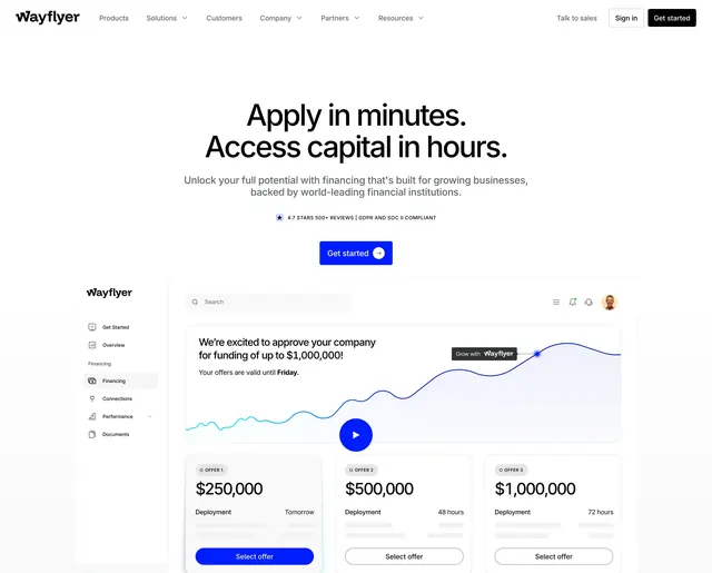
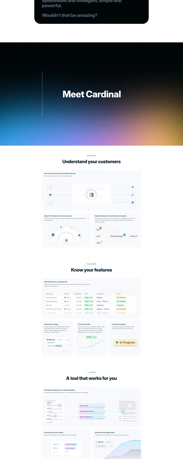
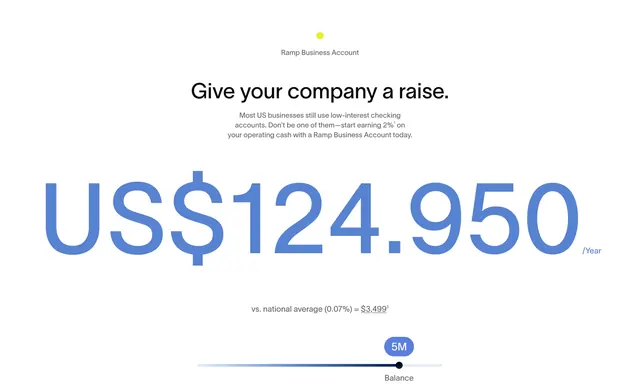
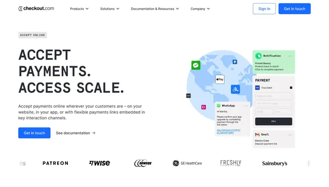
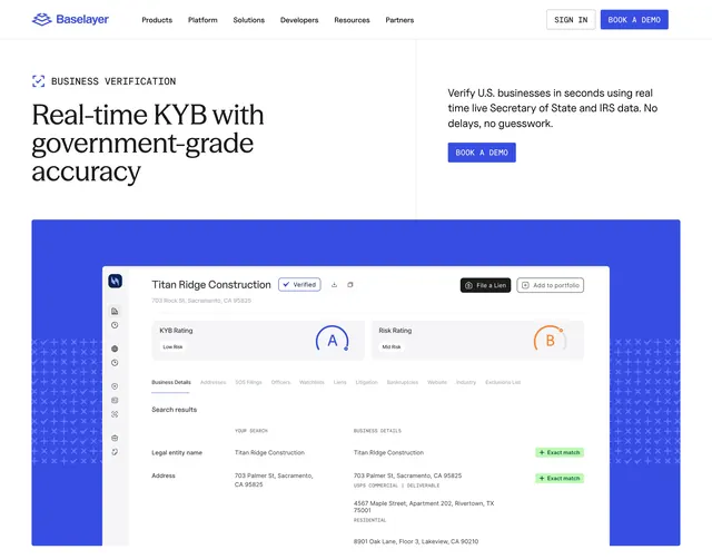
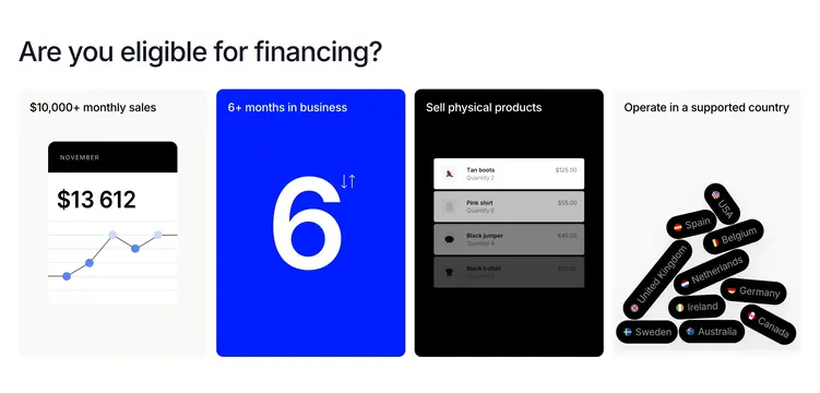
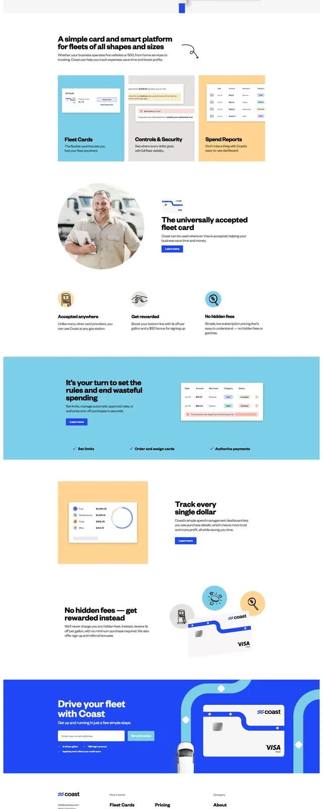
The page opens with a white header and a split hero: large black headline and short supporting copy on the left, and a finance dashboard-style card illustration on the right. A prominent blue primary button and email input sit beneath the hero copy, with small trust-benefit bullets below. Further down, the page shows a three-card feature grid, icon-led benefit blurbs, a wide blue callout band, a two-column product/value section, and a bold blue footer CTA above a compact footer. The overall layout uses generous whitespace, soft shadows, rounded cards, and bright Coast-blue accents against a mostly white background.
Key takeaway
Use oversized black typography with bright blue accents to make a B2B payment product feel simple and immediate. The repeated card-and-dashboard visuals reinforce the product without making the layout feel heavy.
Reuse notes
Strong reference for fintech or B2B SaaS homepages that need a clear signup path plus multiple feature sections. Reuse the structure when you want a light, trustworthy visual system with punchy CTA bands and modular content blocks.