Preview image. Unlock full-res
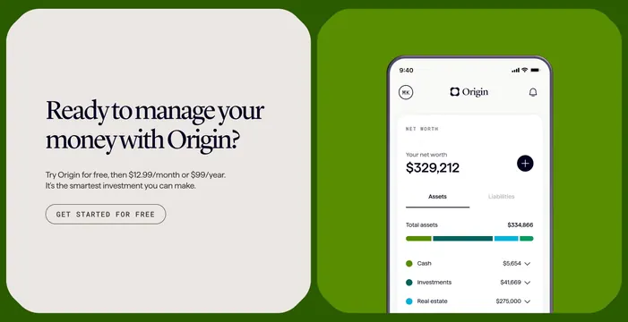
Split CTA with a cream serif headline panel beside a deep green panel holding a phone showing a net-worth app screen.
Summary
A two-panel CTA: a cream left panel with an oversized italic serif headline and an outlined all-caps button, beside a deep green right panel framing a phone that shows a personal net-worth screen.
Visual description
The block is two rounded panels on a green page. The left panel is warm cream and holds a two-line italic serif headline "Ready to manage your money with Origin?", a short grey paragraph about a free trial and pricing, and a pill-shaped outlined button reading "GET STARTED FOR FREE" in spaced all-caps. The right panel is solid mid-green and contains a realistic phone mockup: a light app screen titled "NET WORTH" with "Your net worth $329,212", a circular plus button, Assets/Liabilities tabs, a "Total assets $334,866" row, a multi-segment colored bar, and a list of categories (Cash, Investments, Real estate) with values and chevrons. The phone bleeds off the bottom of its panel.
Key takeaway
The italic serif headline against a cream field gives a finance CTA an editorial, premium calm that most app CTAs lack. Pairing a quiet outlined button with a genuinely detailed app screen lets the product, not the button, do the selling.
Reuse notes
A strong closing CTA for a consumer finance or wealth app that wants to feel considered rather than loud. It depends on a clean, legible app screenshot on the right; the serif-and-cream treatment suits premium or editorial brands more than playful ones.