Preview image. Unlock full-res
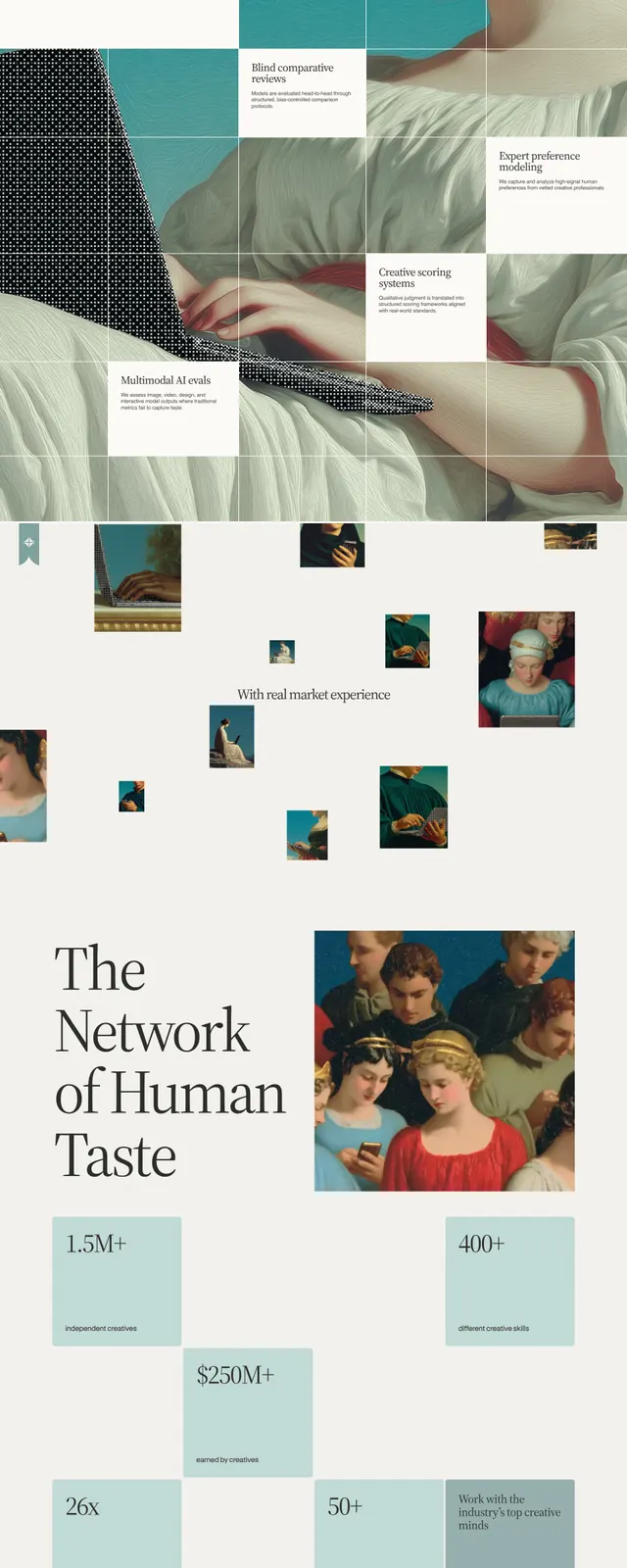
An editorial-style landing page for Contralabs with classical artwork, serif typography, and expansive whitespace.
Summary
An editorial-style landing page for Contralabs with classical artwork, serif typography, and expansive whitespace.
Visual description
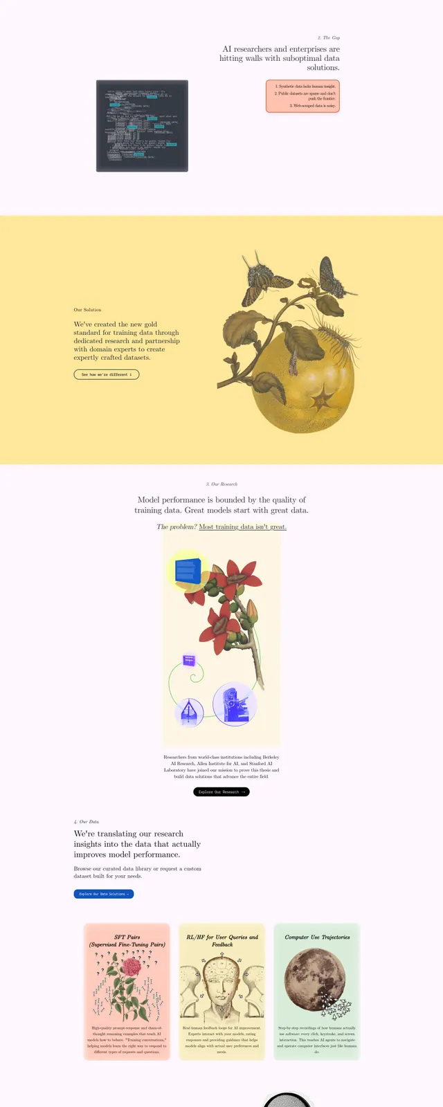
The page opens with a minimal top navigation and a large serif headline on a warm off-white background. A classical painted figure using a laptop dominates the right side, with a small dark call-to-action button beneath the headline. Lower sections mix small floating image tiles, centered copy, and another wide banner with hands framing a laptop, followed by a footer-like area with the Contralabs wordmark and a row of classical figures.
Key takeaway
The design combines gallery-like editorial composition with AI/research positioning. It feels premium and culturally referential, using classical art to make the technology brand stand out.
Reuse notes
This approach works well for brands that want a distinctive, high-end identity and can support strong visual storytelling. Reuse the oversized serif headline, sparse navigation, and art-led imagery to create a memorable first impression.