Preview image. Unlock full-res
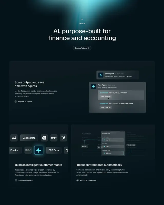
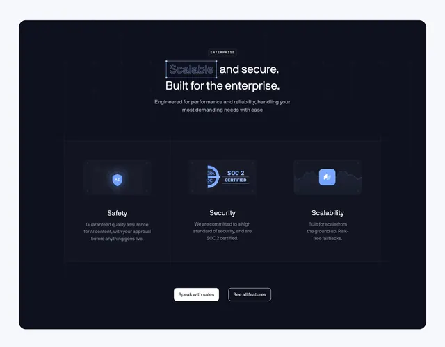
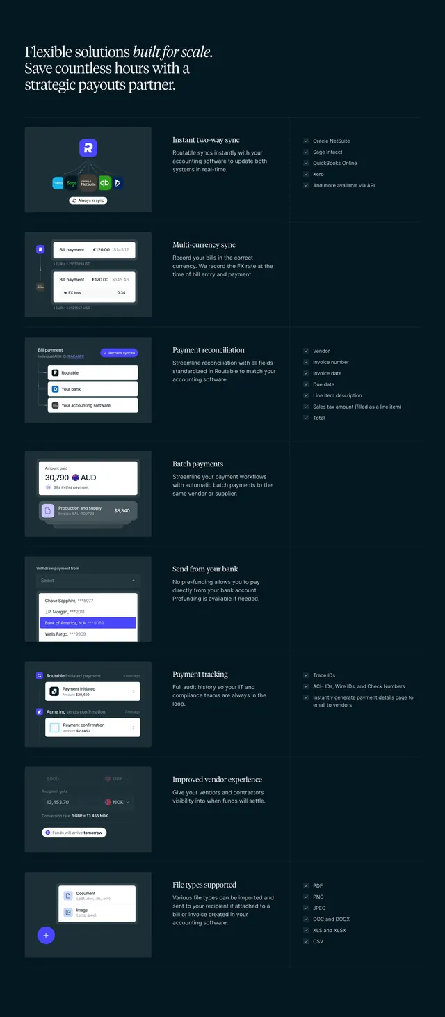
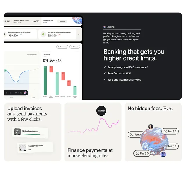
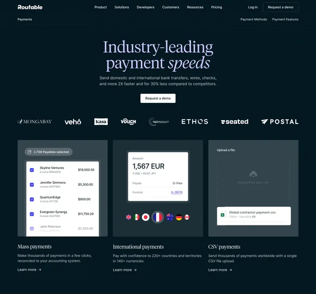
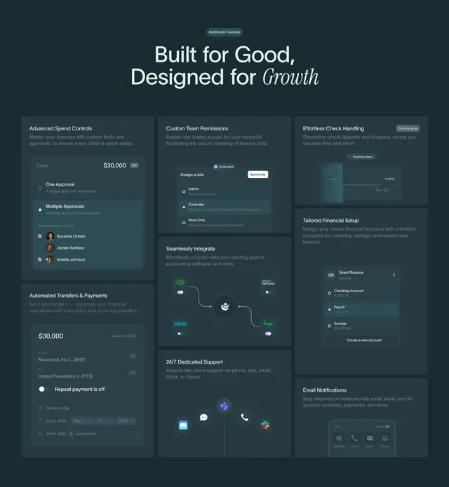
Dark bento features grid mixing copy blocks with realistic product UI mockups across uneven tiles.
Summary
A dark-mode bento features grid where each tile pairs a short feature title and description with a small, realistic slice of the product UI. The defining trait is how many distinct interface mockups it packs into one cohesive dark grid.
Visual description
A centered "Additional Features" pill sits above an oversized two-line headline that ends on an italic serif "Growth" for contrast. Below, a bento of unequal tiles on a deep teal-black background, each tile slightly lighter than the page. Tiles include spend-control approvals with checkboxes, a role-permissions panel, a "Coming soon" check-scanning card, a node-based integration diagram linking accounting logos, an account list with a highlighted row, a 24/7 support cluster of channel icons, and an email-notifications phone mock. Headings are near-white, body copy muted gray, and each tile holds a faithful miniature of the actual app.
Key takeaway
Filling a bento with genuine product UI fragments rather than generic icons, so the features section doubles as a product tour. The single italic serif accent word inside an otherwise plain sans headline is a cheap way to add editorial polish, and the lighter-than-page tiles give depth without borders.
Reuse notes
Strong for a fintech or B2B SaaS that has a lot of real interface to show and wants one section to communicate breadth. Requires polished, consistent UI mockups or it falls apart. Only works on dark, and the tiles must share one accent color to stay cohesive.