Preview image. Unlock full-res
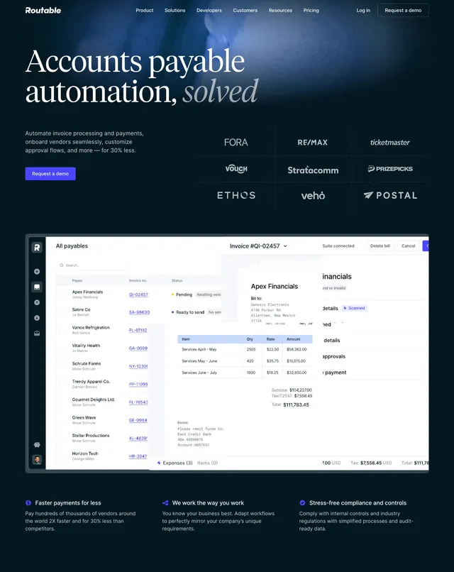
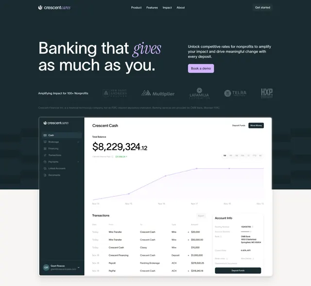
Split dark hero with an oversized italic-accent headline, demo CTA, logo strip, and a large product dashboard below.
Summary
A dark banking hero that splits an oversized headline against a short value proposition and single demo CTA, then anchors the section with a large, realistic product dashboard. The defining move is the italic serif accent word breaking up the otherwise plain headline.
Visual description
A slim top navbar carries the Crescent Cares wordmark, a few links, and a "Get started" button. Below left, an oversized headline "Banking that gives as much as you" places an italic serif "gives" mid-line for emphasis; to the right sits a short paragraph and a single filled "Book a demo" button. A muted grayscale partner-logo strip and a small legal disclaimer line span underneath. The lower half is dominated by a Crescent Cash dashboard mock: left sidebar nav, a large balance figure with a purple line chart, and a transactions table plus account-info panel, all in the same dark teal palette.
Key takeaway
Anchoring a finance hero with a fully built dashboard that shows real numbers, charts, and tables, so the product sells itself above the fold. The grayscale logo strip plus a one-line regulatory disclaimer builds trust quickly, and the lone demo CTA keeps the ask focused.
Reuse notes
Default pattern for a fintech or banking SaaS landing page where credibility and product depth matter. Needs a convincing, data-rich dashboard mock to carry the lower half. Only works on dark, and the single CTA assumes a sales-led, demo-first funnel.