
Preview image. Unlock full-res
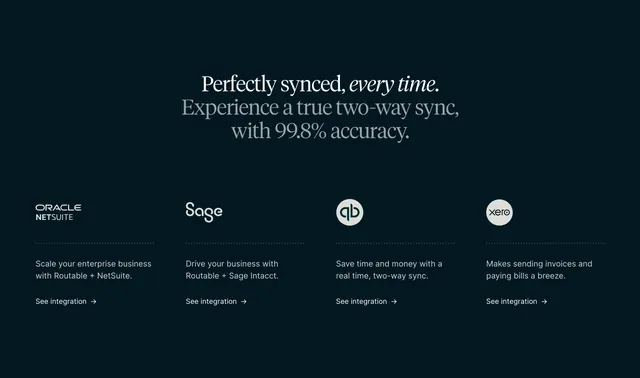
Dark four-column integrations row of accounting-platform logos, each over a dividing line with a short blurb and link.
Summary
A dark integrations section with a centered serif headline over four equal columns, each showing an accounting-platform logo, a one-line benefit, and a "See integration" link.
Visual description
On a near-black teal-navy background, a centered two-line serif headline reads "Perfectly synced, every time." (with "every time." in serif italic) followed by a lighter-grey serif sub-line "Experience a true two-way sync, with 99.8% accuracy." Below, four evenly spaced columns each carry a brand logo near the top (Oracle NetSuite, Sage, QuickBooks mark in a circle, Xero in a circle), a thin dotted divider, then a short white benefit sentence ("Scale your enterprise business with Routable + NetSuite.", "Drive your business with Routable + Sage Intacct.", and so on) and a "See integration" text link with a right arrow. Lots of dark negative space frames the row.
Key takeaway
Pairing each integration logo with a one-sentence, partner-specific value line and its own deep-link, rather than a bare logo wall, so the section sells the integrations instead of just listing them. The dotted divider under each logo gives quiet structure.
Reuse notes
Best for products whose key value is syncing with named platforms (accounting, CRM, ERP). The per-logo blurb and link turn a logo strip into navigable integration pages. Serif headline lends a premium, editorial tone uncommon in fintech. Works on dark backgrounds; keep logos monochrome to unify.
More integrations sections
See all











More like this



Keep what you find
A free account saves references to boards and can send you a weekly email of picks based on what you save.
To see every result, go Pro.