Preview image. Unlock full-res
A bold festival website with a playful geometric hero, event cards, and sponsor-heavy footer sections.
Summary
A bold festival website with a playful geometric hero, event cards, and sponsor-heavy footer sections.
Visual description
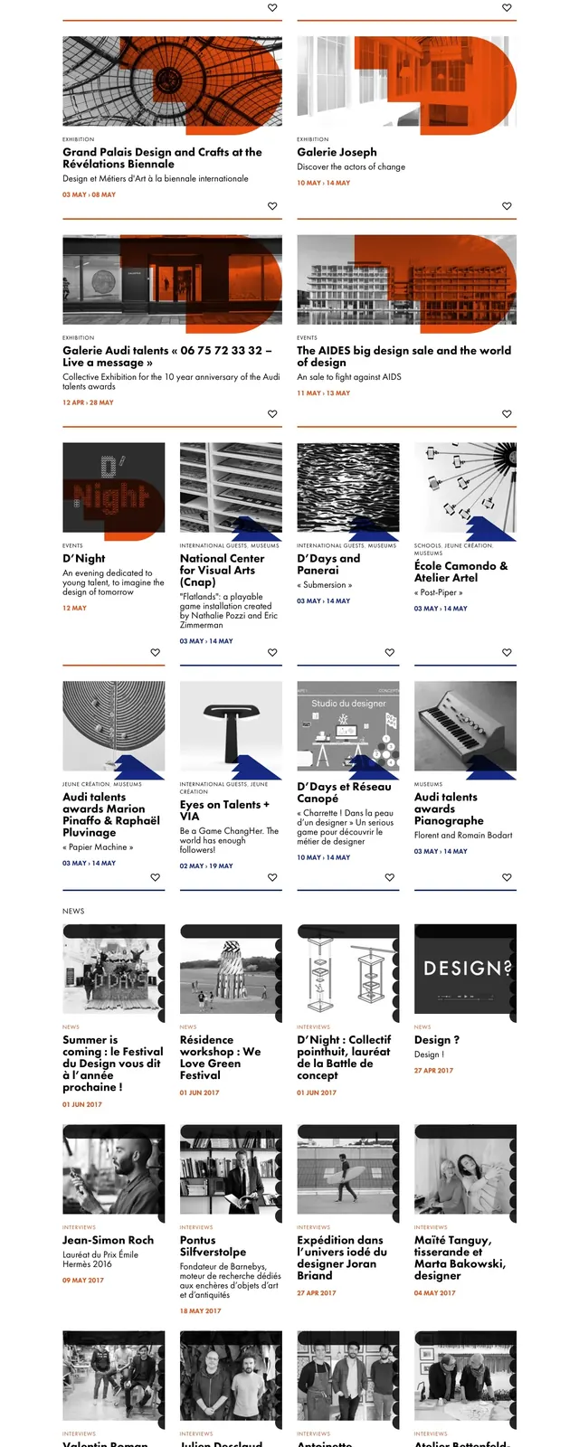
The page opens with a full-width illustrated hero made of bright blue, orange, peach, and lavender geometric forms framing the event title and dates. Below it, a centered intro paragraph leads into a multi-column grid of event cards with thumbnail images, labels, titles, short descriptions, and date ranges. Farther down, a bold orange newsletter signup band appears above a deep blue footer with social icons and contact links, followed by a large sponsor logo area. The overall page is tall, editorial, and structured around visual sections separated by strong color blocks.
Key takeaway
This layout combines a poster-like festival identity with a clear content grid, making it feel both cultural and navigable. The strongest reusable pattern is the illustrated hero paired with modular event cards.
Reuse notes
Useful for event or cultural landing pages that need a memorable identity and a lot of browsable content. The hero illustration style and sponsor/footer treatment can be adapted into a modern festival or conference site.