Preview image. Unlock full-res
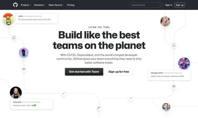
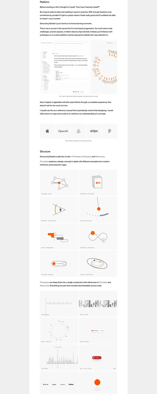
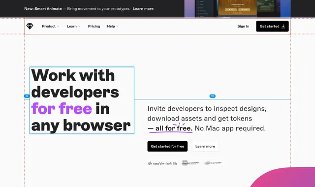
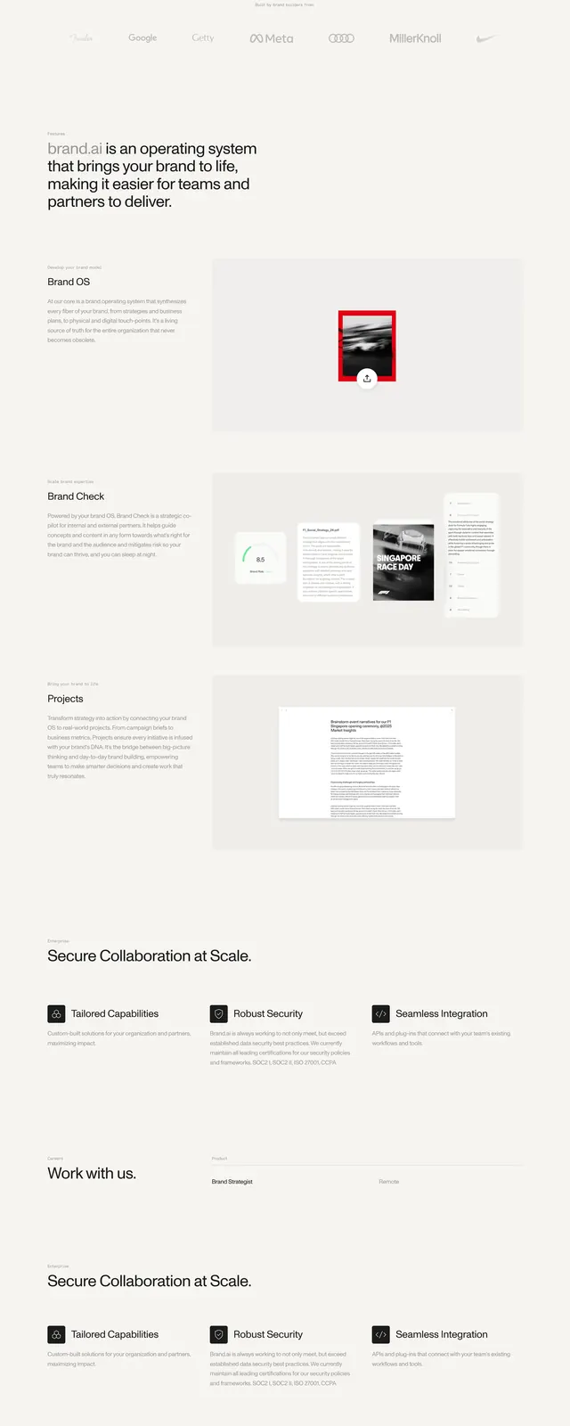
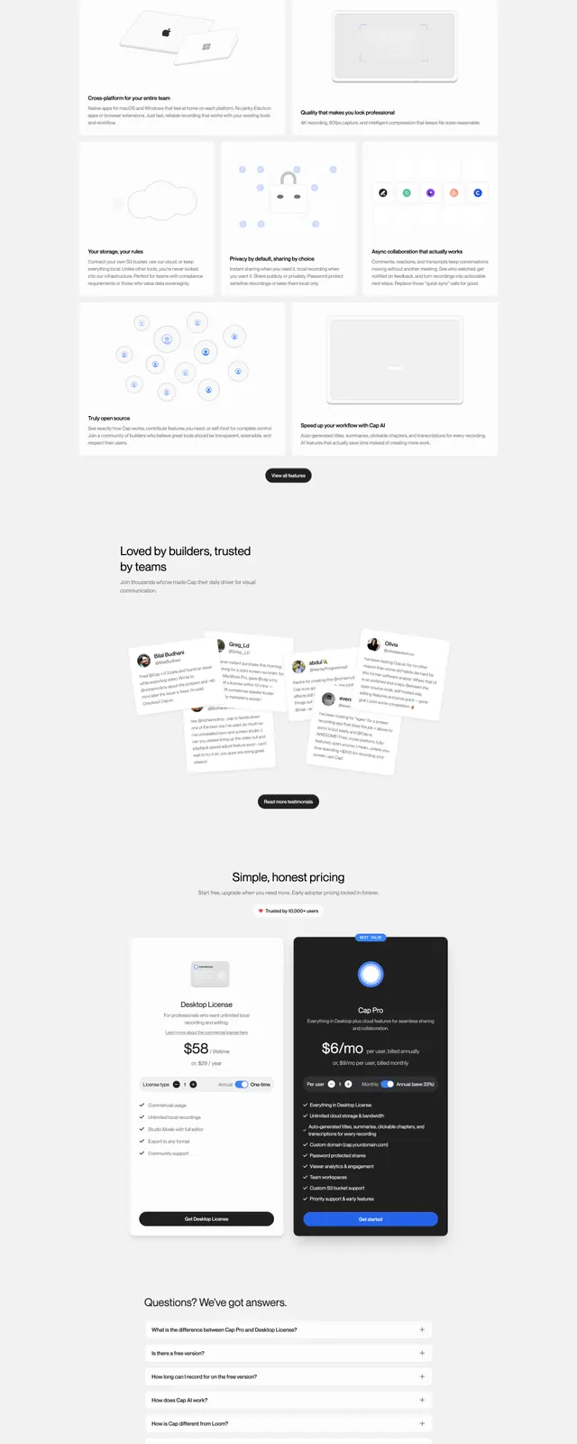
A clean SaaS landing page for screen recording software with a split hero, stacked feature sections, testimonials, pricing, and a strong closing CTA.
Summary
A clean SaaS landing page for screen recording software with a split hero, stacked feature sections, testimonials, pricing, and a strong closing CTA.
Visual description
The page uses a bright white background with a minimal top navigation and a split hero: marketing copy on the left and a large product preview on the right. Below the fold are centered feature blocks, a testimonials cluster with overlapping cards, a simple pricing area, and a rounded CTA panel near the bottom. The overall composition relies on generous spacing, soft shadows, and small black and blue accent buttons.
Key takeaway
This design emphasizes clarity and trust through restrained styling, strong hierarchy, and a product-first hero layout. It is easy to reuse for SaaS marketing pages that need to feel polished without looking heavy.
Reuse notes
The split hero and soft-card testimonial treatment are especially reusable for creator tools, productivity apps, and lightweight B2B products. The same visual system would adapt well to other one-page landing pages with a simple pricing and CTA flow.