Preview image. Unlock full-res
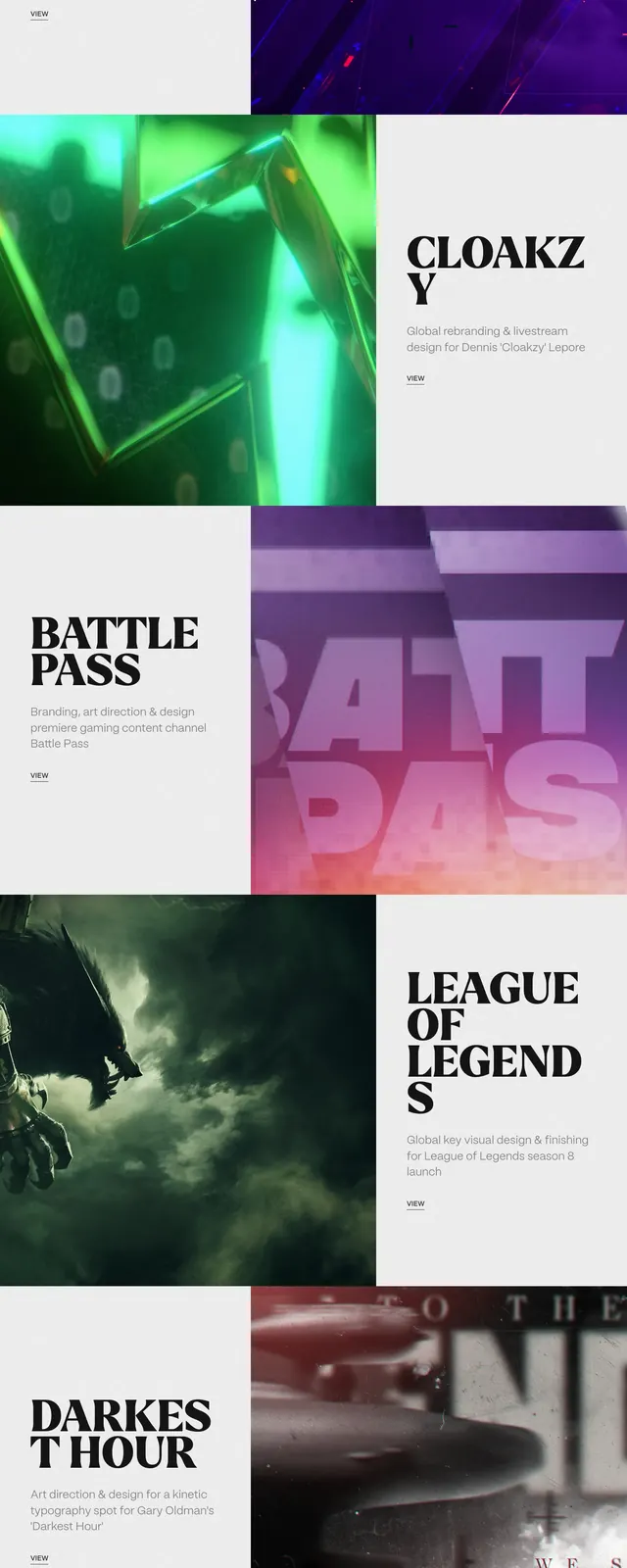
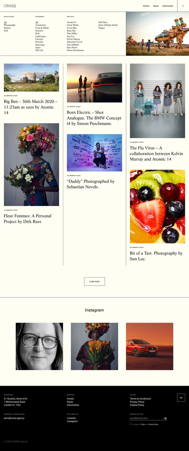
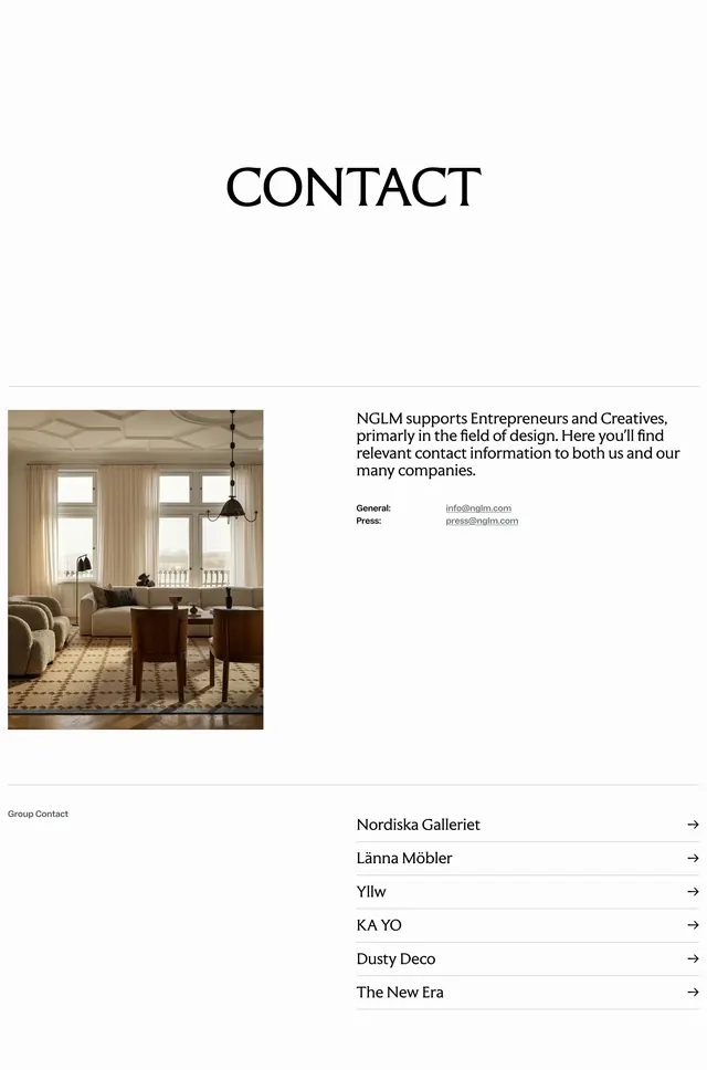
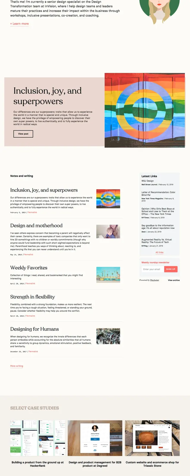
A minimalist portfolio page for designer Donica Ida with large serif headline, project list rows, and sparse case-study imagery.
Summary
A minimalist portfolio page for designer Donica Ida with large serif headline, project list rows, and sparse case-study imagery.
Visual description
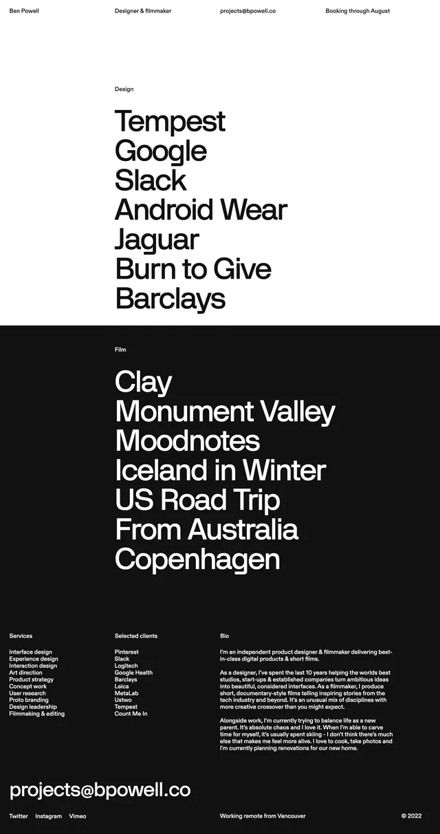
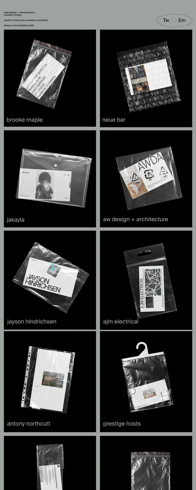
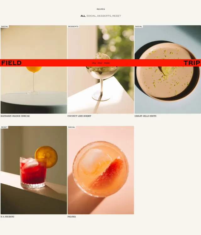
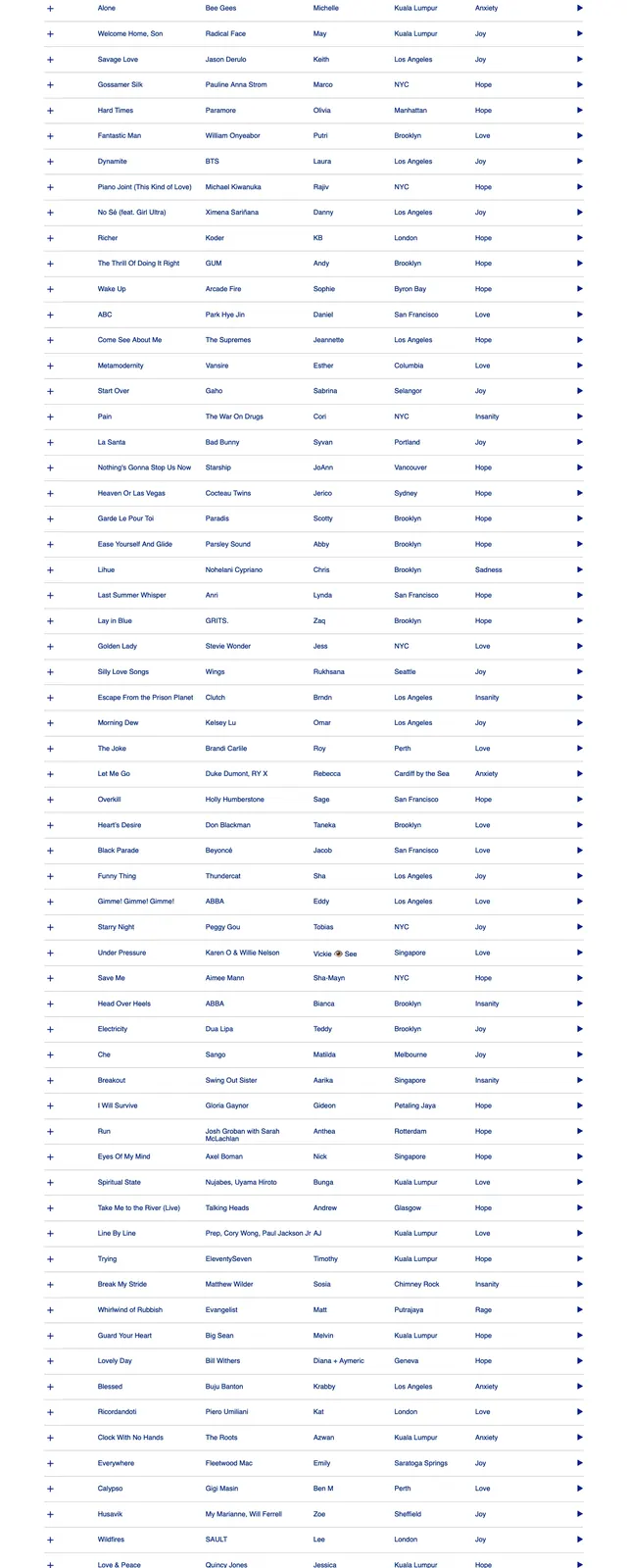
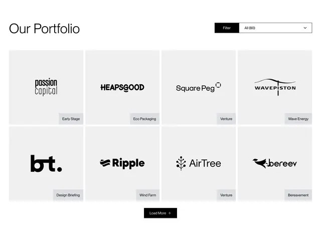
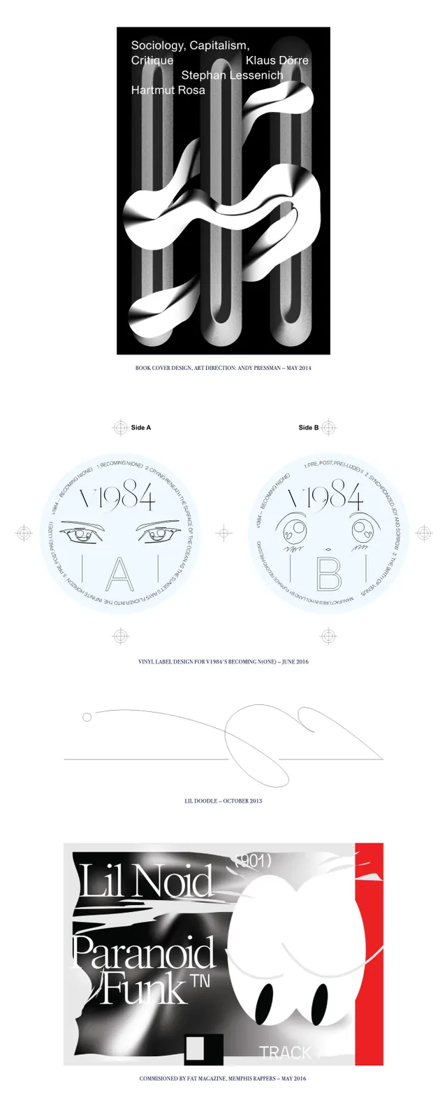
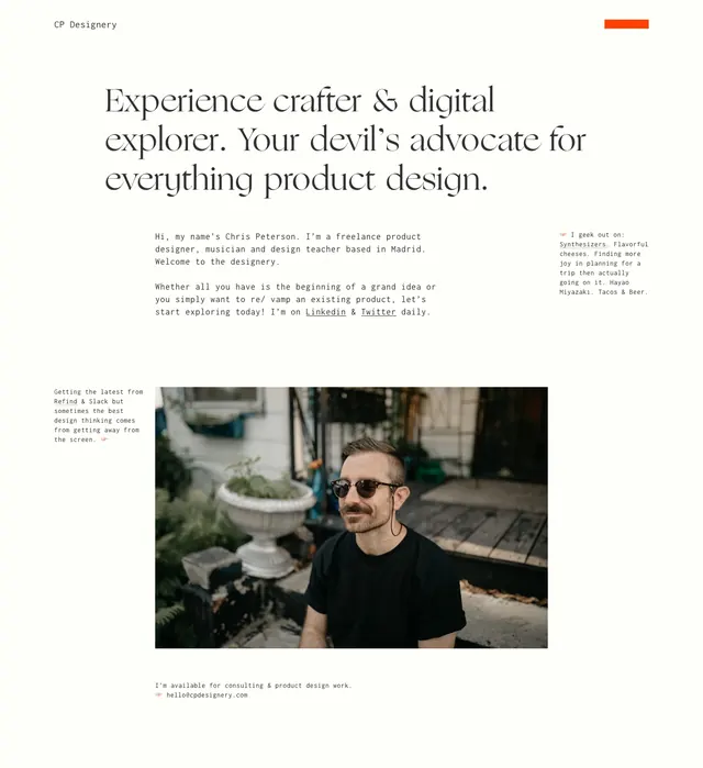
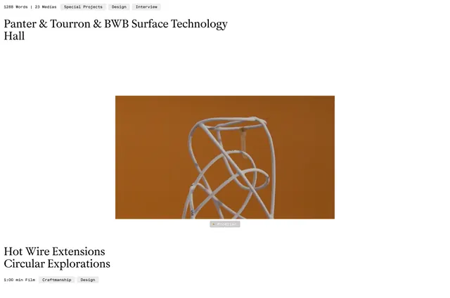
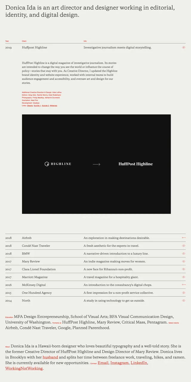
The page uses a warm off-white background with dark serif typography and thin divider lines. A large opening statement introduces Donica Ida, followed by a table-like project list with year, client, and short descriptor columns. One featured project expands into a large black image block showing a logo transition, and lower sections continue with more compact project rows and a brief about/contact area at the bottom.
Key takeaway
The main design move is the restrained editorial structure: big serif intro copy above a highly scannable project index. Repeated hairline rules, generous spacing, and sparse accent color make the page feel refined without adding visual noise.
Reuse notes
Useful for designer portfolios, agency case-study archives, or any site that needs to present many projects in a clean index format. It works best when the content is strong enough to carry the page, since the layout depends on typography and spacing more than decoration.