Preview image. Unlock full-res
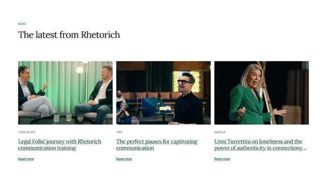
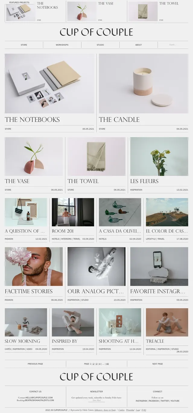
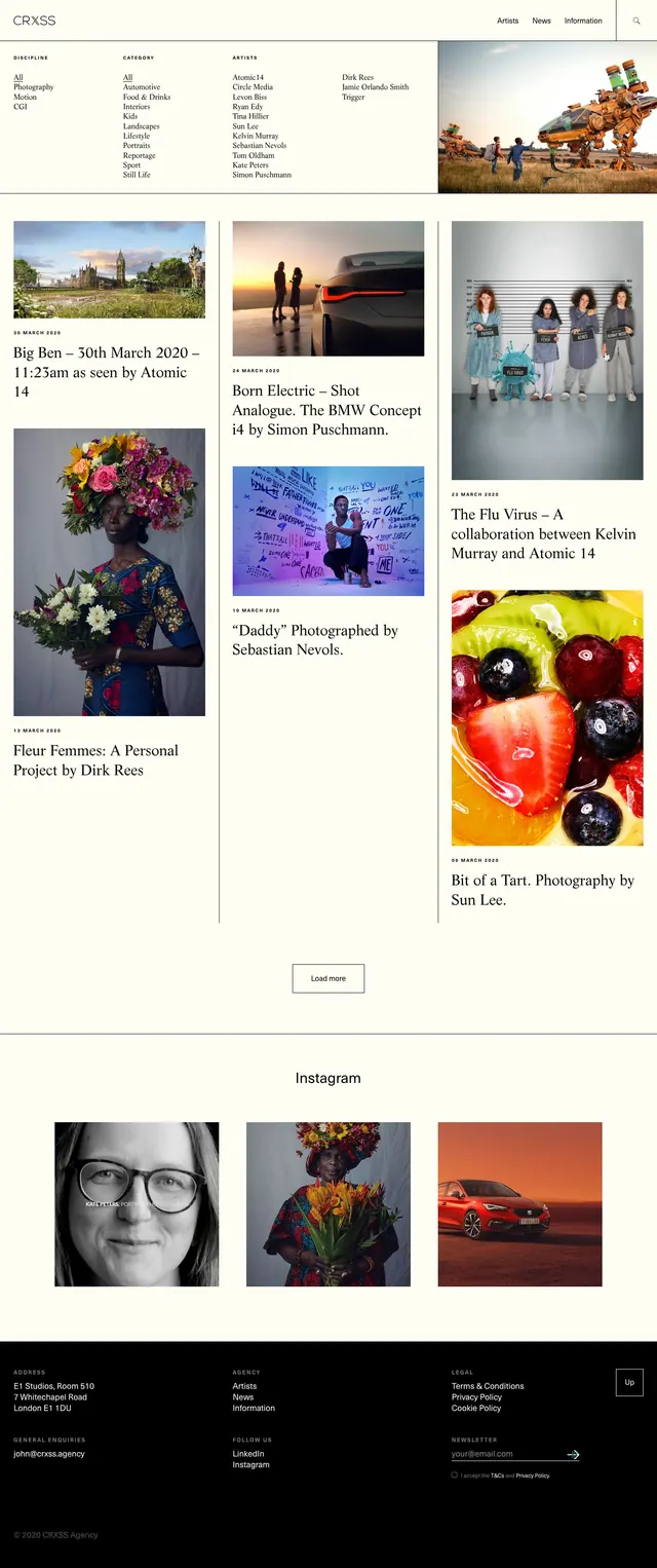
A light, editorial-style art and photography site with a thin top nav, category filters, and a masonry-like grid of image-led story cards.
Summary
A light, editorial-style art and photography site with a thin top nav, category filters, and a masonry-like grid of image-led story cards.
Visual description
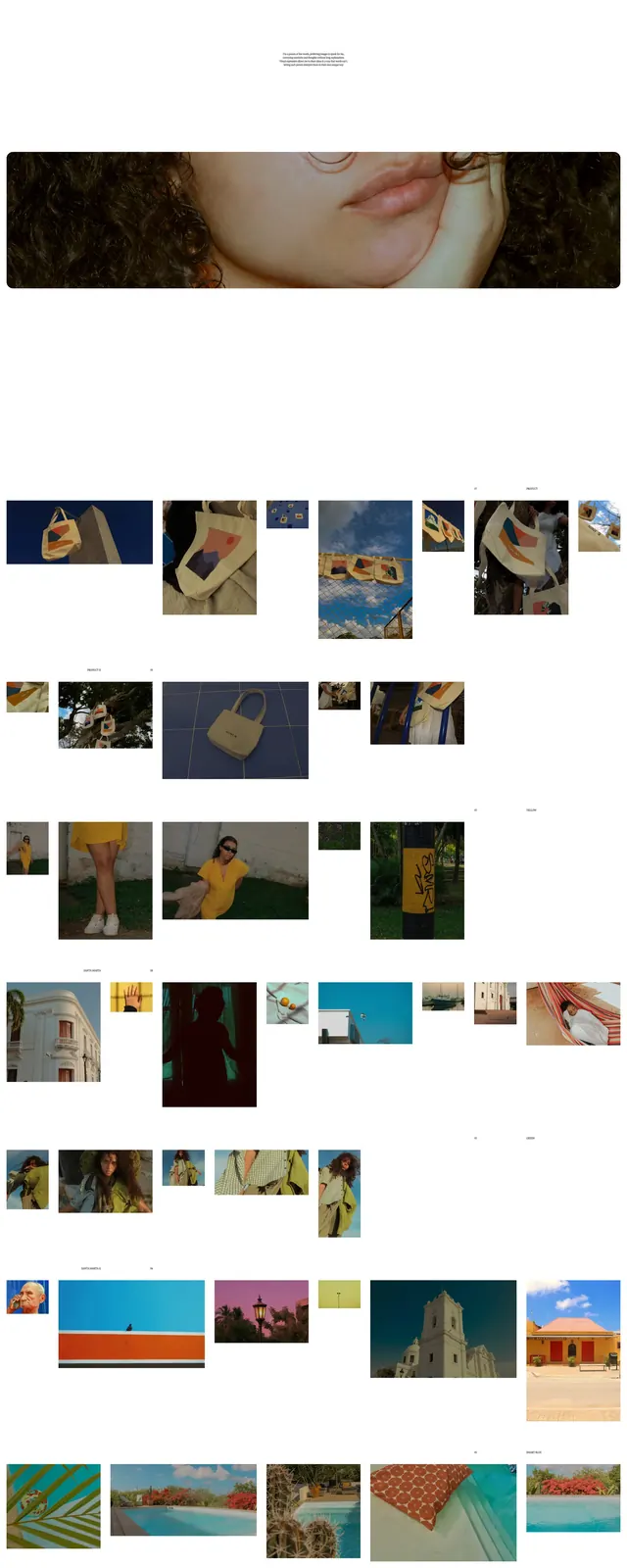
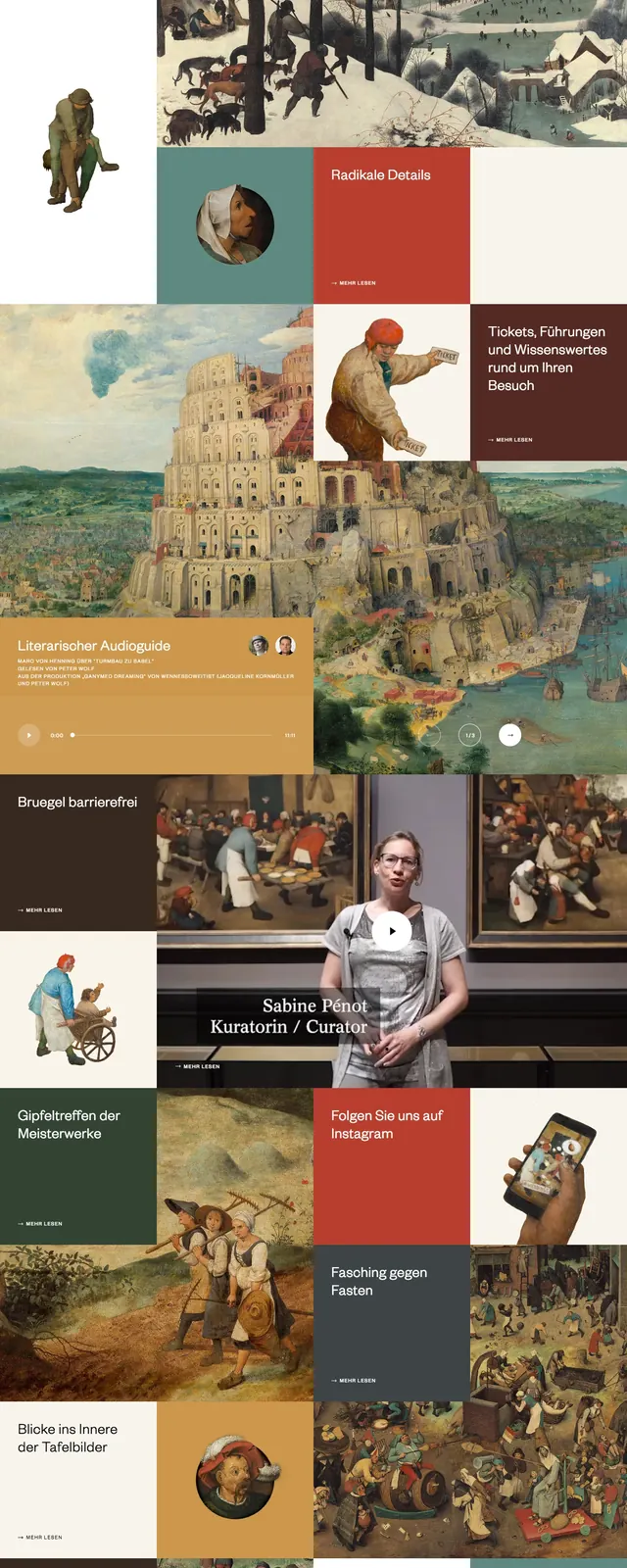
The page uses a pale cream background with thin divider lines and a restrained black serif/sans-serif mix. A compact top header shows the CRXSS wordmark on the left and simple navigation on the right, followed by a filter row with discipline, category, and artist lists alongside a large feature image. Below, the main content is arranged as an asymmetric three-column grid of editorial cards with large photographs, dates, and serif headlines. Near the bottom, there is a centered load-more button, an Instagram section with a small image grid, and a dark footer with contact, agency, legal, and newsletter links.
Key takeaway
The main reuse value is the calm editorial system: thin rules, generous whitespace, and image-first cards that feel curated rather than commercial. The structure works well for art direction, culture, fashion, or portfolio sites that need a premium magazine feel.
Reuse notes
Use this for content-heavy galleries, editorial indexes, or agency portfolios where imagery carries the hierarchy. It pairs well with serif headlines, subtle navigation, and restrained interaction states; the layout depends on strong photography to stay engaging.