Preview image. Unlock full-res
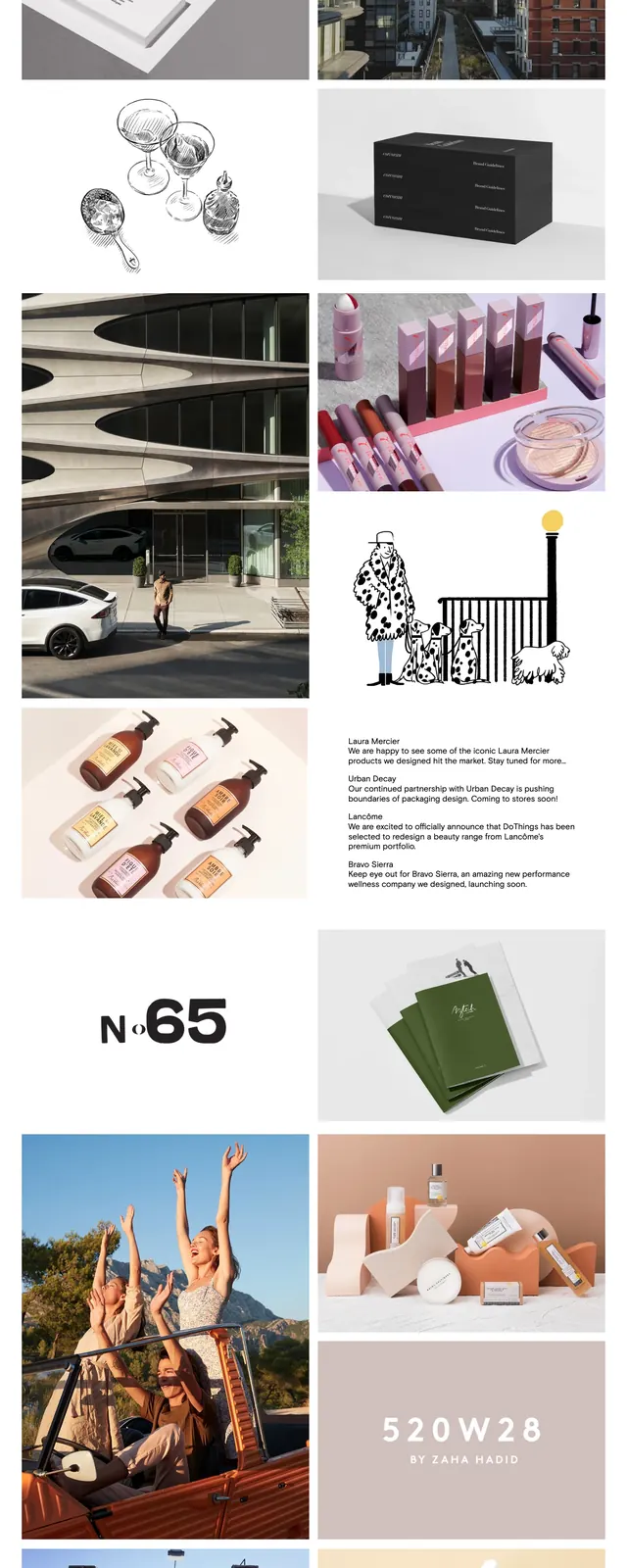
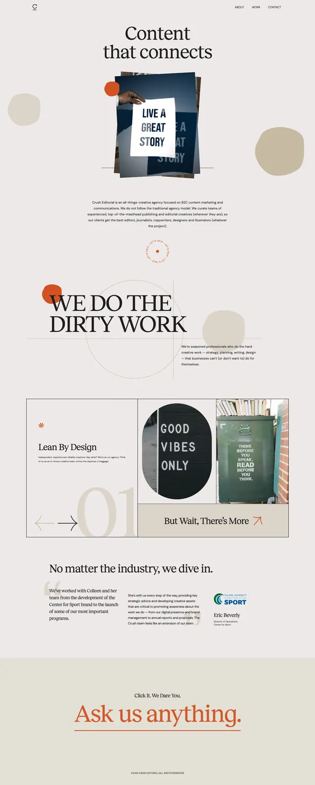
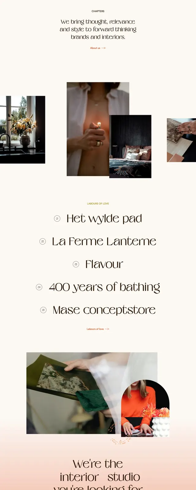
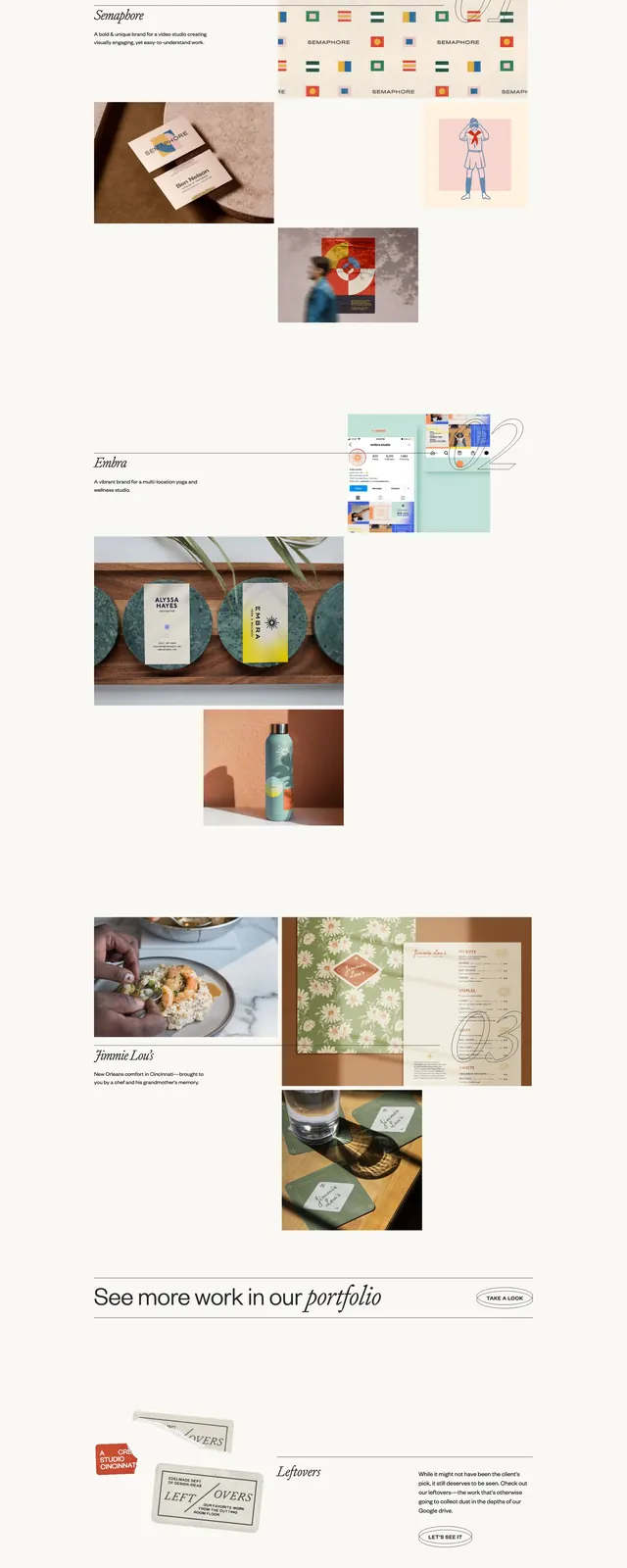
A minimalist editorial agency homepage with oversized serif typography, warm gradient framing, and a refined portfolio grid.
Summary
A minimalist editorial agency homepage with oversized serif typography, warm gradient framing, and a refined portfolio grid.
Visual description
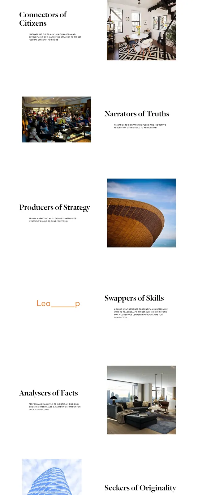
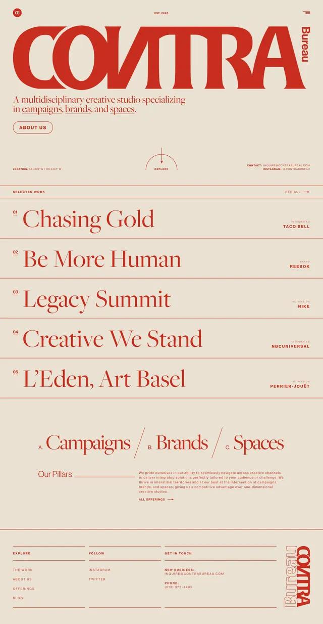
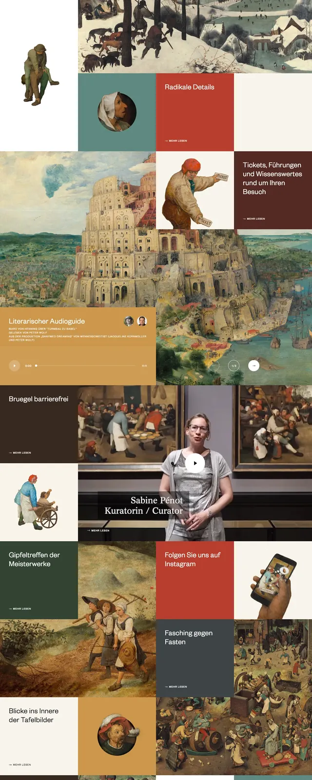
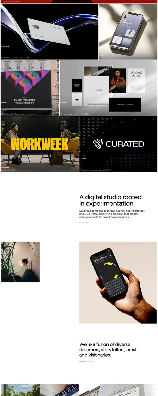
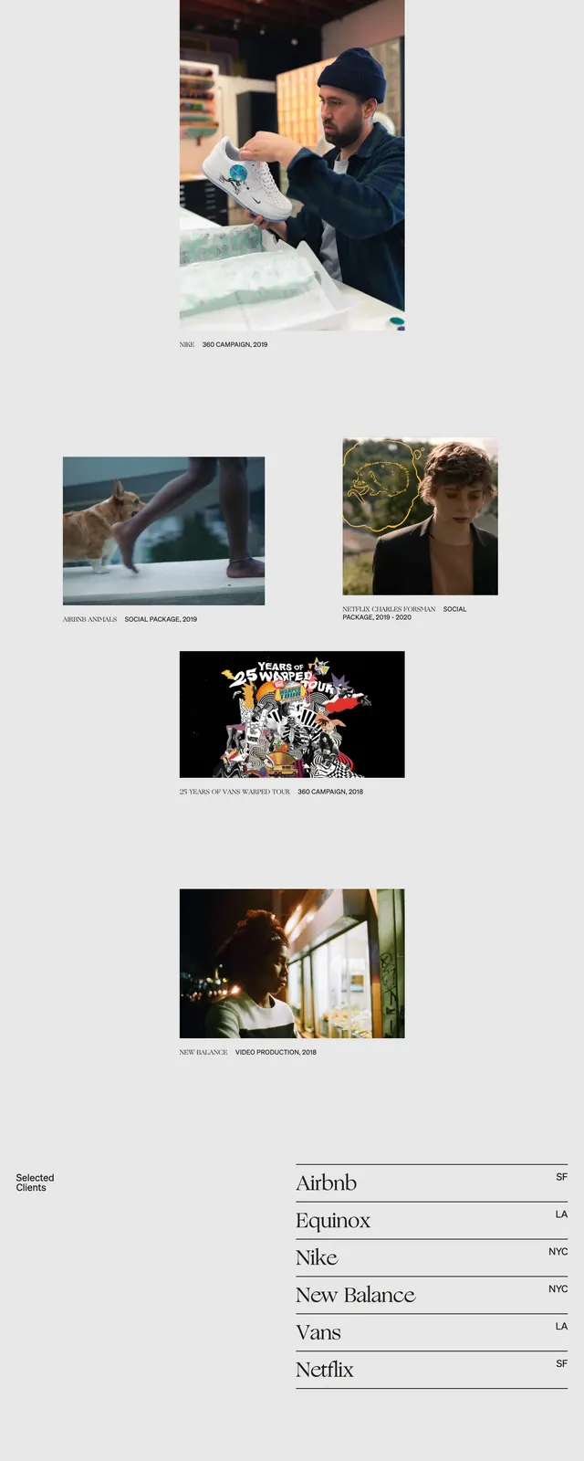
The page opens with a thin top navigation and a huge centered serif wordmark that dominates the hero area. A soft yellow-to-white gradient background creates a warm editorial feel, followed by a sparse featured-work section with image tiles arranged in an airy asymmetric grid. Lower on the page, a large statement paragraph and compact two-column copy block lead into a bold bottom section featuring oversized location text and small contact details.
Key takeaway
Use scale contrast and generous negative space to make a creative studio feel premium and distinctive. The combination of elegant serif headlines, understated navigation, and warm gradient backgrounds is the core reusable pattern.
Reuse notes
Best reused for portfolio or agency sites that want an art-directed editorial tone without heavy UI chrome. The layout works well when large typography, image-led case studies, and sparse copy are the main content drivers.