Preview image. Unlock full-res
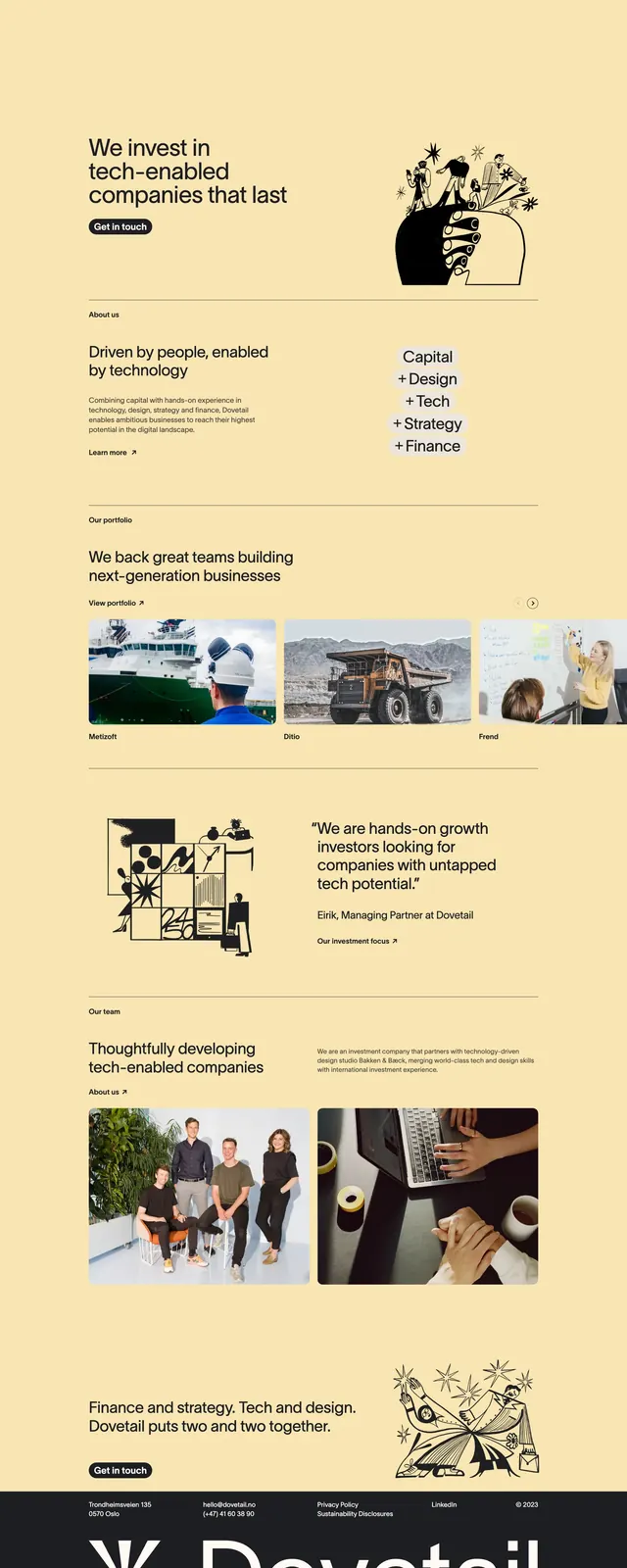
A warm editorial landing page for an investment firm that blends bold typography, minimalist layouts, and hand-drawn illustrations.
Summary
A warm editorial landing page for an investment firm that blends bold typography, minimalist layouts, and hand-drawn illustrations.
Visual description
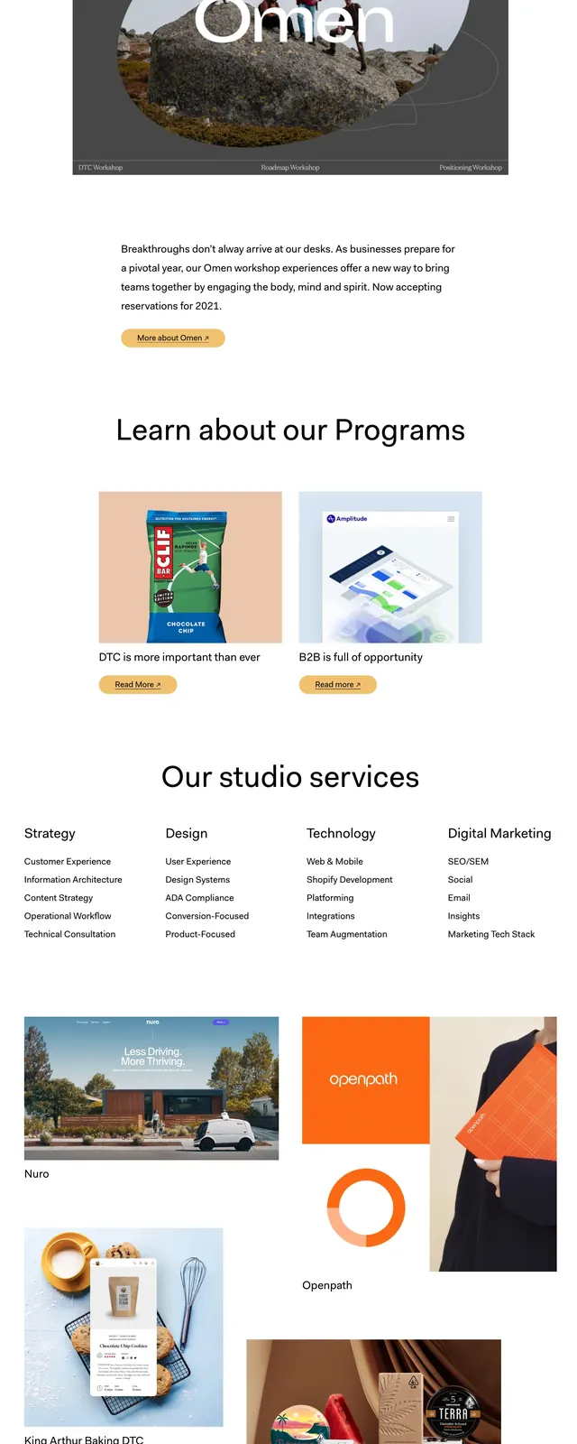
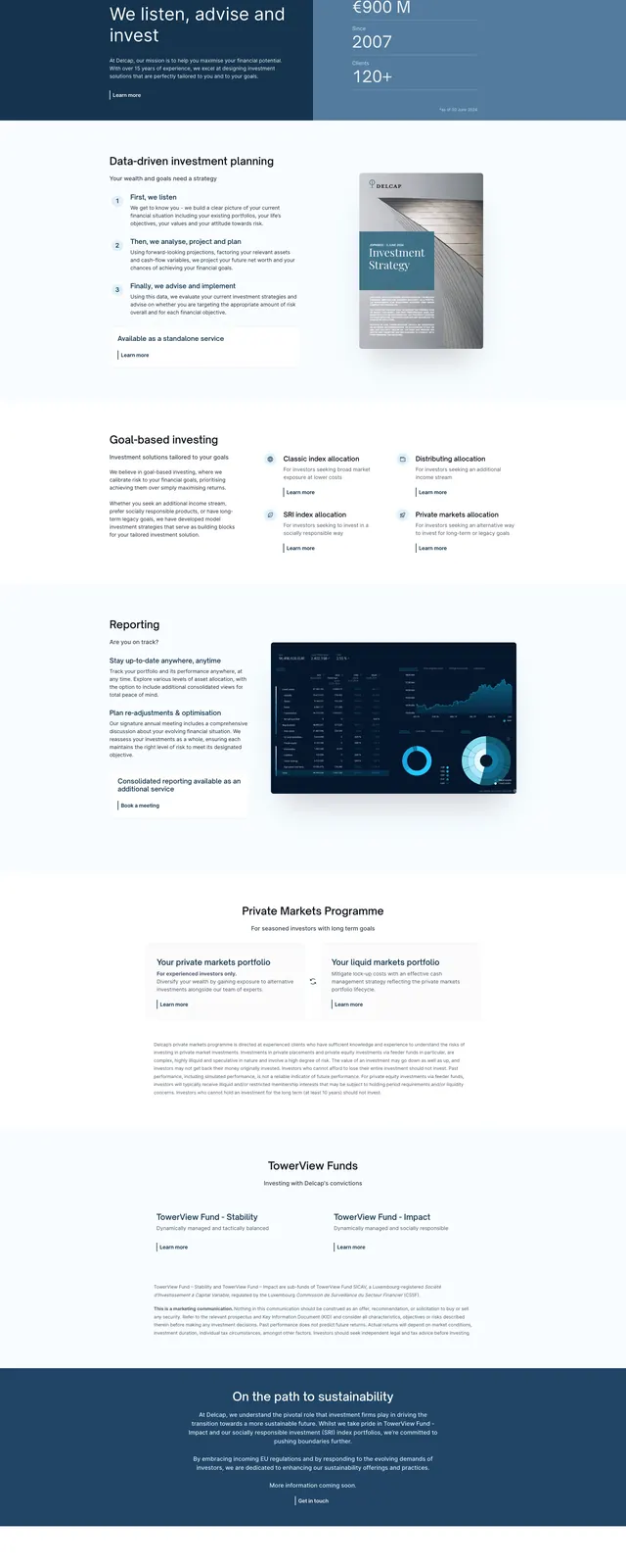
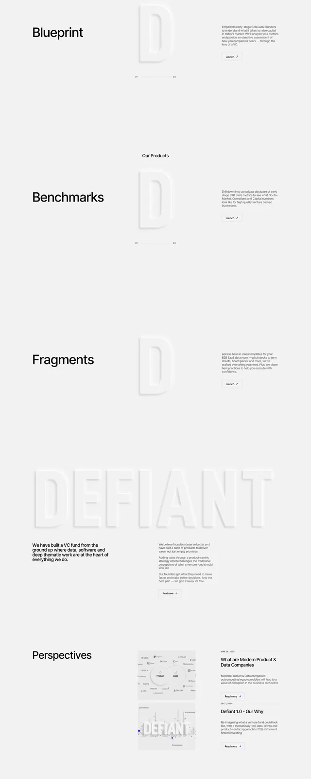
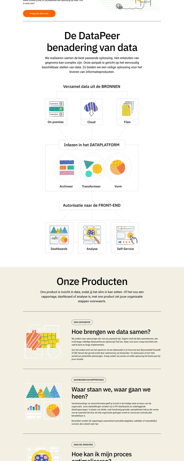
The page uses a pale sand background with black typography and a restrained, high-contrast editorial feel. The first screen pairs a large headline and primary CTA on the left with a whimsical black line-art illustration on the right, while the top navigation stays minimal. Lower sections introduce an about block, a portfolio carousel/grid of image cards, a quote/testimonial area, a team section with large photography, and a dark footer anchored by oversized branding.
Key takeaway
This layout relies on strong type hierarchy, generous spacing, and a warm monochrome palette to make a finance brand feel approachable and design-led. The mix of illustration, photography, and simple section dividers keeps the page varied without losing cohesion.
Reuse notes
Reuse this pattern for investment, studio, or consulting sites that need credibility with a more human, creative tone. The strongest transferable elements are the oversized hero copy, restrained CTA styling, and alternating editorial content blocks.