Preview image. Unlock full-res
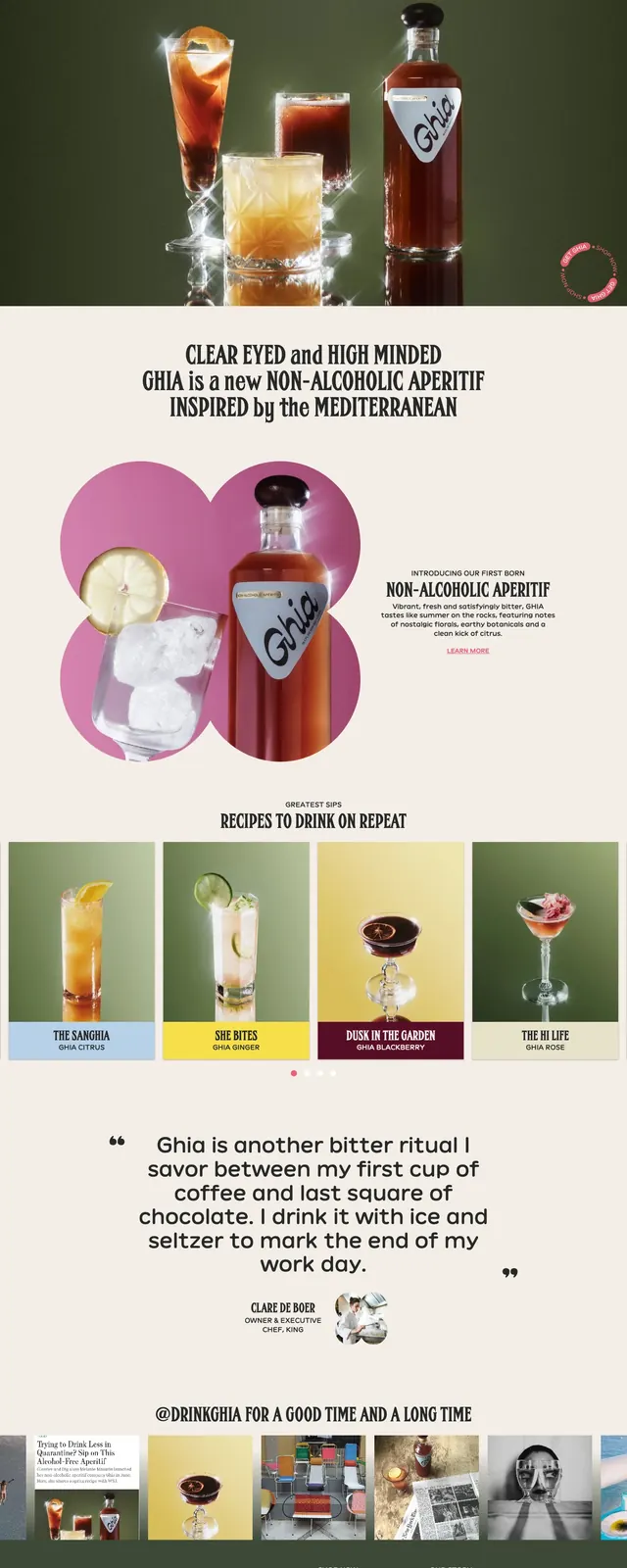
A photogenic, editorial e-commerce landing page for Ghia that combines dark product photography, bold condensed headlines, and soft cream sections with pink accents.
Summary
A photogenic, editorial e-commerce landing page for Ghia that combines dark product photography, bold condensed headlines, and soft cream sections with pink accents.
Visual description
The page opens with a full-bleed hero on a dark olive background, featuring a bottle and three cocktail glasses centered under the Ghia logo. Below, a cream-colored statement band uses large condensed display type, followed by a split product feature with overlapping circular image cutouts and a short text block. Further down, a four-card recipe grid, a large testimonial quote, a social-style image strip, and a dark footer with an email signup form complete the page.
Key takeaway
The strongest pattern is the contrast between moody product photography and airy cream editorial sections. The layout relies on large display type, generous spacing, and recurring pink accent details to keep the brand feeling elevated but approachable.
Reuse notes
This approach works well for beverage, CPG, and lifestyle brands that need a premium DTC feel with content-rich storytelling. It is especially effective when you have strong photography, recipe content, and a brand palette that can carry both dark and light sections.