Preview image. Unlock full-res
A playful SaaS homepage built around a bright illustrated hero, clear CTAs, and stacked proof and signup sections.
Summary
A playful SaaS homepage built around a bright illustrated hero, clear CTAs, and stacked proof and signup sections.
Visual description
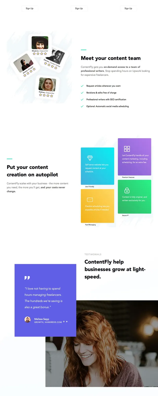
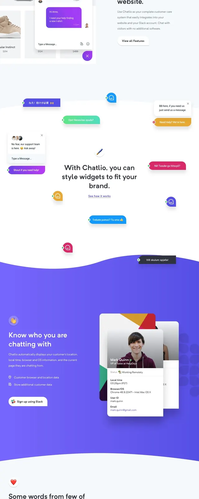
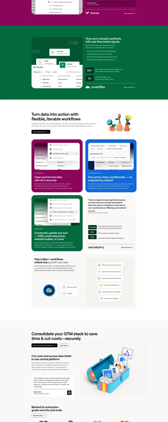
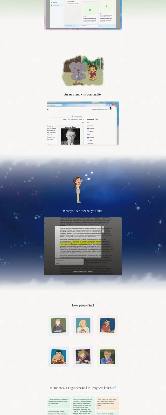
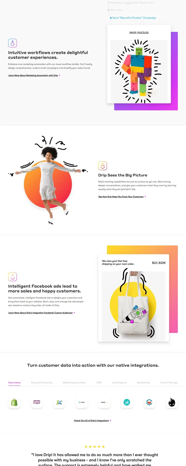
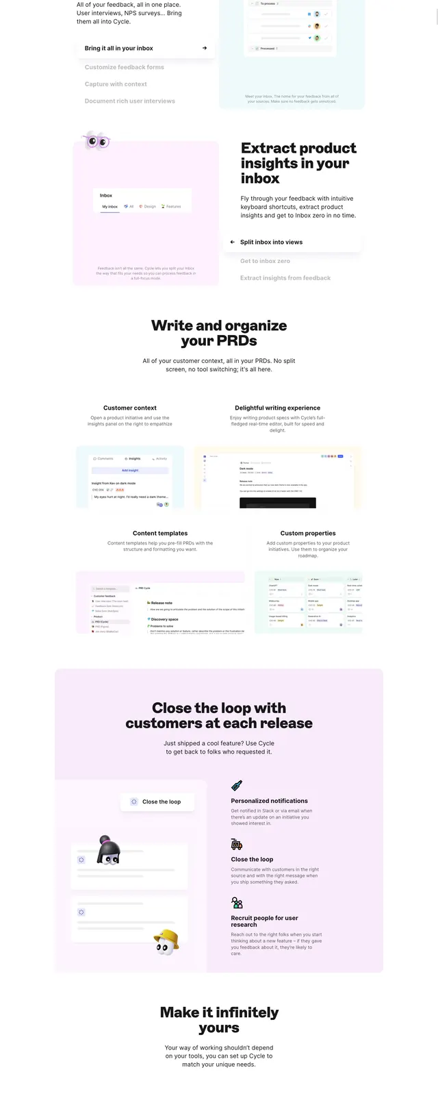
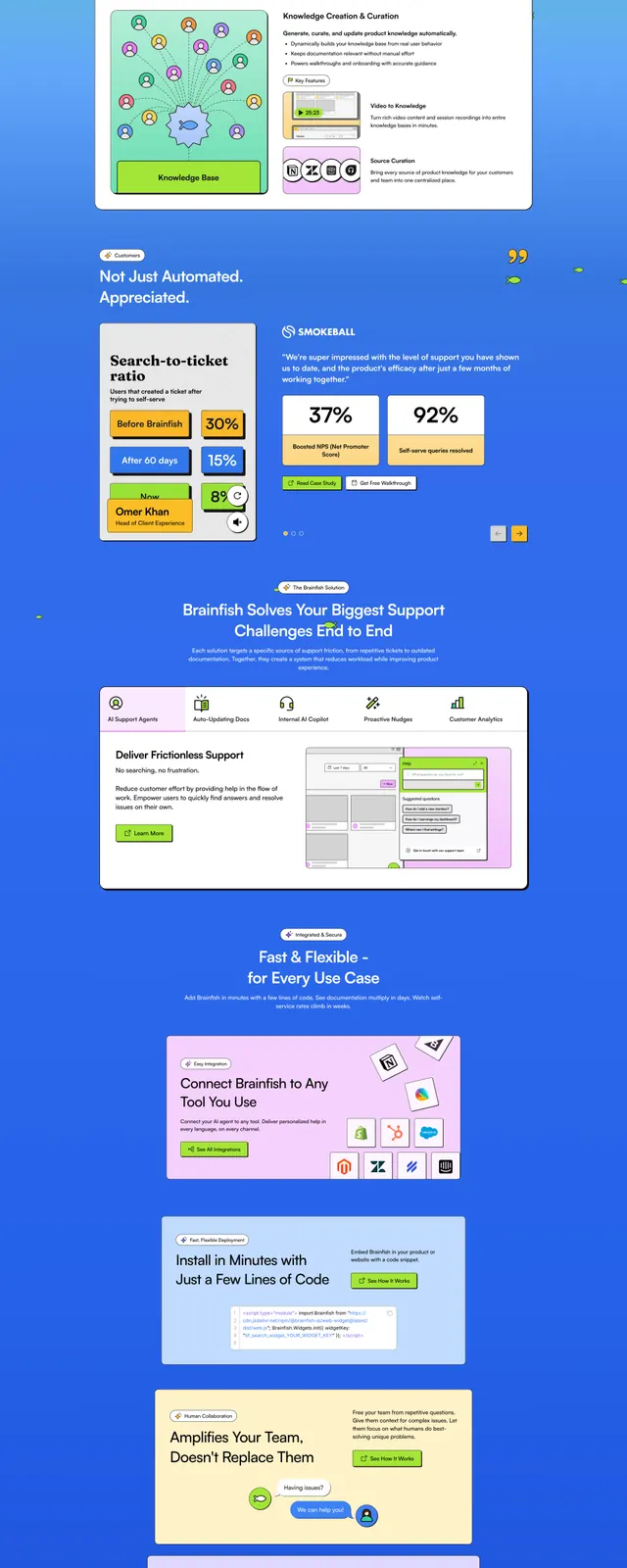
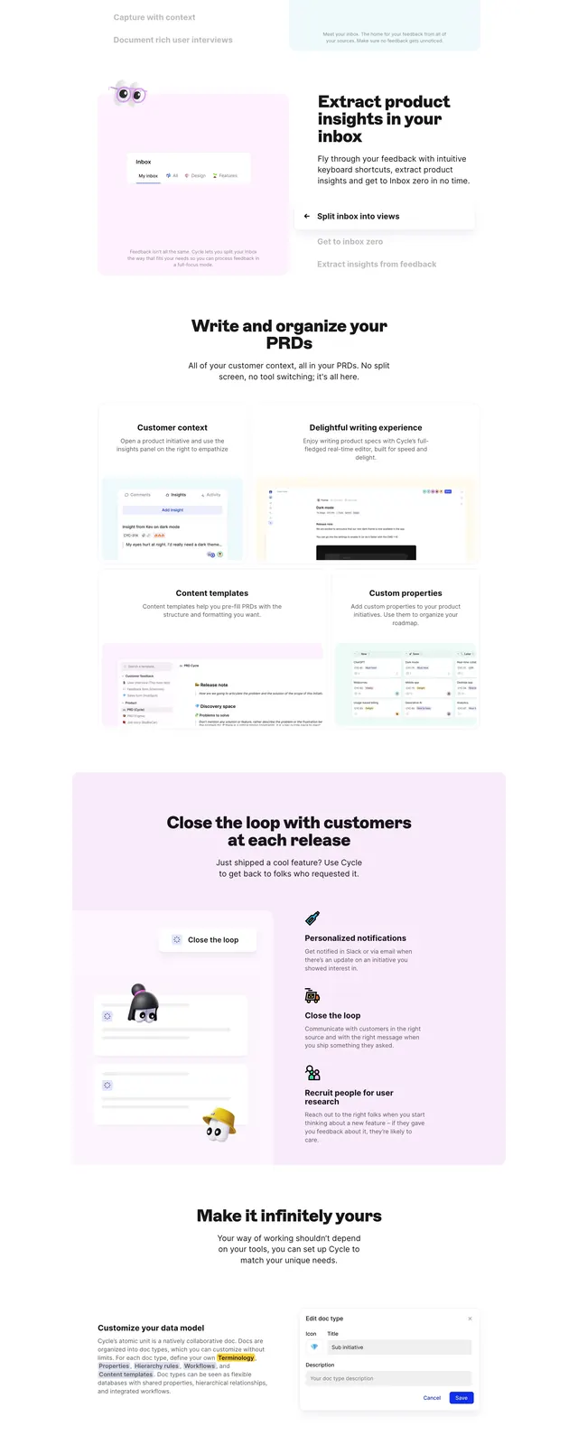
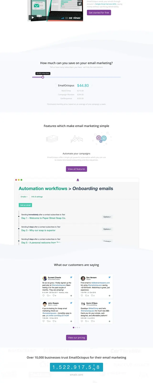
The page opens with a turquoise-to-teal gradient hero featuring a large purple octopus illustration on the right and a short headline with a purple call-to-action on the left. A slim top navigation sits above the hero, and the illustration includes a small envelope to reinforce the email theme. Below the fold, the page stacks a logos strip, a video-based product explainer, feature callouts, a large workflow screenshot, a stats counter, and a dark signup footer with text fields.
Key takeaway
The strongest reusable idea is the friendly illustrated hero paired with a very simple conversion path. It makes the product feel approachable without losing the structure of a direct SaaS landing page.
Reuse notes
Use this pattern for marketing sites that need a memorable brand character, strong top-of-page clarity, and visible proof sections below the fold. It works best when the product can support a playful tone and a simple primary CTA.