Preview image. Unlock full-res
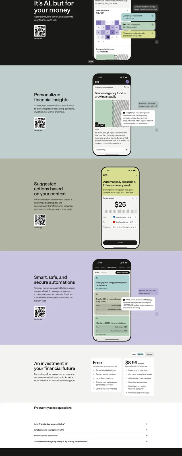
A dark, app-focused fintech landing page that combines oversized messaging with stacked product screenshots, benefit sections, pricing, and FAQ.
Summary
A dark, app-focused fintech landing page that combines oversized messaging with stacked product screenshots, benefit sections, pricing, and FAQ.
Visual description
The page starts with a dark hero featuring a small top navigation, a large left-aligned headline, a QR code, and a tall phone mockup on the right with floating chat-style callouts. Below, the design alternates soft muted background bands with repeated split sections that pair short marketing copy on the left and mobile app screens on the right. A pricing area follows with two plan cards and a year/month toggle, then a simple FAQ list and a dark footer with the brand mark and app store badges.
Key takeaway
The main pattern is a modular, scrollable landing page built from large typography, generous spacing, and app screenshots as the primary visual proof. Soft pastel section backgrounds contrast with the dark hero to keep the page feeling calm and premium.
Reuse notes
Use this structure for fintech or consumer-app marketing sites that need to explain features, show the product, and convert through pricing. The QR-code treatment and floating callouts work best when the product is mobile-first and screenshot-friendly.