Preview image. Unlock full-res
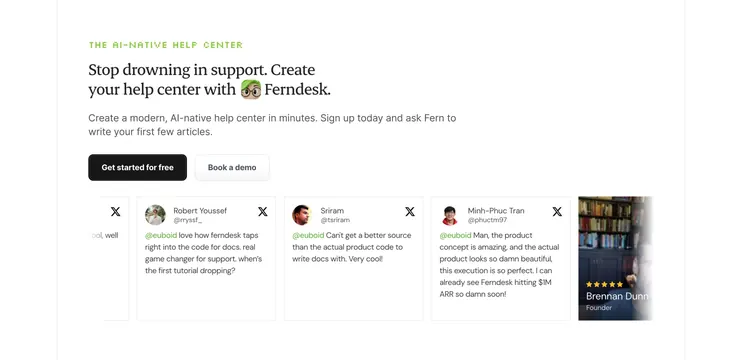
Light section combining a serif CTA headline and two buttons above a horizontal slider of X/Twitter testimonial cards with a peeking photo card.
Summary
A combined closing-CTA and testimonials section: a serif invitation with two buttons sits above a horizontal slider of X/Twitter quote cards, with a photo testimonial card peeking in from the right.
Visual description
White background. A green all-caps eyebrow "THE AI-NATIVE HELP CENTER" sits above a two-line serif headline "Stop drowning in support. Create your help center with Ferndesk." that includes a small inline emoji. A two-line grey subhead follows, then a filled black "Get started for free" and an outlined "Book a demo". Below runs a row of equal white tweet cards, each with a circular avatar, display name, handle, an X logo, and a short quote praising the product (handles like @rryssf_, @tsriram, @phuctm97). A partial card peeks at the left edge and a darker photo testimonial card with a five-star rating and a named founder peeks at the right, signaling a carousel.
Key takeaway
Stacking the final CTA directly on top of the testimonial slider lets social proof and the ask occupy one decision moment. Using real-looking X/Twitter cards, complete with handles and the platform logo, reads as authentic third-party praise rather than curated marketing quotes.
Reuse notes
Good near the bottom of a launch or developer-tool page where Twitter buzz is part of the story. The peeking left and right cards imply horizontal scroll without controls. Keep quotes short and the card layout uniform; mixing a photo card into the tweet row adds variety but should stay visually consistent.
More testimonials sections
See all

More like this

Keep what you find
A free account saves references to boards and can send you a weekly email of picks based on what you save.
To see every result, go Pro.