Preview image. Unlock full-res
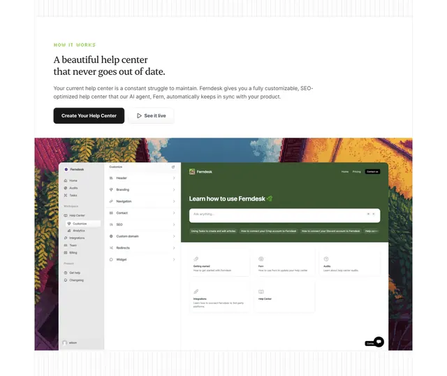
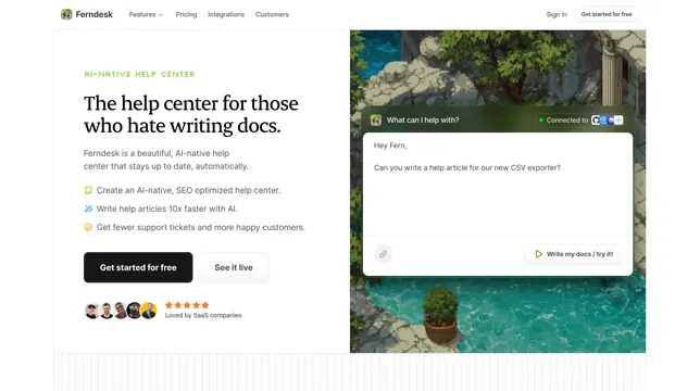
Light how-it-works section with a serif heading and two buttons above a large help-center dashboard mockup set on a painted nature backdrop.
Summary
A how-it-works section that leads with a serif promise and two CTAs, then hands the rest of the space to a large product dashboard mockup composited onto a painted nature backdrop.
Visual description
White background with faint edge gridlines. A green all-caps eyebrow "HOW IT WORKS" sits above a two-line serif heading "A beautiful help center that never goes out of date." and a two-line grey paragraph. Two buttons follow: a filled black "Create Your Help Center" and an outlined "See it live". Below, a wide rounded screenshot dominates: on a painted autumn-forest backdrop sits a help-center admin interface with a left workspace sidebar, a middle "Customize" settings list (Header, Branding, Navigation, Contact, SEO, Custom domain, Redirects, Widget), and a green-headed "Learn how to use Ferndesk" panel with a search bar, quick-link chips, and a grid of getting-started cards.
Key takeaway
Letting one large, detailed dashboard mockup carry the section after a brief serif intro is an efficient way to prove depth without listing steps. Compositing the admin UI over a painted nature scene softens an otherwise dense screenshot and ties back to the brand's illustrated world.
Reuse notes
Best when the product's configuration UI is genuinely attractive and worth showing at scale. Works as a mid-page explainer between hero and features. The illustrated backdrop is brand-specific; on a plainer site a soft gradient or shadow would frame the screenshot just as well.
More process sections
See all

More like this

Keep what you find
A free account saves references to boards and can send you a weekly email of picks based on what you save.
To see every result, go Pro.