Preview image. Unlock full-res
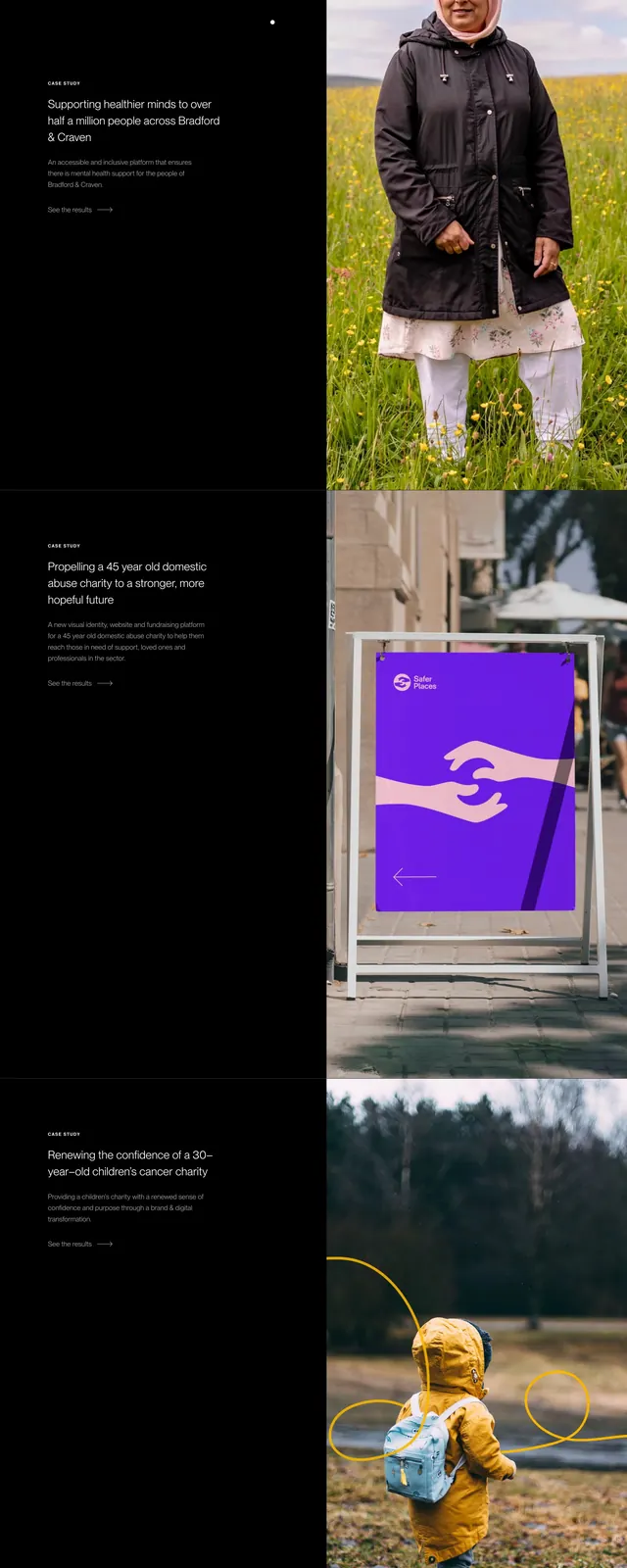
Dark homepage block stacking three split rows, each pairing a black text column with a full-height charity case study photo on the right.
Summary
A work showcase section that repeats the same 50/50 split pattern three times, opening with an editorial headline then listing charity case studies with photo proof and text links.
Visual description
Three full-width horizontal bands stacked vertically. Each band splits roughly half black text column left and full-height photography right. Top band adds a section headline "Work that's making a difference" with italic serif on "difference" above the first case study. Every row shares the same structure: small caps "CASE STUDY" label, bold white project title, gray supporting paragraph, and white "See the results" text link with a right arrow. Right images: a woman in a pink hijab in a wildflower field; a sidewalk A-frame sign with a purple domestic abuse charity poster; a child in a yellow jacket walking in woods with yellow scribble overlays. No filled buttons; links only.
Key takeaway
Repeating one split template three times builds a portfolio rhythm without inventing new layouts per project. Keeping CTAs as quiet arrow links preserves the editorial tone while the photography carries emotional proof. A single serif italic word in the section headline ties the block to the brand's mixed-type system.
Reuse notes
Strong for charity agencies, impact studios, or any portfolio that leads with story over metrics. Needs strong portrait and environmental photography per row. Three stacked splits create a long scroll; consider pagination or carousel for many projects. Collapses to image-over-text stack on mobile.