Preview image. Unlock full-res
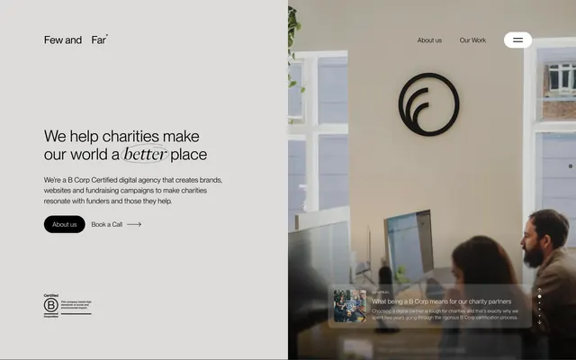
Light-gray hero with mixed-type mission headline, office photography, B Corp badge, and a floating journal preview card.
Summary
A split above-the-fold hero pairing a calm mission statement and CTAs on pale gray with a bright office photo, B Corp mark, and a journal teaser overlay.
Visual description
Left half on light gray: "Few and Far" wordmark top left, centered large headline "We help charities make our world a better place" with "better" in italic serif inside a hand-drawn circle, subcopy on B Corp-certified digital work for charities, then a black pill "About us" button and "Book a Call" arrow link. Certified B Corporation badge anchored bottom left. Right half: full-height office photograph of two people at desks with monitors, black circular logo on the wall, and greenery visible. Top right nav shows About us, Our Work, and a circular hamburger menu button. Bottom right: frosted journal preview card labeled "JOURNAL" with thumbnail, article title, and short description. Vertical scroll-dot navigation runs along the far right edge.
Key takeaway
One italic word in a sketched circle turns a mission line into a memorable mark without a separate logo treatment. The journal card on the hero surface teases content without leaving the fold. Split layout keeps copy readable while humanizing the agency with real workspace photography.
Reuse notes
Strong default for purpose-driven agencies or nonprofits with a editorial brand voice. Requires a quality team or workspace photo and a genuine certification badge. Scroll dots imply multi-section storytelling; omit if the page is shorter. Pastel gray left panel needs sufficient contrast for black type and buttons.