Preview image. Unlock full-res
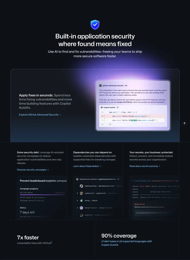
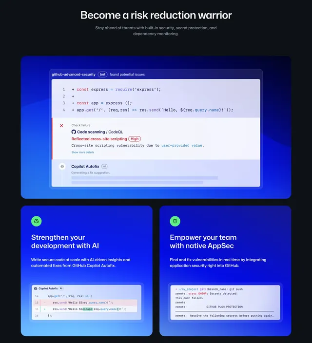
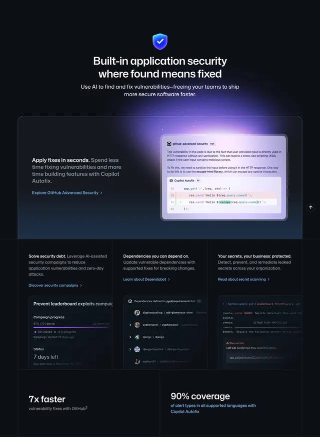
Dark security features block with shield icon, Copilot Autofix spotlight, three-column product cards, and stat callouts.
Summary
A centered security narrative opens with a glowing shield and headline, then stacks a large Copilot Autofix feature card, a three-column grid of security products, and two oversized statistics.
Visual description
Black background with blue-purple ambient glow. Top center: a 3D blue shield with white checkmark, oversized white headline about built-in application security, and gray subcopy on AI-powered vulnerability fixes. A large rounded card follows with purple edge glow: left column has bold Apply fixes in seconds copy and a blue Explore GitHub Advanced Security link; right column shows a bot message explaining an XSS issue with a Copilot Autofix code diff (red removed line, green escaped replacement). Below, three equal columns each pair short heading and body copy with a UI card: campaign progress at 97%, Dependabot dependency list with avatars, and a terminal window showing push protection blocking a secret. Bottom row displays two large stats, 7x faster fixes and 90% alert coverage with Copilot Autofix.
Key takeaway
The hero icon plus headline establishes category before any UI chrome. The primary feature card uses a real code-diff as the visual proof, while the three-up grid repeats the same text-left, product-screenshot-right rhythm at smaller scale.
Reuse notes
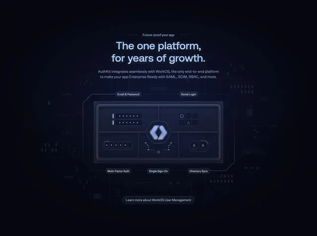
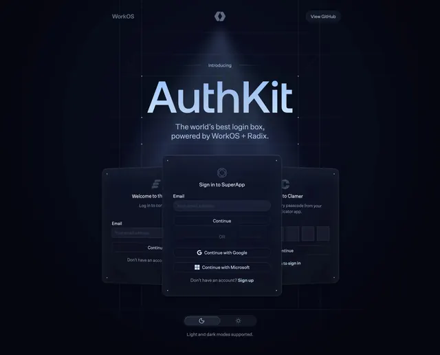
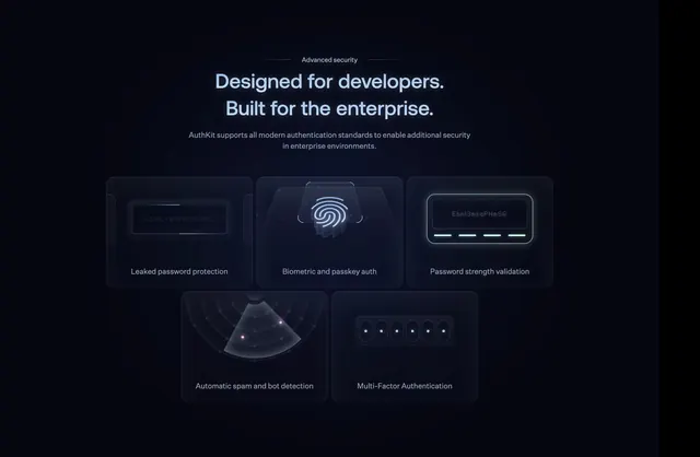
Reference for security or dev-tool feature sections that need to show multiple products in one scroll. Local asset appears to duplicate the security section rather than a productivity tab; verify against live github.com before reusing the slug label. Stats row works when metrics are genuinely strong and legible at large size.